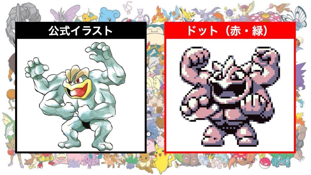
Official Illustrations Dot (Red/Green)
I think there are quite a few of those in the first generation.
Is it just Machamp?
I remember that Raikou had a different design in gold and silver.
I think it’s a matter of skill.
Rhyhorn is at a completely different level compared to other Pokémon.
It’s easy to tell that the red and green were dotted by a specific person.
Specifically, like Rhydon.
Upon closer inspection, the facial features are completely different.
It’s the same guy as Wigglytuff, isn’t it?
Was the dot first!?
Is that an official illustration?
A dotted Golem seems like it would be smooth.
The high level of perfection of the Pteranodon.
The quality difference in the dots is just incredible with Red and Green.
It’s common for graphics to be created after the dot placement even before the Famicom, but in the case of Pokémon, it’s discussed openly.
The dot character with big eyes and a stocky appearance is generally like that.
Even Charizard has a mix of one horn and two horns in its original design.
I can’t help but think of that back view of the lizard first.
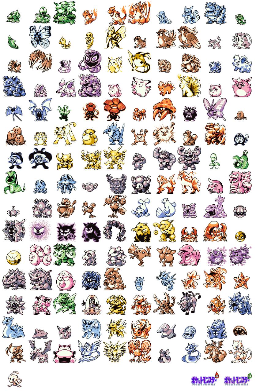
For GAIJIN, red and green pixel art does not exist.
In PokéSpe, Shiba’s Machamp is set up to be saving its power while wearing a belt that it wouldn’t normally wear…
You’re properly wearing a belt even with dots, huh…
Sawarumi was complete from the very beginning.
Mastering Matadogas is just too good… it’s becoming.
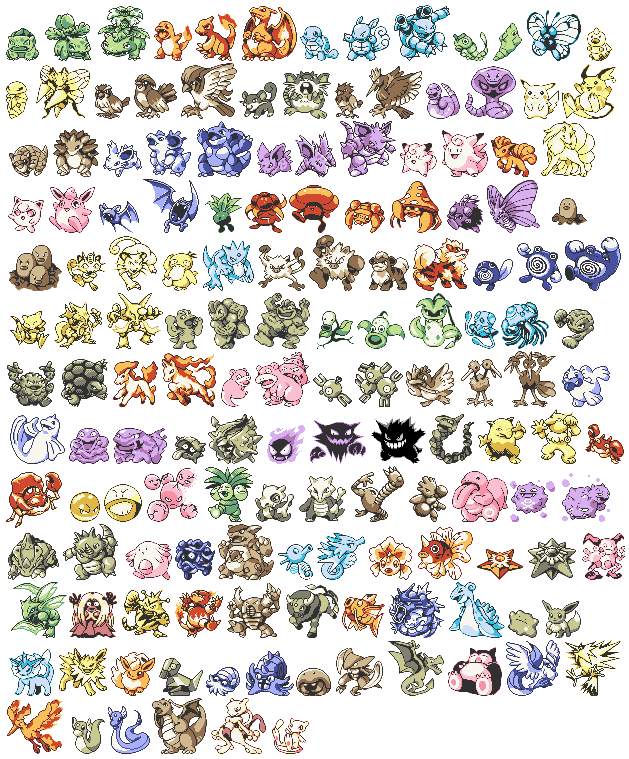
The Pikachu version is from after the anime, so the illustration design has already been finalized.
The sand has a strong biological feel of cuteness in red, green, and blue…
I like blue Omastar.
The Laplace eyes have changed, and they are really alluring.
Azumaou’s dots are skillful.
When comparing the blue Gyarados, Nidoking, and Lapras with Golbat, Golem, and Azumarill, the difference is so significant that it makes me laugh.
It has a Dedede-like quality.
Every time I see it, the early Mew’s quality is too poor.
It’s easy to understand when you move the Pokémon that are being streamlined.
The touch is the same as Red-Green Machamp, but the dynamism of Blue Machamp leaves a strong impression.
The Pikachu version is based on the official art, or rather the character design from the anime, so it’s quite different in direction from Gold and Silver.
It’s super obvious that the same person is drawing the Charizard line and the Dragonite line.
The red-green Mew has quite a fetus motif.
Pika is truly a quality finished version.
I like blue dot.
Goron is cool, but Golem has a strong sense of disappointment.
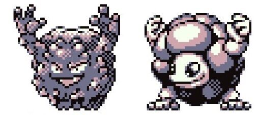
I prefer the original dot version of Ghost, which looks like a collection of dust.
There are many strange things about blue…
The Pikachu version, especially the ones like the pudding type or Pikachu type, can be quite surprising when it comes to facing Ratata head-on.
The Kingler with big pincers.
Upside-down doghouse
A Shellder that has turned sideways.
Oh, I just realized, Blastoise is a turtle bazooka.
The shiny version of Arbok is staring at me too much, don’t you think?
The Pikachu version has high-quality pixel art overall.
After all, the game’s Charizard only looks cute to me.
Even though in anime, I was completely focused on being cool.
The Pikachu version of Onix looks weak.
The pixels of Pikachu in the first generation are really cute.
Well, it would look like a Pokémon’s face.
The difference in appearance when Pikachu is seen from behind is amazing.
I love the dynamism of Sawamur.
The overly stylish red-green Kadabra is nostalgic.
I was freaked out when I first saw the crazy thing come out.
Nidoking from the pixel art era is too cool!
The fire ability in the three birds is really tricky.
Eevee and its evolutions have been cute since the first generation.
Gorbatz is often said to be too creepy.
I wonder why they made Windia leave…
The backward-facing dots looked like bones on the Charizard.
Nidoking is too cool.
The disappointment of seeing Thunder’s back is immense.
The Magikarp seems to be unusually well-made.
The red-green pixel art was created by the dot artist freely, and based on that, Mr. Sugimori made concept art for the anime, which led to the creation of the Pikachu version, right?
The bone structure of Charizard is amazing.
Marmine has a flat head, making it easy to place it discreetly.
The level of detail in the pixel art of Ptera from the very beginning is amazing.
Mewtwo was cool from Red and Green, so it’s no surprise it became a movie.
The basics of two-panel comics are truly great.
Windy is originally Dodongo, right?
The original Medarot had some pretty rough dots, didn’t it?
In the end, I became the scenario writer after that.
When you take a closer look, even the number of fingers is different.
Mewtwo had a cry like Parasect, but it was really cool.
Gallop is amazing!
I wanted to convey a sense of dynamism within the constraints.
What was with the delay in the release of the gold and silver? It seems like there was a lot of confusion.
It’s common to strike weird poses to add movement from red and green.
There was information about skateboarding and other things before the release, like gold and silver.
Onidrill is nice too, right?
Since I was a child, I’ve thought the red and green Dragonite looks really thin.
I think it’s because of the white border.
The eyes of the Azuma King are scary!
Goes, is it that small…?
Horizontal Palpitoad is also pretty cool.
I really like the cute vibe of Charizard from the first generation.
I thought it was a different Pokémon at first because the back looks too different.
I felt really disappointed when I used the cool Pokémon from the first generation and saw its back view.
You were crossing your arms like a jellyfish, huh…
It only looked like a bird with its butt facing the Ebiwalar.
Windy has a strong sense of “Dodongo” when looking at its predecessor, Wing.
I love my current dog, but I can’t forget that picture that was based on something distinct.
The blue version of the beetle might be incomprehensible if you don’t know the original.
The characteristic feature is the exaggeratedly large dot eyes.
Onidriiru is best in red and green.
I wonder if there are people who want to see this kind of thing.
There are people who make really big-headed dots…
The dot, which is in charge of the person with bulging eyes, seems to strongly retain the remnants of being a monster resembling a kaiju.
This is really good.
It’s great how each Sawamurā is striking a cool pose that’s different from the others.
Upon closer inspection, the swirl on Nyoro-bo’s design is too random and just doesn’t work.
Even at the red-green point, the level of completion of the dot shows that I was initially inclined to support the Pikachu lineage.
Additionally, the quality of things like Dogars was exceptionally good.
For some reason, among the Nidoran♂ series, Nidorino in the middle just has an unusual sense of dynamism and looks really cool, which I don’t quite understand.
Isn’t the red and green dugong really skilled?
The Pikachu version has a solid design, so there are fewer discrepancies and it’s generally pretty nice.
There are quite a few people who like red and green as poses.
The blue beetle is terrible!
The red and green Onidrill is really cool.
Shower is more erotic in red and green.
Looking at it this way, Eevee doesn’t become perfectly cute until it evolves.
Red and green Mewtwo, the origin and the pinnacle.
The person who drew Mataragas, Betobeton, and Marumain seems to still be doing main pixel art at a high quality in later years.
It’s clear that the various comments are just a reaction from those who feel completed in the original series.
A surprisingly polished Sawamur in the red and green phase.
The completion level of the Ghost series in the Pikachu edition is insane.
I really liked how the ghosts in Red and Green looked super cool.
Gengar is too plump.
Isn’t it unfair that Kentauros is the strongest with this design?
I love Pikachu version Jigglypuff.
No strikes missed.
The Pikachu version of the Ghost type feels especially animated.
Because it was one of the first created, Rhydon’s body shape is completely different.
Golem’s eyes are too sparkling.
Games created by salarymen who are not even in-house creators, which are unique to the production scale of the past, have a profound flavor when viewed today.
When I think about it again, the naming sense is amazing.
Club Dugong, Gallop, Ghost, Pigeon, Beetle probably haven’t thought about anything at all.
I’ve been thinking for a long time about why Arbo has a duck face.
Isn’t the drop here too steep?
The red and green Ninetales is nice.
I hate the big-headed Dogaas!
The early ghost is just a clump of dust.
![[Rune Factory] I’m sorry, but I live behind the general shrine.](https://otaku-reviews.net/wp-content/uploads/2025/06/af0f4933.jpg)
![[Monster Hunter Wilds] I wonder if those who bomb with low ratings want to kill the series.](https://otaku-reviews.net/wp-content/uploads/2025/06/618be522.png)
![[Manga] The magic trick that everyone tried to master as kids but couldn’t is trending, lol.](https://otaku-reviews.net/wp-content/uploads/2025/06/bf53dd2f.jpg)
![[Gundam GQuuuuuuX] Even though you’re a Newtype, you’re so insensitive, Egusabe-kun.](https://otaku-reviews.net/wp-content/uploads/2025/06/b96ae33d.jpg)
![[Manga Time Kirara] Tell me your favorite couple in Kirara.](https://otaku-reviews.net/wp-content/uploads/2025/06/7f363a8b.jpg)
![[Fullmetal Alchemist] I have no certainty, but I feel like Envy is the weakest among the homunculi.](https://otaku-reviews.net/wp-content/uploads/2025/06/da613d5c.png)
![[Thunder thunder thunder] I thought this cover was sexy… so I bought it, and it turned out to be more interesting than I expected.](https://otaku-reviews.net/wp-content/uploads/2025/06/d303d5fc.jpg)