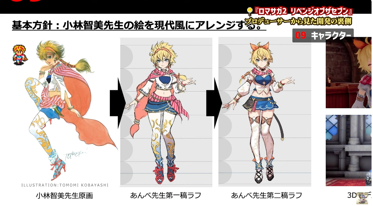
Basic Policy: Arrange Ms. Tomomi Kobayashi’s illustrations in a modern style. Behind the development from the perspective of the producer of “Romancing SaGa 2: Re;birth of the Seven.” Character ILLUSTRATION: TOMOMI KOBAYASHI Original drawing by Ms. Tomomi Kobayashi, draft one by Mr. Ambe, draft two by Mr. Ambe.
It’s amazing how much better it has gotten with the third one.
Are you saying that the original artwork is super trendy? Wow!
>>2
Because the person who saw the rough draft of proposal 1 said to aim for the Reiwa era, and what came out was proposal 2!
>>10
Is a cape unnecessary in the Reiwa era!?
>>10
Thank you, P.
It’s the work of a professional.
30 years ago!?
I like the story about how LP was added because the initial group like Thérèse often died during playtesting.
Are you a naughty teacher?
I like the redesign of the hairstyle.
The way they use ribbons to keep the silhouette intact while changing the impression to a modern style is really professional.
I didn’t think the dotted mite was very cute, so I really think the current design is super cute.
You’ve piled it on all at once…
If you line them up, you can tell they are the same character, which is a good modification.
The transition from the first rough draft to the second rough draft is just too genius.
There were various new job proposals, but you became a dancer because you were lecherous, huh…
There’s no way the exposure of the butt is that high.
>>16
Does that mean it’s trendy because the exposure level has increased?
Indeed, this hairstyle doesn’t belong in the Reiwa era.
I thought Ero-chan was just okay, but I never expected the character design to be this good.
You’ve trimmed it down quite a bit.
White tights → Knee socks, it’s a sign of the changing times.
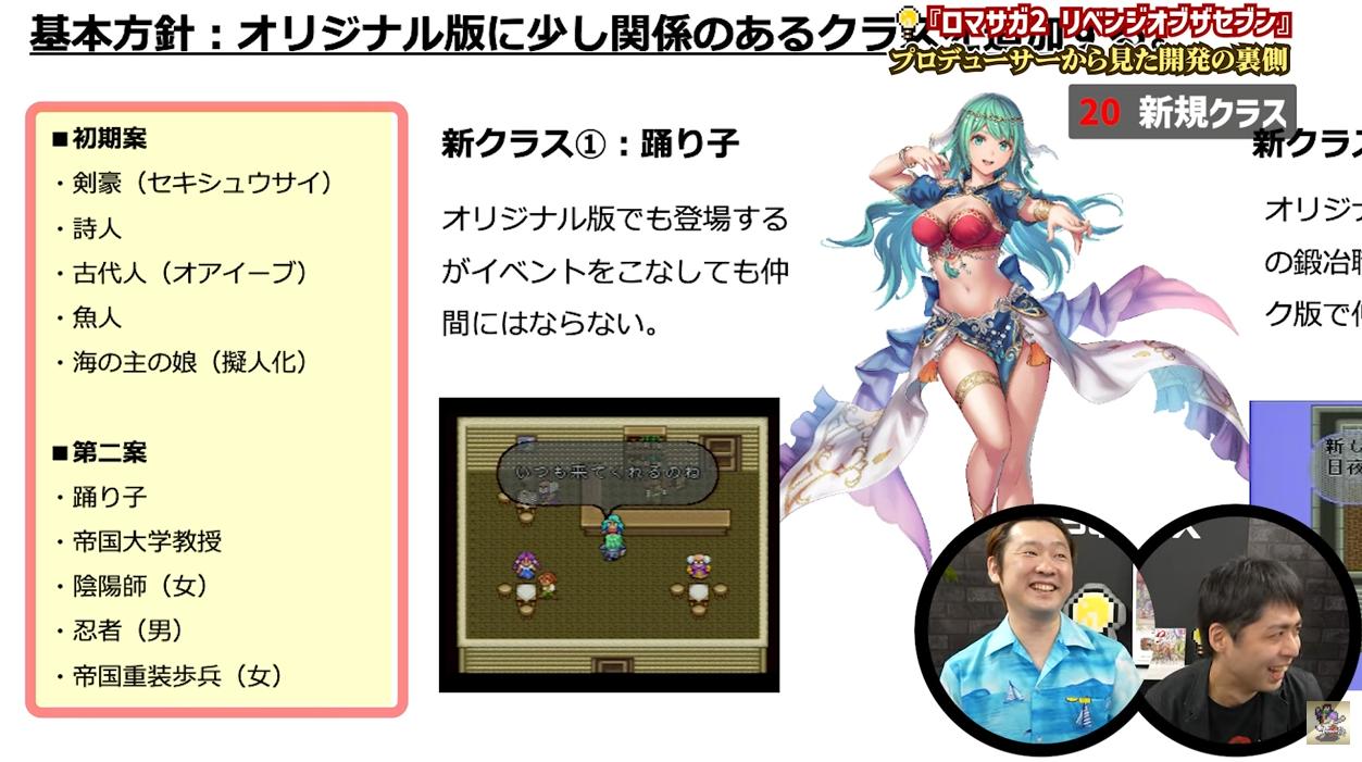
Basic Policy: A slightly related class from the original version “Romancing SaGa 2” “Revenge of the Seven” Behind the scenes of development from the producer ■Initial Proposals ・Sword Master (Sekishūsai) ・Poet ・Ancient Person (Oaibe) ・Fishman ・Daughter of the Sea Lord (Anthropomorphized) ■Second Proposal ・Dancer ・Imperial University Professor ・Onmyoji (Female) ・Ninja (Male) ・Imperial Heavy Infantry (Female) New Class ①: Dancer Appears in the original version, but will not become a companion even after completing events. You always come, don’t you? Yes 20 New Class
Hmph!
>>22
Just implement the initial plan and the second plan completely.
By the way, the Imperial blacksmith was originally planned to be male, but the lewd Yoshirou-sensei said, “Let’s go with this…” and introduced that female blacksmith, so it became that way.
>>23
It’s an incredibly bold decision…
Pervert!! 11111
The sleek silhouette feels very contemporary.
Wasn’t there something like this in the middle of JoJo?
The first draft is quite faithful to the original, but the second draft suddenly becomes sleek and polished.
Are capes and scarves super trendy now?
I might like the one in the middle.
You think I’ll be lured in just because you made a trendy erotic character?
As expected of a professional… No, that’s not it…
1 and 3 are completely different things, but 1 to 2 has become more modern, and 2 to 3 has become super cute.
When asked which one looks more like a cat, it’s the one on the right.
I really think it was a great remake.
The decrease in flutters seems to be due to modeling considerations.
Now that you mention it, there might not be many characters with such spiky, messy hair in the Reiwa era.
Modern, shoujo manga-style.
Producer, you…!
Thank you…
Huh, was this Anbe!? Is Anbe the person from Squid Girl?
>>40
For a moment, I thought the same thing, but it turned out to be a different person with the same last name after all.
While trimming the accessories, I’ll enhance the breasts and thighs.
The thread doesn’t have a name, and it has poop on it.
I don’t know who the illustrator is, but it’s definitely clear.
This guy is a pro.
>>43
Of course, lol.
I really think it’s great that you made it into a ribbon.
You’ve really gotten it all over the place, haven’t you?
Short bob without a mane.
Giant Ribbon
Exposing the chest prominently.
Cape off
Pull down the socks to create an absolute territory.
This is the Reiwa transformation…
Wasn’t it unnecessary to make the legs so thin?!
It was quite a good promotional video.
So you’re already working on 3, right?
The outfit on the right is good, but the hairstyle around the middle is also acceptable.
The tights are super uncool.
>>52
I’ll kill you…
I like all three patterns, including the original.
But I understand that if it’s a game being released now, it must be the final version.
I really think I did a great job.
The original style of Mr. Kobayashi’s drawings is not so much outdated as it is too painterly.
I like this as it is.
Mr. Anbe’s cartoonish style is very good.
Looking at it this way, it seems to inherit more of Tomomi’s design than I thought.
Oh, so Mr. Ambe is doing this kind of work now.
A redesign that is easy to create cute 3D models.
When wanting to modernize, the first things to remove are the cape, the gem, and the leotard.
The first draft was quite faithful to the design.
I don’t know about 3 yet, but I think it would have been difficult to directly convert 1 and 2 into 3D.
Everything in Minstrel Song has also changed, and it’s partly for religious reasons.
I think the first one is cute enough and refined, but it probably didn’t go viral.
The second one from here is just too genius.
I really like the first draft, but was it not good enough?
I really fell for this scam.
I’m glad I was caught.
I really like the first arrangement.
The battle speed was originally set to 1.3 times.
The person who said “the tempo is bad” is nice…
>>68
I’ve come to think that having passionate people at key points is the essence of remasters and remakes.
It seems that the first draft has a lot of decorations, making it difficult to move in 3D.
Being told to align with the Reiwa era and actually being able to do so is too professional…
Does it feel like you slimmed down and added some volume to your chest?
Things that seem troublesome for making capes or models will be confiscated.
It’s impressive how they’re arranging things to reduce decorations for easier 3D rendering while making sure it doesn’t look shabby.
At the draft stage, it’s already an 80 out of 100 as a remake.
Kobayashi’s artwork is generally composed of some kind of fabric and decorations that resemble ethnic or religious elements.
It seems like the selection and elimination for 3D conversion will be difficult.
If you look closely, it seems that the sexy points of the original illustration have only changed slightly, with the tights turning into knee-highs while the chest and belly button remain the same.
Advanced
The first draft is clunky, but it suddenly becomes really good—what a pro…
You’re a pro──
It’s impressive to completely cut out quite a distinctive element of the original plan.
Where did that tail-like thing come from?
It seems that cloaks and sleeves can conceal the challenges and attractive aspects of modeling and movement.
It’s amazing how something can suddenly change from a strong sense of secondary creation of the original illustration.
Tomomi Kobayashi’s illustrations are really great!
>>84
Both male and female characters are truly beautiful.
As expected of a professional, it’s different…
I don’t want to be greedy, but I wish I could choose all items in DMC.
Changing the direction of cuteness and actually getting results, that’s really professional…
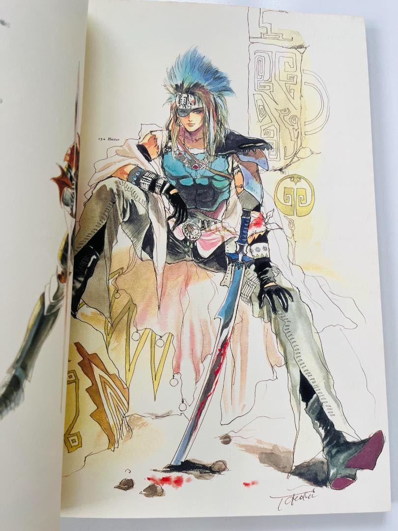
I like Hector…
Many have been lured by mites and ninjas.
Just tying messy hair with a ribbon instantly makes it look modern, which is amazing.
To be honest, I don’t want the Saga Frontier characters to change from Kobayashi’s style.
I’ll do my best!
The charm point has been neatly removed, and it has become an ordinary social game character.
I like the one in the middle as a picture, but the one on the right is probably better for a 3D model design.
>>95
I feel an aura that subtly clashes between the cloak and the wide sleeves.
It turns out that the class change costume designs for the remake of Secret of Mana 3 were also drawn by the same person, Ambe.
>>97
It is a hiring based on that achievement.
Are you a pro at being a pervert?
Personally, I think the design of Dani from Reversed Saga is most impressive because the end of the belt looks like a cat’s tail.
The giant ribbon is truly a divine move.
I want to punish you.
It really feels like the selection and arrangement of Kobayashi’s drawings after properly updating them to the latest Reiwa version is impressive…
I think the character designers and illustrators at the studio are amazing.
I do like the first draft, but if you’re going to change it completely, it has to be the final draft, right?
Even someone as talented in redesigning as Teacher Ambe needed two hits, huh, Dani?
There’s only the color scheme left of the original form.
In the first draft, the gaze is somewhat sharp, while in the second draft it feels like it has returned to a cat-like eye.
The city thief guy has a cool pose during battles, and I really liked him as he felt like the main character, but I never expected him to become the only shota member of the team.
Isn’t it a bit rude to say “in a modern style”?
>>111
But over a quarter of a century ago is a long time ago…
>>112
A quarter of a century ago was still modern, right…?
>>111
The meaning is that the design from that time is made to feel natural in the modern era, so it is not disrespectful at all.
Especially in Kobayashi’s image (the dots seen during gameplay).
The Anbe illustration appears as it is in the game, so the role it serves as an image is completely different.
There must be a better way to say that…
Let’s arrange the outdated design of the very old Tomomi Kobayashi-sensei to make it work in the Reiwa era!
It’s too far from the original form…
Perhaps it’s because Kobayashi’s art has never really been influenced by the trends of the times.
I feel like only the design has changed significantly, like in the thread image and the pineapple.
If the proportions are this different, it’s like the pixel art characters from back in the day, so it’s fine, isn’t it?
In other words, you inherited it.
It’s an old design from 30 years ago, so no matter how you try to dress it up, it’s still old…
The strategists like Koumei are almost exactly the same, which reflects a high level of completeness.
It’s not that the design is old, after all, it’s just not modern-style clothing.
It’s interesting how adding things like orbs to various parts or big shoulder armor in fantasy makes it super trendy.
![[Rune Factory] I’m sorry, but I live behind the general shrine.](https://otaku-reviews.net/wp-content/uploads/2025/06/af0f4933.jpg)
![[Monster Hunter Wilds] I wonder if those who bomb with low ratings want to kill the series.](https://otaku-reviews.net/wp-content/uploads/2025/06/618be522.png)
![[Manga] The magic trick that everyone tried to master as kids but couldn’t is trending, lol.](https://otaku-reviews.net/wp-content/uploads/2025/06/bf53dd2f.jpg)
![[Gundam GQuuuuuuX] Even though you’re a Newtype, you’re so insensitive, Egusabe-kun.](https://otaku-reviews.net/wp-content/uploads/2025/06/b96ae33d.jpg)
![[Manga Time Kirara] Tell me your favorite couple in Kirara.](https://otaku-reviews.net/wp-content/uploads/2025/06/7f363a8b.jpg)
![[Fullmetal Alchemist] I have no certainty, but I feel like Envy is the weakest among the homunculi.](https://otaku-reviews.net/wp-content/uploads/2025/06/da613d5c.png)
![[Thunder thunder thunder] I thought this cover was sexy… so I bought it, and it turned out to be more interesting than I expected.](https://otaku-reviews.net/wp-content/uploads/2025/06/d303d5fc.jpg)