Watercolor painting is great, isn’t it?
The first generation of blue has been redrawn with all Pokémon in different poses.
The drawings from that time are still the coolest.
Pikachu was also round and cute.
I really like how cool Nidoking looks in the official art from that time.
I understand.

A book to master! Isn’t that Nidoking from the mastering book?
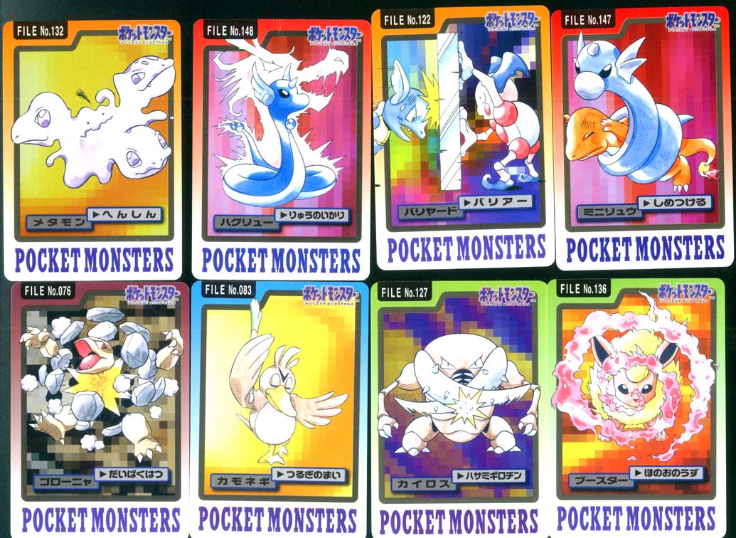
I really had fun looking at illustrations on cards back then.
A Nidoking with a really fierce expression is so cool, right?
>>7
I was happy that the design was based on this in Pokémon Stadium 2.
I feel like I’ve been seeing a lot of Kabutops threads recently.
The illustration of the Pokémon sticker in the blue version was really cool.
The official blue version art of Mankey is just too cool…
I wonder if the Pokémon card game uses a lot of illustrations from the Blue version.
>>11
The one with the dark red background, right? That’s oddly cool.
Is there any book that has the official illustrations of the first generation compiled and is still available?
The quality of the illustrations has been high since the beginning…
Suddenly growing too many body parts from the beetle, right?
Why did the cool Mankey from the blue version of the old official art become that pixel art…?
Pokémon Seal Legend
I just found out that there’s an official illustration of the blue version.
I thought there were several types of illustrations for some Pokémon.
All the illustrations in the blue edition have great poses.
The bad glare looks cool.
The official art from the first generation has a nice balance of monster feel and is cool, isn’t it?
The difference in quality of the dots is huge.
Kabutops and Scyther are a sure thing.
The dots are also tightly packed into the square due to size constraints…
It’s exciting because it’s an illustration that consciously represents the structure of the body, rather than just being casually connected.
I like the illustration of the blue version Gengar.
I liked that unique color.
What was the first appearance of the illustrations from the card das stickers? I wonder if there was something that couldn’t be seen otherwise.
The one where Eevee wags its tail.
>>27
It’s an original illustration for the card!
It’s hard to imagine now.
The early Venusaur looks like a HIRAKI drawing when I see it now…
We said that the dot came first and the illustration was added later, but I wonder how it really is.
Is this the type?
>>31
At the time, I was so absorbed in collecting that I didn’t pay much attention, but when I take a closer look, there are a lot of things that make me think, “Wait a minute!”
What is Kameil doing shooting ice out of its forehead with a rocket?
>>58
I think it’s an expression of lens flare.
I really like how horseshoe crabs are shaped more like water scorpions and sea scorpions.
This massive explosion is instantaneous death.
Flamethrower! Hydro Pump! Vine Whip! Isn’t that a bit much?
Can’t we at least become a Solar Beam?
The quality of the drawing is quite shaky when I look at it now…
Ptera and Mewtwo are terrible.
The thunderbolt Pika has quite a character.
It’s a bit of a change-up like thread images or Strikes, but also Blastoise.
I love Pokémon with body parts dedicated solely to attacking.
Blue is really putting in effort with posing and various things.
I didn’t really understand physics or special stuff, so I basically hired this guy as a water resource based on his visuals.
If you ride the waves one way or another, you can win.
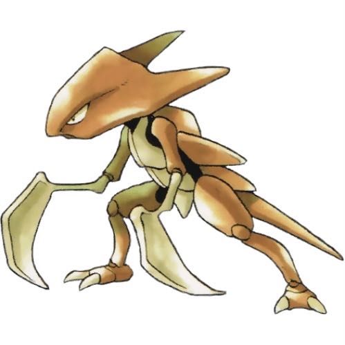
Is that how Kairos is!?
It really was Tsubasa hitting with his wings.
I feel a bit worried.
I thought you would shoot by flapping your wings.
It’s the hitting side…
Old-fashioned nostalgia enthusiasts are tough…
The city of water is cool, isn’t it?
Golem died dramatically and it was no good.
Although it’s a rare card, I wonder if Pippi was a popular character back then.
>>47
In the game, they are treated like an idol, and initially, they probably supported Pippi more than Pikachu.
>>50
I wonder why I allowed the existence of Giepy…
This Ditto’s monster-like feel is really good…
The high mobility of Kairos’s scissors.
The destruction beam is lame…
I prefer the one that is not from Pokémon Seal Legend Revised.
I also like the ones that use card data techniques.
I was extremely disappointed to see the moves in the Seal Legend because of the anime art style.
In the old official illustrations, the TM (Technical Machine) was supposed to be belt-shaped.
If it weren’t for Giepie, would Pippi have been sitting in the chair where Pikachu is sitting now?
>>55
A round-trip slap and waving fingers don’t look good in anime, so it’s impossible.
Pikachu’s belly is white!!!
Even so, Pikachu is a regular in the game, but that’s generally…
For some reason, the fossil Pokémon that doesn’t learn Rock Slide in the first generation.
I wonder why the anime chose Pikachu.
Did Pippi and Purin not have a chance?
>>62
Wasn’t Pikachu popular with players?
Pippi has a mysterious line on her face that looks like a cursed object, like Itadori.
I think it was impossible for Pippi to win against Pikachu in terms of design because, aside from Pikachu, most of the cute Pokémon that were popular have round, large eyes.
I remember there was a move called Spike Cannon…
>>64
I remember that the techniques of that kind were all normal.
I thought seeing Red or Green flying on a small sticker-sized Charizard would help me remember things from the game.
There was a time when the cute Pokémon icons were unified in the Clefairy line.
Although it evolved into pudding and Pikachu in Gold and Silver…
I only remember Palasheen and Omastar, and they’re not particularly strong either.
I think there were also ones where the lightning stood out.
![[Rune Factory] I’m sorry, but I live behind the general shrine.](https://otaku-reviews.net/wp-content/uploads/2025/06/af0f4933.jpg)
![[Monster Hunter Wilds] I wonder if those who bomb with low ratings want to kill the series.](https://otaku-reviews.net/wp-content/uploads/2025/06/618be522.png)
![[Manga] The magic trick that everyone tried to master as kids but couldn’t is trending, lol.](https://otaku-reviews.net/wp-content/uploads/2025/06/bf53dd2f.jpg)
![[Gundam GQuuuuuuX] Even though you’re a Newtype, you’re so insensitive, Egusabe-kun.](https://otaku-reviews.net/wp-content/uploads/2025/06/b96ae33d.jpg)
![[Manga Time Kirara] Tell me your favorite couple in Kirara.](https://otaku-reviews.net/wp-content/uploads/2025/06/7f363a8b.jpg)
![[Fullmetal Alchemist] I have no certainty, but I feel like Envy is the weakest among the homunculi.](https://otaku-reviews.net/wp-content/uploads/2025/06/da613d5c.png)
![[Thunder thunder thunder] I thought this cover was sexy… so I bought it, and it turned out to be more interesting than I expected.](https://otaku-reviews.net/wp-content/uploads/2025/06/d303d5fc.jpg)