Watercolor painting is nice, isn’t it?
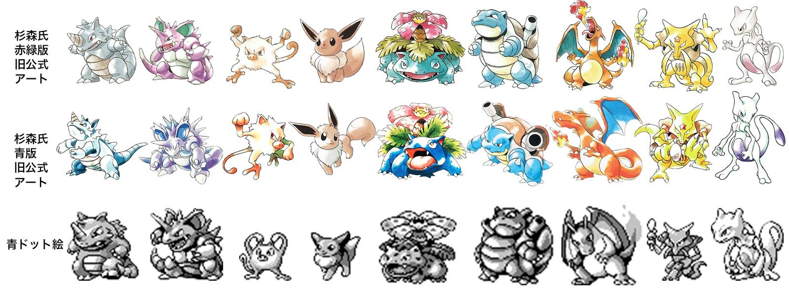
By the time the generation one blue comes out, all Pokémon will have been redrawn in different poses.
The drawings from that time are still the coolest.
Pikachu was also round and cute.
The official illustrations at that time made Nidoking unusually cool, which I liked.
Understand
The ultimate book! Isn’t it the ultimate book’s Nidoking!
Back then, it was really fun looking at illustrations on cards.
A Nidoking with an extremely fierce look is really cool, right?
>>7
I was happy that the design was based on ours in Pokésta 2.
I feel like I’ve been seeing Kabutops threads a lot lately.
The illustration on the Pokémon sticker was super cool in the blue version.
The Mankey in the blue edition official art looks too cool…
Are they using a lot of illustrations from the Blue version in Pokémon cards too?
>>11
Is it the one with the dark red background? That one is unusually cool.
I’m wondering if there’s a book that compiles the official illustrations from the first generation that’s still available now.
The illustrations have been high-quality from the beginning…
Isn’t it too sudden for a body to grow so much from the shell?
How did the cool Mankey from the blue version’s old official artwork turn into that pixel art…
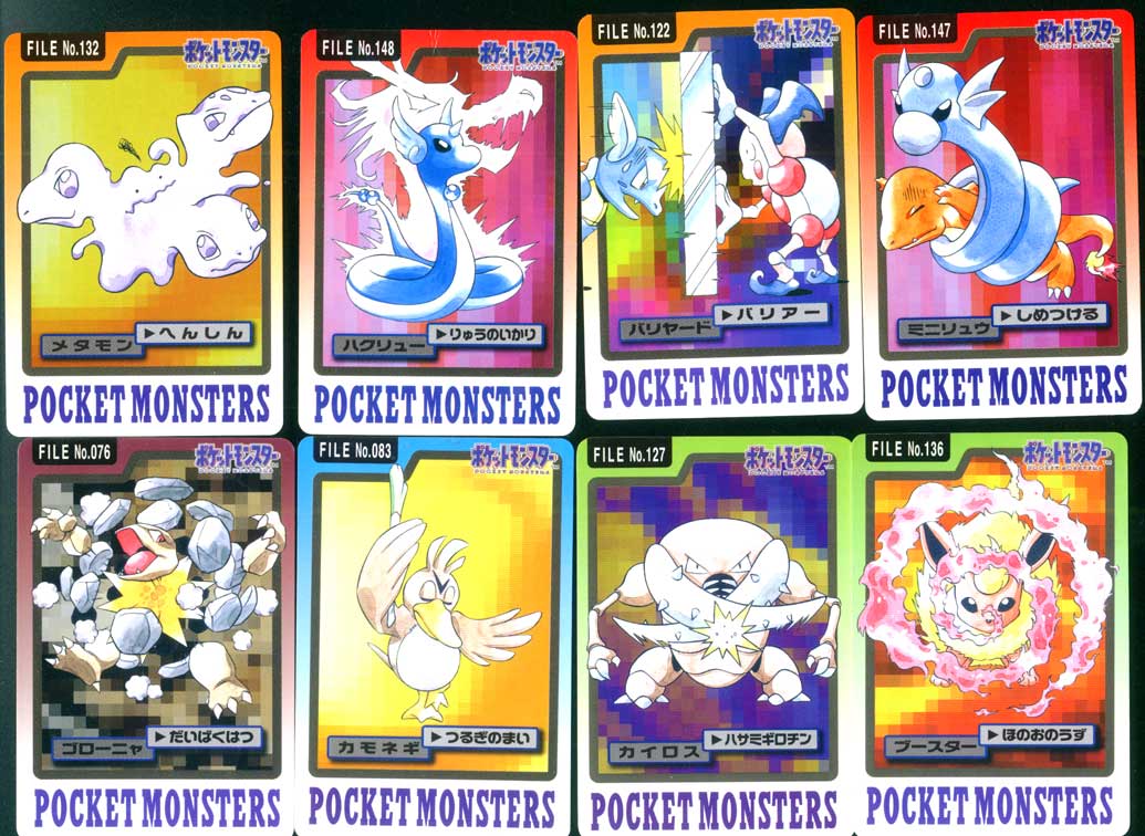
Pokemon Sticker Chronicles
I just found out there is an official illustration in blue version.
I thought there were some Pokémon with different types of illustrations.
The poses in the illustrations of the blue edition are all too good.
The mean look is cool.
The original official art has a cool vibe with just the right amount of monster feel, doesn’t it?
The quality difference in dots is amazing.
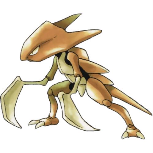
Kabutops and Scyther are sure bets.
Dots are sometimes squeezed into the square due to size constraints…
I’m excited about the illustrations that allow you to be aware of the body’s structure rather than just being superficially connected.
I like the blue version Gengar illustration.
I liked that unique shade.
What was the initial appearance of the group of illustrations that could only be seen on Carddass stickers?
Things like Eevee wagging its tail.
>>27
It’s an original illustration specifically for the card.
It’s unimaginable now, but
The early Venusaur looks like a HIRAKI drawing now…
We said that the illustration was added after the dot art came first, but I wonder how it really is.
Is it like this?
>>31
At the time, I was so absorbed in collecting that I didn’t really care, but on closer inspection, there are quite a few moments where I thought, “Wait a minute!”
Kameil is using its rocket headbutt to shoot out ice from its head. What is that?
>>58
I think it’s a depiction of lens flare.
I really like how the horseshoe crab resembles a giant water bug or sea scorpion.
This explosion is instantaneous death.
Flamethrower! Hydro Pump! Vine Whip! Isn’t that lineup a bit much?
Couldn’t it at least become a solar beam?
The quality of the drawing is quite shaky now that I look at it…
Aerodactyl and Mewtwo are terrible.
Thunder Pika has quite a lot of character.
The text or strike or a bit of a curveball, but Blastoise or something like that.
I like Pokémon that have organs specifically for attacking on their bodies.
Blue is working hard on posing and various other things.
I didn’t really understand things like physical or special, so I visually picked this one as my water member.
Somehow, as long as you’re riding the waves, you’ll win.
“Kairos, is that what’s happening!?”
It was really “hitting with wings” that I transferred with wings.
I feel kind of worried.
I thought it would shoot by flapping its wings.
It’s about hitting…
Old geezer nostalgia buff…
It’s cool in the city of water, isn’t it?
Golem died spectacularly, and it was no good.
Hata-kun is a shiny card, but was Pippi a popular character back then?
>>47
In-game, they’re treated like idols, so they were probably pushing Clefairy more than Pikachu at first.
>>50
I wonder why I allowed the existence of Giepi…
This Ditto’s monster-like vibe is really awesome…
The high mobility of Kairos’s scissors
Destructive beam…
I prefer the artwork from Pokémon Seal Legend series, not the redesign.
I also like the ones selling techniques in Carddass.
In Seal Legend, the technique appeared, but I was terribly disappointed with the animation art.
In the old official illustrations, TMs were supposed to be belt-shaped.
If there hadn’t been “Gi-e-pii,” would Clefairy be sitting in the seat where Pikachu is now sitting?
>>55
The return slap and finger wagging don’t look good in anime, so it’s not possible.
Pikachu’s belly is white!!!
To tell the truth, even Pikachu in “Giepy” is usually a regular…
For some reason, the fossil Pokémon in the first generation does not learn Rock Slide.
I wonder why it was Pikachu in the anime.
Didn’t Pippi and Purin have a chance?
>>62
Wasn’t Pikachu popular with players?
Pippi has mysterious lines on her face like Itadori from Jujutsu Kaisen…
Other than Pikachu, the Pokémon that fall under the cute category usually have big, round eyes, so I think it was impossible for Clefairy to surpass Pikachu from a design standpoint.
Come to think of it, there was a move called something like Thorn Cannon…
>>64
I remember that type of move was mainly normal.
I used to think I might be able to learn to do that in a game when I saw Red or Green riding on a Charizard depicted on a sticker the size of a small desk pad.
The time when the cute Pokémon icons were all unified with the Clefairy type.
In Gold and Silver, it evolved into Jigglypuff and Pikachu, but…
Only Cloyster and Omastar learn it, and it’s not particularly strong.
I think the lightning also stood out.
![[Rune Factory] I’m sorry, but I live behind the general shrine.](https://otaku-reviews.net/wp-content/uploads/2025/06/af0f4933.jpg)
![[Monster Hunter Wilds] I wonder if those who bomb with low ratings want to kill the series.](https://otaku-reviews.net/wp-content/uploads/2025/06/618be522.png)
![[Manga] The magic trick that everyone tried to master as kids but couldn’t is trending, lol.](https://otaku-reviews.net/wp-content/uploads/2025/06/bf53dd2f.jpg)
![[Gundam GQuuuuuuX] Even though you’re a Newtype, you’re so insensitive, Egusabe-kun.](https://otaku-reviews.net/wp-content/uploads/2025/06/b96ae33d.jpg)
![[Manga Time Kirara] Tell me your favorite couple in Kirara.](https://otaku-reviews.net/wp-content/uploads/2025/06/7f363a8b.jpg)
![[Fullmetal Alchemist] I have no certainty, but I feel like Envy is the weakest among the homunculi.](https://otaku-reviews.net/wp-content/uploads/2025/06/da613d5c.png)
![[Thunder thunder thunder] I thought this cover was sexy… so I bought it, and it turned out to be more interesting than I expected.](https://otaku-reviews.net/wp-content/uploads/2025/06/d303d5fc.jpg)