Watercolor painting is nice, isn’t it?
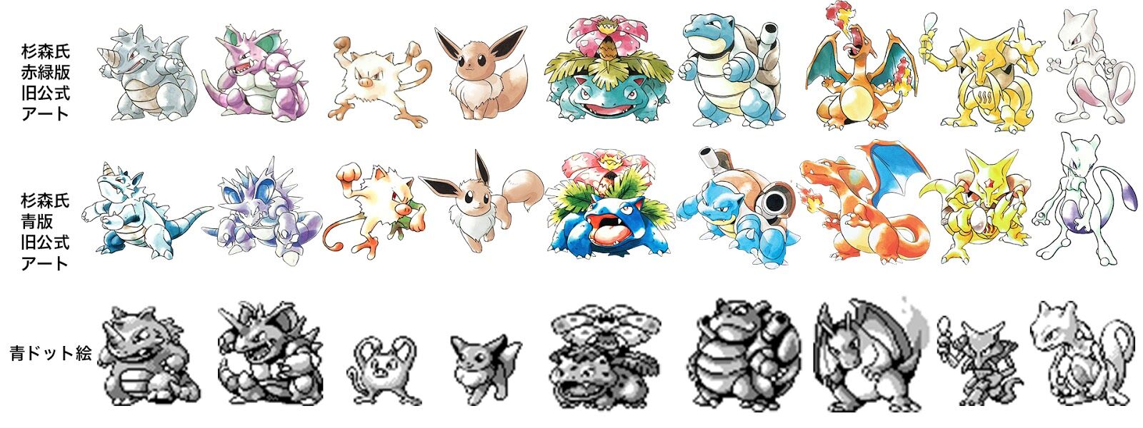
All Pokémon have been redrawn in different poses, reminiscent of when the first generation’s Blue version was released.
The drawings from that time are still the coolest.
Pikachu was also round and cute.
The official art at this time made Nidoking unusually cool, and I liked it.
Understand
The Ultimate Book! Isn’t it the Nidoking of the Ultimate Book!
It was really fun to look at illustrations on cards back then.
A Nidoking with a really menacing look is so cool, isn’t it?
>>7
I was happy that the design was based on ours in Pokémon Stadium 2.
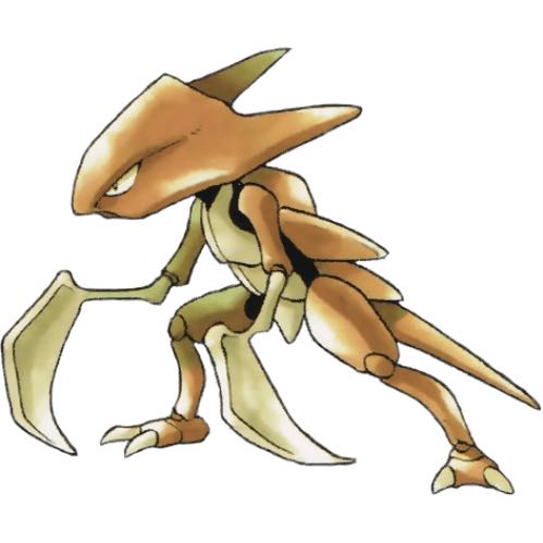
I feel like I’ve been seeing Kabutops threads a lot lately.
The illustration on the Pokémon sticker in the blue version was incredibly cool.
The Mankey from the official blue version art is too cool…
I wonder if Pokémon cards are also using quite a few illustrations from the Blue version.
>>11
Is it the one with the dark red background… That one is unusually cool.
Is there a book available that compiles the official illustrations of the first generation?
The illustrations have been of high quality from the beginning…
That’s too much body growing suddenly from a helmet, isn’t it?
How did that cool Mankey from the official Blue version end up with that pixel art…
Pokemon Seal Legends
I just found out there’s official artwork of the Blue version.
I thought there were several types of illustrations for Pokémon.
The poses in all of the illustrations in the blue edition are just too good.
The coolness of having a fierce look.
The official art of the first generation has just the right amount of monster feel and looks cool, doesn’t it?
The quality difference in dots is incredible.
Kabutops and Scyther are sure bets.
Dots are crammed into the squares due to size constraints, among other reasons…
The illustration that allows you to be aware of the body’s structure rather than just being vaguely connected is exciting.
I like the illustration of Blue Version Gengar.
I liked that unique shade.
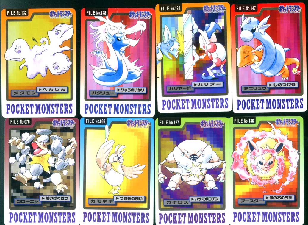
What was the first appearance of the illustrations that could only be seen as Cardass stickers?
Eevee’s tail wag or something like that.
>>27
“It’s an original illustration for a card.”
Can’t imagine it now, but
When I look at the early Venusaur now, it seems like a HIRAKI drawing…
We said it started with the pixel art and the illustration was added afterward, but I wonder if that’s true.
Is it this type?
>>31
At the time, I was so immersed in collecting that I didn’t pay attention, but upon closer inspection, there are quite a few instances where I go, “Hold on a second!”
Kameer is using Rocket Headbutt to shoot ice from its forehead, what is that?
>>58
I think it’s the representation of lens flare.
I really like how the horseshoe crab takes on a form more like a giant water bug or sea scorpion.
This explosion is instant death.
Flamethrower! Hydro Pump! Vine Whip! Isn’t that a bit much?
Could it at least be a solar beam?
When I look at it now, the quality of the painting is quite shaky…
Aerodactyl and Mewtwo are just terrible.
Lightning Pikachu has quite a flavor.
Imageboard topics like Strike are a bit of a curveball, but Blastoise, for example,
I like Pokémon that have organs on their bodies specifically for attacking.
Blue is putting a lot of effort into posing and various things.
I didn’t really understand physical or special, so I recruited this guy for water duties based on visuals.
If you ride the waves somehow, you’ll win.
Is that what’s happening with Kairos!?
It was really hitting with wings.
Somehow, it makes me worried.
I thought you would shoot by flying feathers.
It’s the batting side…
Old-fashioned nostalgia geek is tough…
Cool city of water, right?
Golem spectacularly died, and it was no good.
Is Hataku a shiny card? I wonder if Pippi was a popular character back then.
>>47
It seems that they were initially promoting Clefairy more than Pikachu, as Clefairy was treated like an idol even within the game.
>>50
Why did I allow the existence of Giepie…
The monstrous feel of this Ditto is really great…
The high mobility of Kairos’s scissors.
Destructive Light Beam…
I prefer the artwork that is not from Pokémon Seal Retsuden Kai.
I also like the ones with Carddass techniques.
In the Seal Legends, the move appeared, but I was incredibly disappointed with the anime-style art.
In the old official illustrations, the TM (Technical Machine) was supposed to be belt-shaped.
If there was no Giepi, would Clefairy be sitting in the chair Pikachu is in now?
>>55
A back-and-forth slap and finger wagging don’t look good in anime, so it’s impossible.
Pikachu’s stomach is white!!!
Even though Pikachu in “Giai P” is a regular, it’s generally…
In the first generation, for some reason, the fossil Pokémon can’t learn Rock Slide.
I wonder why Pikachu was chosen for the anime.
Did Pippi and Purin never have a chance?
>>62
Wasn’t Pikachu popular with players?
Pippi has mysterious lines on its face like Jujutsu Kaisen’s Itadori…
Aside from Pikachu, most of the cute Pokémon that are popular have big, round eyes, so I think it was impossible for Clefairy to win against Pikachu at the design stage.
There was indeed a technique called Thorn Cannon, wasn’t there…
>>64
I remember that those types of moves were all normal ones.
I used to think you could learn it from games when I saw Red or Green flying on a Charizard depicted on stickers about the size of a small desk pad.
The period when the cute Pokémon icons were all Clefairy-themed.
In Gold and Silver, it branched off to Cleffa or Pichu, but
Only Cloyster and Omastar can learn it, and it’s not particularly strong either.
I think the lightning was striking too.
![[Rune Factory] I’m sorry, but I live behind the general shrine.](https://otaku-reviews.net/wp-content/uploads/2025/06/af0f4933.jpg)
![[Monster Hunter Wilds] I wonder if those who bomb with low ratings want to kill the series.](https://otaku-reviews.net/wp-content/uploads/2025/06/618be522.png)
![[Manga] The magic trick that everyone tried to master as kids but couldn’t is trending, lol.](https://otaku-reviews.net/wp-content/uploads/2025/06/bf53dd2f.jpg)
![[Gundam GQuuuuuuX] Even though you’re a Newtype, you’re so insensitive, Egusabe-kun.](https://otaku-reviews.net/wp-content/uploads/2025/06/b96ae33d.jpg)
![[Manga Time Kirara] Tell me your favorite couple in Kirara.](https://otaku-reviews.net/wp-content/uploads/2025/06/7f363a8b.jpg)
![[Fullmetal Alchemist] I have no certainty, but I feel like Envy is the weakest among the homunculi.](https://otaku-reviews.net/wp-content/uploads/2025/06/da613d5c.png)
![[Thunder thunder thunder] I thought this cover was sexy… so I bought it, and it turned out to be more interesting than I expected.](https://otaku-reviews.net/wp-content/uploads/2025/06/d303d5fc.jpg)