It might not be very well done.
I would say it’s done…
I would like parts one to three to have a more muscular style, like Fist of the North Star or Dragon Ball.
Well, it’s just a prototype.
If it’s too muscular, it will hinder mobility, so it’s fine to be somewhat skinny…
I came to say that recent arts are all really good, but I was incredibly disappointed.
Jotaro is particularly terrible.
A balance that recalls early arts.
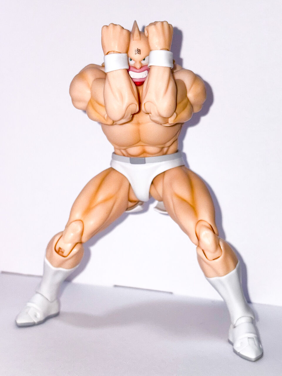
The new Kinnikuman was really good.
Your face looks a bit different.
Even if it’s the anime version, it still feels different somehow.
Jonathan definitely has bad posture.
Aren’t everyone’s faces kind of awkward?
There’s still room to improve the quality.
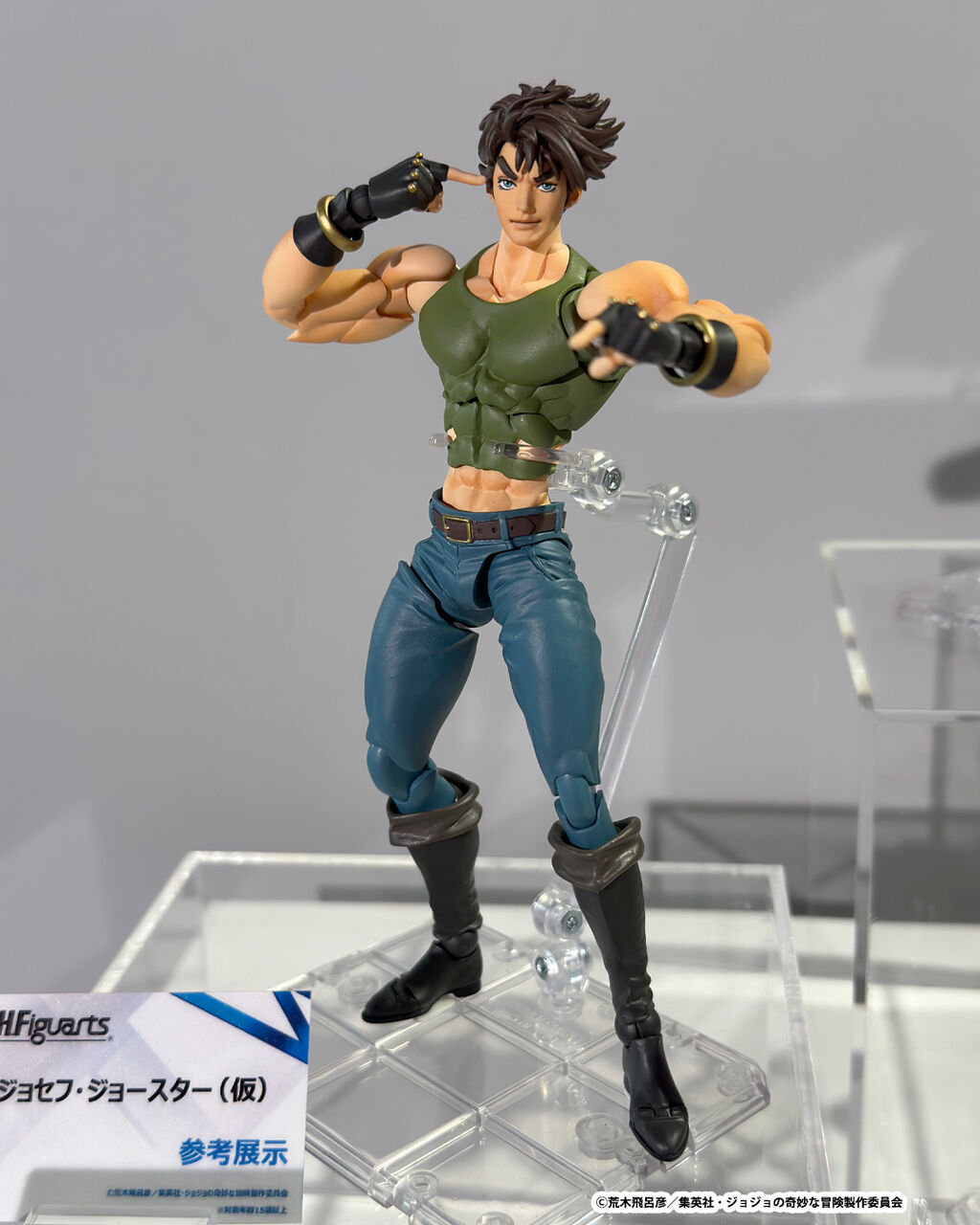
You can tell it’s Jonathan and Jotaro by their outfits, but who the heck is this Joseph?
It’s okay to be slim, but the way the limbs are defined is somewhat off-putting.
Is the strange half-squat because the stand is not long enough?
Jonathan, if you look at it as an anime version, well… who the hell are you?
No, the ultra figure is also thin.
The quality is poor and the pose is simply bad.
It feels like Jotaro drawn by Araki in the style from after Part 7, with that kind of thinness.
Jonathan is also quite like this with ultra figures.
The expression of the hair is similar.
Joseph is… thin…
It has a body shape like a wheel of fate.
There are some areas that can be excessively concerning when viewed in a highly magnified state with high-quality photos.
When you pick it up, you might find that it’s not as bothersome as you thought.
Well, Joseph is thin!
Since it’s small, you don’t really notice the face, right?
Body shape is…
I’m not really sure how you want it to be.
I don’t know if I want to do something that adheres to the anime style or if I want to showcase the current thinness of the original artwork.
The only thing left is whether they plan to continue beyond DIO, since I’m not really interested if it’s just more JoJo being released.
Maybe it’s because it’s based on a thin general-purpose model or something like joints, so when you bulk it up, the joints don’t move, resulting in an unnatural appearance?
There will probably be some adjustments to be made to turn it into a product.
Jonathan looks like Jonathan.
I think the arms and chest are good, but the lower body is thin.
The balance is bad.
It seems that the Super Alloy figures are good in terms of lineup and price…
The statues are sometimes movable, and I occasionally release other works, but fundamentally I’ve been focusing on JoJo for over ten years. When I think about it, it’s a pretty crazy series.
Beautiful Jotaro
It’s like the person from the Wheel of Fortune in the thread.
It feels like Chozou has released many different colored versions.
Who are you?
Maybe they didn’t want to break it with an impossible JoJo pose since it’s a prototype.
The sculpture itself doesn’t seem bad, but the very conventional way it’s posed gives it a counterfeit feel.
It feels a bit like chicken leg.
Jotaro doesn’t look like either the anime or the original work, but I wonder what kind of face he was designed to resemble.
I can only say it’s really vague…
I think there is definitely room for improvement moving forward, as it’s still a prototype.
I’m quite worried that anime-style arts still often miss the mark with facial expressions.
It looks like only the episodes with subpar animation from the anime version have been selected and cut out.
They occasionally release beautiful girl figures as statues, but since it’s really rare, it strongly feels like the company is showcasing their own tastes in the lineup.
Since the person in charge changes regularly, experience points get reset, Bandai.
I wonder if it feels like it’s trying to align with recent drawings.
Since it’s based on the anime version, it accentuates the feeling of poor design even more.
Thin
Honestly, I don’t want it.
It seems that all the hit battle shonen from Jump are being turned into arts.
Isn’t the full-action figure released by another manufacturer better made? Is that not the case?
I was reminded once again of how amazing super sculptures are.
If it was bad at that price, it would have been dead a long time ago…
Is this what Joseph’s face looks like…?
Jotaro looks the best in terms of physique, but that’s because of his outfit…
Aren’t the chest and legs really strange?
On the contrary, there is a possibility that the other two might be dressed in something as well.
I don’t know why, but I have an impression that JoJo merchandise has surprisingly low quality.
The stickers and cards from the recent snack toys were obviously lacking in good taste.
Jonathan is the only one doing well… What’s with this disparity?
I think those who completely prioritize art over faithfully recreating the original tend to do well.
Recently released gacha for stands or so.
It might be because it’s a prototype, but the paint seems kind of flat and lacks that JoJo vibe.
It’s amazing that almost everyone is somewhat lacking.
Even for a prototype, we could do a bit more…
I feel like the ultra figure turned out really great…
Araki: “Isn’t this enough?”
I think Jonathan is good.
Joseph…?
The face is not bad.
I don’t like such a weak and slender body.
It’s probably not wrong according to the current standards for art, but…
Simply not similar.
Joseph, whose increasingly thin appearance resembles a combination of Araki’s art and poorly animated episodes of the anime.
Perhaps a pattern that will only be shown as a reference and not released.
Jonathan has a relatively nice face, but everything else is a bit lacking…
Overall, it feels like the current Araki’s lankiness.
Josuke has a good-looking face, though.
Joseph’s pants look like armor.
In Chainsaw Man, even with pants, it looks natural.
Well, I can’t help but think that they should revise the plan and come back without releasing it.
Bandai tends to continue with their arrangements running wild from time to time.
Is it that the super skinny and ripped six-pack, like it’s wrapped in a corset, makes it even more interesting?
If you’re going to release it so late compared to Super Action Statues, you have to surpass them in quality…
It’s not about movement or anything like that; it’s a different character.
Jonathan was just rewatching an anime that was airing, and his face looks pretty much like this.
Joseph is, hmm…
I’m too used to the art styles of Dragon Ball, One Piece, and Naruto, so I don’t have the know-how to handle character designs that are more intense; it’s more of a manga-related art.
The beautiful girl is Uma Musume → The 2.5-dimensional line is the only miraculous success, but when it comes to other manga adaptations… it becomes disappointing.
The lineup of super figures will probably never be surpassed.
I remembered when there was a large exhibition of Showa Rider arts from the past, but the quality of the prototypes was so poor that they were heavily criticized.
That was a product that could be made to a certain level of quality, but I wonder if we can take enough time for this one.
Regardless of body type, why are you posing in such an unrefined way?
I wonder why the product name on this stand is blurred out for some reason…
Was Joseph’s outfit this simple?
For a moment, I thought it was Heero.
Anyway, if we keep producing numbers and accumulate know-how for that series, it will surely stabilize, but I don’t know if JoJo can last that long…
It’s not good like this, even though it’s a follow-up to the super figure…
When it was announced, I was told that the hyper statue design was old and not similar, so it was good that the art was decided…
The super movable figure is around 9,000 yen now, right?
There isn’t much difference from arts, right?
The prototype maker drinks the brewed edge of the runner of the super figure.
You say the price range is different, but isn’t it not that different?
If it ends with just the main character, I won’t buy it.
The super figure still doesn’t have all of Pucci’s stands, right?
First, show me Jotaro and Star Platinum…
Rather than an anime face, it has a half-hearted recent Araki-style arrangement.
As long as there is a stand, if you intend to develop it properly, the current times of rising prices are just too incompatible.
When it comes to know-how, there are plenty of arts that combine muscularity and mobility, so it starts with the question of why the know-how isn’t being utilized.
I think Jonathan is really good and close to the anime version, but Joseph and Jotaro have such an unidentifiable level of facial structure that it makes me wonder, “Who are they?”
If it were around 2013, I could accept the quality.
Please pose more properly.
They say super figures are expensive, but looking at recent Figuart releases…
There may not be much of a difference up to that point.
Jonathan has a vibe that feels like something from an anime.
Is Jonathan the one with the belly button showing style?
I found out that it’s more of a belly-showing style than I thought.
I’m finally over 10,000 with the limited sale of Jodio linked to the magazine.
Aside from the basic big sizes, everything else is under 10,000 yen, such as the super figure.
If it’s old, it’s around 5,000 to 6,000 yen.
It may have a high-priced image due to the price increase reselling, but the price range itself is the same.
Well, the live-action Rohan-chan is more than enough for me.
It looks like Jonathan is doing quite well.
It looks like someone who isn’t interested in posing just stood up for the time being.
It’s too funny that the live-action Rohan-chan art has already been released.
The animation style resembles but is not very similar to the original work of the anime.
I don’t think there will be a character as diverse as Chozou, so I don’t know what to expect.
It would be great if they could mainly feature the SBR characters to match the anime.
The Bunbun family and such.
I thought it would be better to go with the anime-adjacent seventh part… but the major characters have already been released as Super Action Figures.
I have a strong impression that arts are powerful when there are opposing contenders, but I wonder how it will turn out.
The 7th scale figure felt off because the face was too flat.
In the anime and manga arts, if you don’t have a strong motivation or don’t get accepted, you often just nibble at a few pieces and that’s it.
Thinking about it, it’s pretty impressive that Berserk has introduced Isidro based on the original work.
It looks like a body with a massive muscle relocation.
I wonder if they could release Seiya in his armor.
Where are the parts that are better than the super figure?
It feels like making a character drawn in my current style into a three-dimensional anime version.
Kinnikuman is indeed tough if there aren’t any opponents that can be combined with, just like the old arts.
There are parts that could be released alongside the anime, but that anime hardly features any battles from Kinnikuman.
It’s typical to only get meat for one person…
It seems that there is inherently little demand for 3D figures of Kinnikuman.
Because there are many core fans, the small-batch production of Spice Seed resin is likely to continue for a long time.
For example, even if they offer a gunslinger for 15,000, I don’t think it would sell, and it seems tough.
JoJo’s protagonists are likely to sell well, so they’re probably a safe bet.
Our Kinnikuman is all alone, hanging out in the meat curtain because there’s nobody to fight.
Jump Arts, can you first gather the Straw Hat Crew before introducing the new generation…?
It’s a follow-up to Buzzmod, but it’s impressive that Demon Slayer is expanding into a series.
It’s a shame that the new Kinnikuman arts are so well done, as it seems they won’t continue.
It might only be something like the General if you bring it out.
Aside from Rider Ultra Mandragon Ball, most are pretty much being sold off cheaply.
It’s not just a story limited to Kinnikuman.
Isn’t Suguru’s image strongly associated with white tights in the original work?
I want Ginsan a little, but it seems like other characters won’t come out.
It gives the impression that at least two people are participating.
No way, Jotaro.
I hope that during the commercialization phase, it has improved as an expression of intent to release it.
Jonathan’s pose may be dazed, but I feel like the result itself isn’t so bad.
![[Manga] The magic trick that everyone tried to master as kids but couldn’t is trending, lol.](https://otaku-reviews.net/wp-content/uploads/2025/06/bf53dd2f.jpg)
![[Manga Time Kirara] Tell me your favorite couple in Kirara.](https://otaku-reviews.net/wp-content/uploads/2025/06/7f363a8b.jpg)
![[Gundam GQuuuuuuX] Even though you’re a Newtype, you’re so insensitive, Egusabe-kun.](https://otaku-reviews.net/wp-content/uploads/2025/06/b96ae33d.jpg)
![[Rune Factory] I’m sorry, but I live behind the general shrine.](https://otaku-reviews.net/wp-content/uploads/2025/06/af0f4933.jpg)
![[Fullmetal Alchemist] I have no certainty, but I feel like Envy is the weakest among the homunculi.](https://otaku-reviews.net/wp-content/uploads/2025/06/da613d5c.png)
![[Thunder thunder thunder] I thought this cover was sexy… so I bought it, and it turned out to be more interesting than I expected.](https://otaku-reviews.net/wp-content/uploads/2025/06/d303d5fc.jpg)