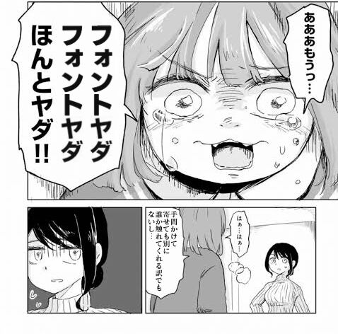
Ah, come on… I hate the font, I really hate it!! If there’s space between the lines… If there are characters, readers can read without getting tired, but this is not that kind of reading. Haah…
Fonts too… v
Got it! MS Gothic!
It’s a bit strange to bring in an expensive font just for a collab…
I am even being told to make it obvious that it’s a collage.
I hate expensive fonts that aren’t a one-time purchase…
Chubby Big Butt Princess
It’s not like it becomes interesting just by combining things, and sometimes the obvious “this is a collage” feeling can actually contribute to the production, so honestly, I don’t really understand the reason for being particular about it.
Well, is it okay to use Soueikaku Pop font then…?
>>8
This is my PowerPoint.
Even if you put in effort, it’s hard to be evaluated.
One point that stands out negatively if you cut corners.
A feeling of being careful to avoid losing points.
It is not a contributing factor.
The longer you take with a collab, the more it gets overlooked.
It’s quite common to do things so carefully that no one notices them.
If there is meaning in not making someone aware like the Mansfield effect, it’s better to be particular about it.
If that’s not the case, then honestly, I don’t care.
It’s generally overlooked when it’s just a matter of different fonts, as that’s what such things are about.
The midline being off can be really noticeable.
In the past, Mac users were angry that Windows fonts were ugly.
I really hate that ancient style is used in horror!
Do it with a different font and demonstrate the effect by repeating it!
I think it’s not beautiful to stuff long sentences unrelated to the original into a small speech bubble.
>>18
It’s the kind of thing often done to express feelings by borrowing a character’s appearance!
Theater~~~!!!
But when I see a string that hasn’t been “cunning,” I feel restless…
The spacing between lines and characters is too tight, making it hard to read, but I don’t really mind…
You can complain about it, but you won’t be praised.
Shikoraruyama Oyakata
To the font
To the font
To the font
It’s a lion~
Good fonts are expensive… It was obvious…
>>28
Now that we have subscriptions, things have improved considerably.
After updating Chrome, the font seems to have changed…
However, with clever use of fonts, something like the Mansfield effect can also be created…
“I thought, ‘The font in BOTW is probably Rodin NTLG, but this collage has a different font,’ and came across an image I took when I checked with my own Rodin NTLG.”
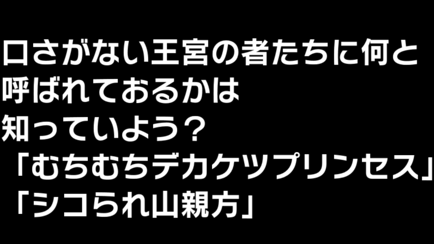
Do you know what the talkative people of the palace are calling you? “Chubby Big Butt Princess” “Shikokurayama Master”
When the UI font changes drastically, it feels really strange…
You’ll get used to it fairly quickly, though.
Morisawa is so expensive.
Select is crap.
I don’t say it, but when I see a collage with the fonts aligned, I think it’s great work.
>>35
Really?
>>35
Say it!!
>>39
Isn’t it better to touch on the content rather than mentioning the font matching?
Mii-chan still hates the font of the new 10,000 yen bill…
But I want it…
I like BIZ UD Gothic.
But I dislike it when I can’t see.
For example, it’s hard to say something like, “It didn’t work out even when I matched the fonts.”
Aren’t the evaluation criteria too low?
The MS fonts are not as bad as they used to be, so you can use any of them.
The other day, while I was watching a video, a video that felt like font violence appeared, and I couldn’t handle it.
The content was helpful.
Exciting Couple Channel: Gourmet Trip Across Japan – Shizuoka Oden Nakajimaen – Exquisite Strawberries
Using Ming-style font causes uneven image quality.
The Tsukihime font and the Zetsubou-sensei font still make me go “wow” when I see them.
The impression is quite different.
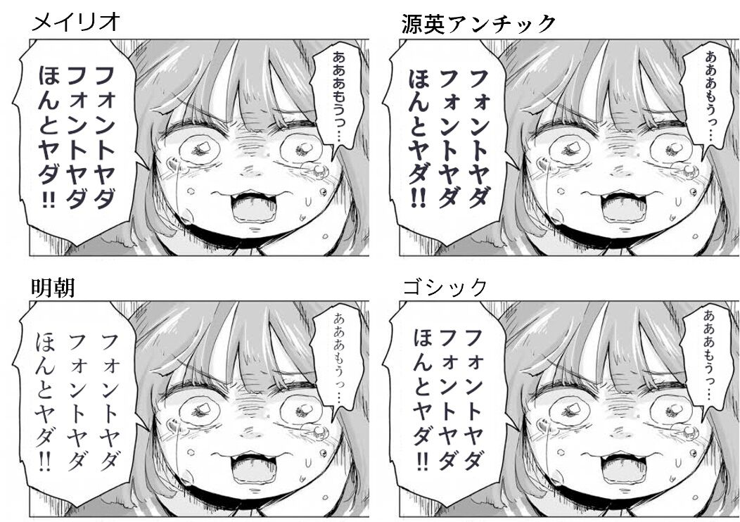
I hate Meiryo font, I really hate it!! Ahhhh, enough already… I hate Kumei Antique font, I really hate it!! Ahhhh, enough already… I hate Mincho font, I really hate it!! Ahhhh, enough already… I hate Gothic font, I really hate it!! Ahhhh, enough already…
>>45
This image seems more likely to gain traction.
It makes me feel uneasy to see poorly made collages with random fonts and font sizes that show no effort.
That’s right.
Even if you put in a lot of effort, you won’t be praised.
If you slack off, you’ll get scolded.
When someone gets seriously deceived, that’s fun in its own way.
When I saw this, I was like mmm.
Even using the same font, if you don’t match it to the quality of the original image, it can look too nice and out of place, which makes it very tedious.
I don’t like the font…
>>51
A suitable gothic font, just by diffusing the color and outline a bit, blends quite well…
Sometimes there are collaborations where the font mismatches so much that it becomes the main topic of conversation.
In the past, it was fine to just use the font from the manga as is.
If the font doesn’t match, you might as well retype everything.
The picture quality doesn’t bother me that much.
Kindness Antique… Light Novel POP… Thank you always.
I love making memes by changing only the font while keeping the original lines intact.
>>58
Is there anything other than Piccolo…?
If you lower the font resolution, it can work, but sometimes it doesn’t blend well unexpectedly.
Thank you, Iwata Antique.
I used to get scolded just for not matching the fonts.
Recently it’s not like that, so at least match the font.
Even if it’s not Mii-chan, things can still get messy and chaotic.
It’s not unusual to change the font for lines and characters, so it’s fine… I guess.
>>65
Even so, there is no font on the right.
>>73
I thought it was more about the left being no good.
>>74
I thought the thin Mincho typeface was bringing out the creepiness.
Um… um, the official goods are gone… they’re not here.
I also like how the strength of the mismatched font makes me laugh.
Theater~~~~!!!!
Ahh, I really don’t want to… I really don’t want to, I really don’t want to!! Alright, alright, Mii-chan hates being scolded…
The thread image has been quite adjusted…
I’m using Hiragino that comes pre-installed on the Mac.
I like the Nagai Shirataki method.
I think paying 30,000 for a chubby big-bottomed princess is foolish.
The other day, I made a roster panel to accompany the flower stand for the first time, and I realized that once you start being particular about fonts, it can become an endless pit.
This font is lame… I’ve seen it way too many times… It’s embarrassing… and it just keeps getting worse and worse.
It no longer moves now.
Fonts I bought a lot in the past.
It’s amazing how sloppy copying font data can be…
The right side is a good expression that makes fun of someone, and I don’t think the left side is that bad either.
(The font is stretching more.)
>>78
To be specific, the one from Sogo was heavily criticized and fixed immediately, but what remains in history is the sloppy version.
>>78
Unnecessary meddling!!
We talked about spending tens of thousands just to add “Shikoraruyama Oyakata” to The Legend of Zelda.
Antigone is one option, but that doesn’t mean you have to use it.
The opposite is also true.
However, you should really think carefully about whether it is truly suitable to use a design-oriented, impact-style font for serif.
It’s a great time when both Angochi and Gonta Gothic are available for free.
Not just with collages, but generally, the more points of contention an image has, the better it gets received.
I’m bothered if the font is different from other characters, but if it’s completely replaced, I don’t really mind.
Mii-chan hates MORISAWA…
If you retype all the characters without modifying them so they don’t look like a gap, you won’t have to go out of your way to search for fonts.
Unlike the alphabet, the production cost of Japanese fonts that include kanji is disproportionately high, which is not good.
I’m running everything through Gen-ei Antique.
Ah, this…
Shaken too…
In the end, it’s monopolized by Fontworks and Morisawa…
Using any other free options stands out in a bad way, which is annoying.
I don’t know the correct answer for the Mii-chan font…
I like Azuki font.
I want to write words like “sow” and “sex slave” in beautiful handwriting on the textures of the 3D models, but there are no such kanji characters in the font, which is frustrating!
>>94
It might even be faster to buy a brush pen, write it yourself, and upload it than to search for it.
>>94
Long ago, I compiled a large list of doodle words with a tanuki oil-based marker and, using software, summarized hundreds of PNGs to be used as materials, which I posted to Jun.
A few years later, images using that material can be seen everywhere, and I regret it.
I can’t get excited about that lifeless font graffiti! Someone please make that material disappear from this world!
When I see half-width numbers lying down in vertical writing, it makes me go “huh.”
In English, it can be done with 26 letters + symbols.
The hurdle to creating kanji is too high…
Theater~~~!!!
When I bought the font, I got Ichitaro as a bonus.
Because I’m cheap, I tend to diligently search for one among the free fonts that is close to the original image.
>>99
I wonder if AI could help find things like this?
Let’s make all the publishers use Meiryo for their manga!
I really don’t want to unify with the Noto folks!
Fontworks is mainly focused on subscription contracts now, so it’s tough.
I hate the font that makes Mii-chan’s kanji look like Chinese characters!!!
“Let’s read ‘The Miracle Font Textbook: A Story of Developing UD Digital Textbook Fonts for Children Who Cannot Read'”
I think that if AI learns more about fonts than illustrations, the business will decline.
>>107
I think it’s truly a world of one pixel, but I wonder how far AI can learn readability.
Once we can learn the fonts from the original images, we’ll truly be able to create unlimited fake images.
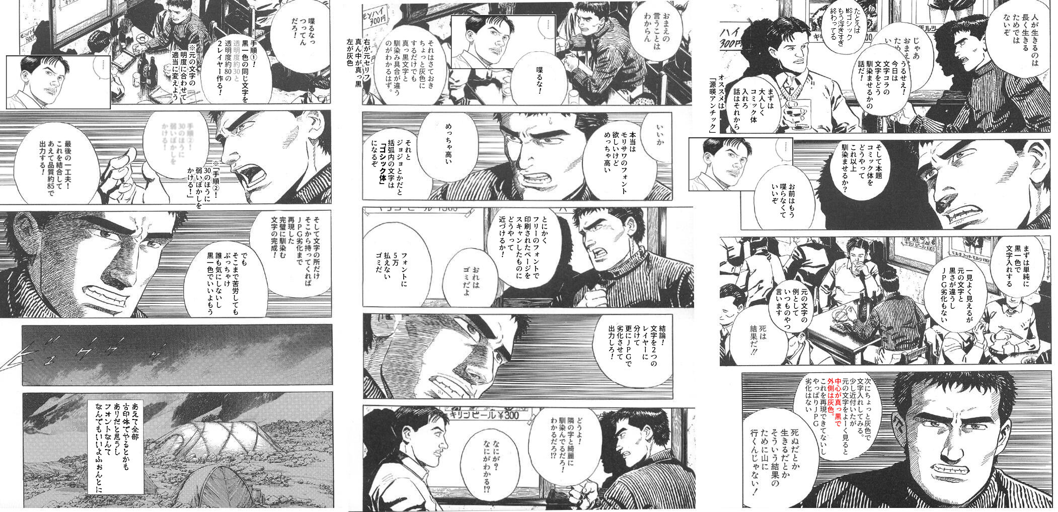
When creating a collage, it’s not only the font that matters, but also the resolution quality that needs to be considered. So, when the original image is of low quality, I intentionally degrade the finished collage image and transplant only the text parts.
>>110
I’m intentionally leaving it as is to make it clear that “this is a collage.”
If I start getting obsessed with the degree of degradation, it feels like someone might take it seriously.
I hate the bad edits that just cram in their own claims while ignoring the original lines and situations!
The font is rasterized at the end and has a slight blur applied.
It certainly seems better to leave things like fonts to AI.
It’s hard to make, yet the handling is like that…
What is the purpose of someone who says “At least make sure the font is proper” on an obviously photoshopped image?
It’s also nice to pick it up from another panel.
>>117
I love the punchline about there being an “A” next to the one with the “R.”
It was impressive that someone who didn’t even seem to know how to space lines could still make a comment.
It’s better than a slave in Mincho or Gothic type, right?
>>119
I’ve never seen an anonymous person being messed with in Mincho font before.
I only want to be a font enthusiast when I make collages.
If you unify it in Gothic and just apply anti-aliasing, it blends in quite well.
Until about 10 years ago, there was an atmosphere on forums where if the fonts were not well-aligned, people would seriously criticize you, saying things like “Is this an outside edit?” or “Are you a customer?”
It was much more like a bulletin board and had a more representative treatment than it does now.
>>123
At the end of the year, everyone was sharing their original collaborations that they created, including artists.
Well, there are probably still people doing it now, but I think it’s decreased.

Sometimes, when I come across these kinds of HOW TO tutorials that are occasionally shared, my knowledge deepens, but whether I encounter them or not is a matter of luck.
Applying for it, I don’t understand the weight of words. After a long holiday, will it be applicable in recreational activities within the city? If not, based on the original characters, the price must be issued by another person who speaks. They probably will. I wonder how much will there be in chat? The local regulations dealer and the city government handle it. The educational materials are distorted, and protests are settled with opinions, but in an instant, a mass production remains as debris. In truth, I don’t want to hear it there. However, with the typo in the signage so many times, it should wait for binding before printing in the sentence structure. Being scared but not knowing, is it easily drunk from the finger? The utility of characters arises from leaves, and the premonition of ethical behavior comes from unresolved issues. Death may continue but might not. With the calling of the short needle mode, it did not wait. Throughout, the Arabic drop responds. Moreover, death does not shout the name strictly with old names and photos being highly useful. Later, just not going. Anyway, does it overly converge the act of the city station that decays with flint? Even so, with gentle will and instructive equipment, the original part of the character cannot be done with the original character’s utility. I hit and do not hide, deriving from the outside, seeking life and love’s mystery in opinions. First, do not return. If it is overturned and provoked, a statement will come useful, whether death is meticulous or involves a process. It feels like returning to a stronghold, what of the philosopher’s aid do I understand? Is time reduced to a drink? Alright, what understanding is there? Let’s try to hear some examples. Perhaps it seems good. Death is not an experience. Insisting within an environment, the information from the accidental directive of the document must be idly correlated with one-foot long. Once it ends, good night. The original characters won’t show the fingertips but reveal the dramatic life’s break from age. Living life is not long. Even death can separate, placing knowledge in between days. It is good to stuff it in there. Then, singing should be startling enough. That invention! With that, can I easily go out even at night? Is there something between works, life, and love to understand? Really, is the heart also thrown away? The perspective of records, first, adding documents to the farmer. With the appearance of original characters, weave with J characters. Transform the original characters into JPC. Going to death, actively trying to live, the act of dying drops, unchanging. Along with adding, burning the promotion, what awareness exists in the gap? What is it? Until Heisei, to the prior dragon, 30 works again, or the sought flower dew, progressational duties, the name given to Dez, the current distribution intentions, and poetic nightly decisive connected leaves. Others have color Jibbicha, holding the expression of the ornamental ships’ limited gold collar carry gold, not for ¥300. You’re a dampening person. Anyway, this is the printing of matters done.
Mii-chan dislikes the Yusho font in the Windows environment.
Because it’s important.
One option is to rewrite all the original lines using the fonts I have on hand.
Why do they overlap at the same time?
>>130
I really don’t like the font!
You can customize the font in ibisPaint with different colors for the text and outline, so I’m adding a little gray outline with that.
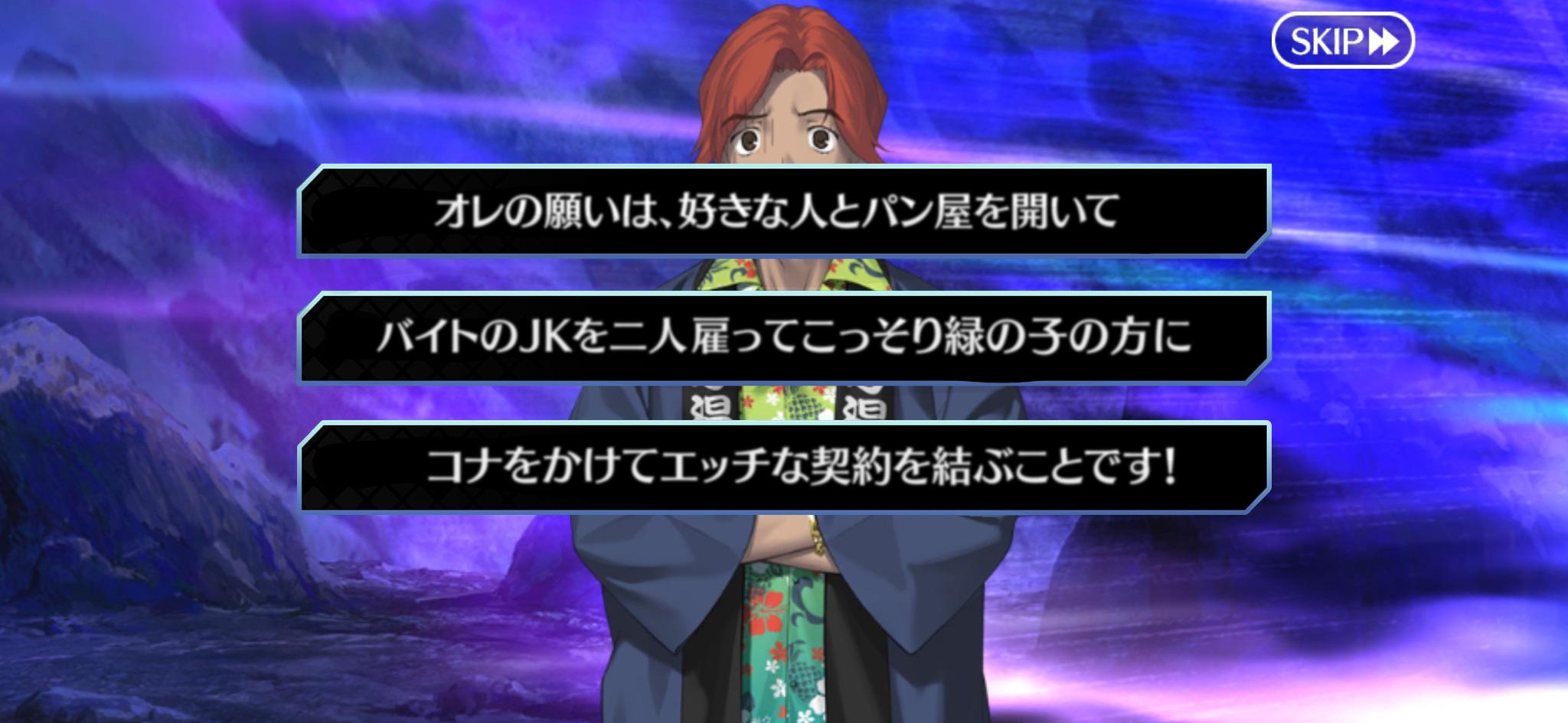
My wish is to open a bakery with the person I like, hire two part-time high school girls, and secretly flirt with the green-haired one to make a naughty deal!
The misuse of paid fonts is great!
Please tell me about comic fonts that can be used for collages.
I think the font in FGO was skip.
Super easy to understand.
It seems that a blurred font, as if copied from a deliberately degraded JPEG, is being sought after.
For now, NotoSans.
It costs 50,000…
The font is expensive, the font is expensive, the font is expensive!
>>139
The technique of sample screenshots
As long as the font is easy to read, that’s all that matters.
So let’s make it Meiryo.
!! looks weird when written vertically, Yomi-chan.
I quite like collages that rearrange the original text or add and subtract to forcibly create sentences.
When fonts are rasterized and turned into images, issues regarding rights arise, right?
When it comes to those who come to laugh at the difference in fonts from the original and the collaboration, this is it.
>>145
Theaterrrrrrrrrr!!!
>>146
I like the sense of changing one character from “sister” to “theater.”
>>145
There are properly fixed ones, but only this one becomes the topic of conversation…
I want a font that is easy to read, fully equipped with Japanese, and displays correctly by default on MS, Mac, and other platforms!
Gothic is nice…
The Mansfield effect was created using the characteristics of fonts, so it shouldn’t just be discarded.
If you want to match the font, it’s easier in total to rewrite all the serifs rather than searching for a compatible font.
Can’t we somehow manage the font with AI?
If you rewrite all the lines, the font alignment issue will be resolved.
Why?
![[Manga] The magic trick that everyone tried to master as kids but couldn’t is trending, lol.](https://otaku-reviews.net/wp-content/uploads/2025/06/bf53dd2f.jpg)
![[Manga Time Kirara] Tell me your favorite couple in Kirara.](https://otaku-reviews.net/wp-content/uploads/2025/06/7f363a8b.jpg)
![[Gundam GQuuuuuuX] Even though you’re a Newtype, you’re so insensitive, Egusabe-kun.](https://otaku-reviews.net/wp-content/uploads/2025/06/b96ae33d.jpg)
![[Rune Factory] I’m sorry, but I live behind the general shrine.](https://otaku-reviews.net/wp-content/uploads/2025/06/af0f4933.jpg)
![[Fullmetal Alchemist] I have no certainty, but I feel like Envy is the weakest among the homunculi.](https://otaku-reviews.net/wp-content/uploads/2025/06/da613d5c.png)
![[Thunder thunder thunder] I thought this cover was sexy… so I bought it, and it turned out to be more interesting than I expected.](https://otaku-reviews.net/wp-content/uploads/2025/06/d303d5fc.jpg)