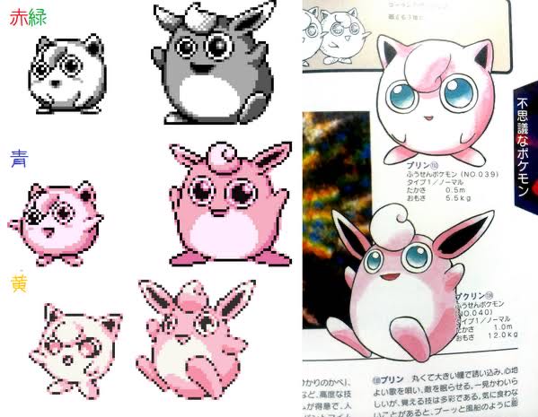
Red, Green, Blue, Yellow
Jigglypuff
Classification: Balloon Pokémon
No. 039
Height: 0.5m
Weight: 5.5kg
Wigglytuff
Classification: Balloon Pokémon
No. 040
Height: 1.0m
Weight: 12.0kg
Mystical Pokémon
The Pikachu version has become quite cute, hasn’t it?
>>1
She’s a beautiful girl, isn’t she?
>>18
The eyes appear larger, and just by making contact with the rim of the eyes, it changes so that they are not completely white-eyed.
As expected, the eyes are gross, red and green.
The first generation with different eye sizes on the left and right is quite frightening.
I started playing Pokémon relatively after it became a boom, so the impression of the official illustrations was strong.
If it was my first time seeing the game, I definitely wouldn’t think Jigglypuff is cute.
It’s scary above.
Although everyone keeps talking about Wigglytuff, Jigglypuff also has a strange and unsettling look with its eyes being off-center.
The Pikachu version of Jigglypuff has a beautiful girl vibe.
If you look closely, the sizes of the drawings are different on the left and right.
It doesn’t really seem like a representation of perspective.
The first generation is quite monster-like, isn’t it?
Isn’t the yellow pudding a bit of a rule violation?
Even Eevee had a bit of a cosmic creature vibe, right? Red and Green.
It feels like the red and green tried to create a sense of depth in the illustration but failed.
>>11
Ebiwalar is definitely one of the top examples…
Which came first for the first generation, the illustration or the pixel art?
I think the person who created the yellow dots understood what is called “moe” quite well for their time.
The pretty dotted one has been nice since the red and green days, you know…
Because it’s “Pocket Monster”…
Sawamurā is generally cool until the end of the fifth generation.
The green and red monster vibe is amazing.
The dynamism is amazing, but if you see that without knowing the original design, you’d probably have no idea what it is, right? That’s Ekans.
I think it’s amazing how it was translated from the setting illustrations of the Pikachu version anime into pixel art.
It’s already pretty gross at the pudding stage.
In the first generation, I think Pippi, Purin, and Pikachu were the three major idol characters, and Pikachu was treated as just a little less important than Pippi and Purin, but even now, I still think Pikachu’s design is on another level in terms of completion.
>>23
In the official strategy guide, Pikachu is treated as a super popular character among researchers (i.e., the production staff?).
I think Pikachu was actually the most popular among my family.
At first, they probably weren’t interested in doing character business.
The shape of the mouth is also no good.
It looks cuter than the illustration below.
You’ve been re-trained, huh…
The red, green, and blue dots were all strange, weren’t they?
It doesn’t seem like it’s specifically aimed at matching the official illustration anyway.
>>28
At the time when the dots were created, there were almost no Pokémon that had proper official illustrations, or something like that.
>>28
I made it suddenly from dots, so when I developed it into a magazine, I drew illustrations based on the dots later.
So when the Giepé series started, there were hardly any proper drawing materials in the hands of Mr. Anakurubo.
>>38
Then why can we draw a crab from a Doduo with its back turned…?
Personally, I think Mewtwo looks the coolest in the red and green pixel art.
I think this has become really cute in 3D.
The difference in skill between the pixel artists in the first generation is drastic.
The Pikachu version of Jigglypuff is really cute.
By the way, it’s not just pudding; yellow dots are really cool.
BW’s Wigglytuff is squishy and bouncy, and it’s so cute!
I feel a strong sense of failure when translating the design into pixel art.
Red and green have some that look almost exactly like official art, like Pteranodon, so I’m not really sure.
In episode 1 of Giepia, Masara Town is treated as a tropical town.
I’m curious about what materials were given to Professor Anakubo.
It has a bit of a revised feel in blue.
Isn’t it insane to transcribe everything in dot format for each version when you think about it calmly?
>>42
It sold well.
>>42
Since they are selling it later even though it’s not the complete version, they should at least do that…
Also, the map of Hanada Cave is different.
>>42
It’s really bad.
I really think Game Freak’s passion for pixel art was incredible.
>>42
No, the red and green are the same pixel art.
It started as a catalog sale and then became a separate dot for the first time.
It has probably become the first official illustration in dot form resembling the Pikachu version.
It feels like I can finally express what I wanted to do when I had yellow with red and green.
I think the materials I provided for the comic adaptation were probably game images and the instruction manual.
>>48
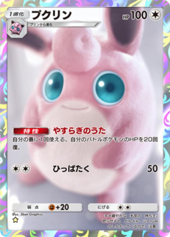
What I was looking for in the movie Detective Pikachu was about this level of realism.
I got used to seeing it come out in reality, but…
I hate those who treat the Pikachu version as inferior.
Placing highlights below feels quite advanced, perhaps.
I like the face of a bipolar girl during her manic phase.
I guess they wanted to make the depth of the red and green Jigglypuff’s eyes stand out.
Purely bad!
I wonder who was the person that made those unique dot patterns with bulging eyes.
It might be Sugimori because he already had bulging eyes at the stage of the proposal.
Is the difference between the red-green and blue of pudding perhaps a difference?
The design of the Pikachu version was too close to the anime, lacking the unique flair of the game, which made it unsatisfying.
Many people thought Mankey’s nose was a fang.
There is an image that there is someone dangerous in charge of red, green, and blue.
The blue Golbat is now just a prank, but even at the red and green stage, it’s a monster.
I love the original Sidon that is soft and chewy.
It doesn’t look like a Sideon at all.
Even when I was in elementary school, not really understanding concepts like pixel art or division of labor, I thought there were really skilled Pokémon and really bad Pokémon…
It seems there was a bit of a misunderstanding with the watercolor painting.
The pixel art of the Pikachu version is seriously still relevant even now.
When typing dots, I want to focus on how it looks rather than just inputting information.
The Pikachu version of Jigglypuff really gives off a beautiful girl vibe.
I feel like I’m waking up.
Isn’t pudding pretty gross in the first place?
>>70
I think pudding is still okay, but honestly, I feel that Jigglypuff is not cute regardless of the pixel art being bad.
Up to blue, it’s like a balloon, and I can feel it trying to make the body look bigger.
I wonder why the blue version Mewtwo’s dots changed halfway through.
It seemed strong, but…
The white of the gradually widening belly.
Pudding is cute.
I have never thought that Pippi is cute.
The first generation of dots divides into about three types: skilled people, average people, and unskilled people…
>>77
It’s not that it’s bad, but rather that the arrangement is too excessive.
The people who illustrated Nyorozo and Kakuna perfectly translated them into pixel art, making them stand out even more.
>>77
Did no one think about whose back it is that Moomin, who thinks of himself as a lizard, is looking at?
The first generation dots are influenced by the differences in the artist and the time of production…
The dots that have little deviation from the later design are mostly those drawn by Sugimori-san in the late development stage of the official illustrations.
Pudding
Jigglypuff
Pippi
Happy
Happinas
It’s hard to understand how each one will evolve.
>>81
It’s lucky, and don’t forget the pixie.
Personally, I don’t really like the Pikachu version because it feels strange due to excessive anti-aliasing on the pixel art outlines overall.
On one hand, it turned out quite beautiful, but since the lines are too clean, the dot feel might be diminished, so it seems like preferences will vary for the Pikachu version.
Fur is a luxury item!
If you look closely, the illustration is sort of creepy.
At the time of Red and Green, not all Pokémon had their illustrations converted into pixel art.
I wonder why the back view in the first generation Gold and Silver has such rough enlarged dots.
Sorry, the gold and silver were no longer rough.


![[Rune Factory] I’m sorry, but I live behind the general shrine.](https://otaku-reviews.net/wp-content/uploads/2025/06/af0f4933.jpg)
![[Monster Hunter Wilds] I wonder if those who bomb with low ratings want to kill the series.](https://otaku-reviews.net/wp-content/uploads/2025/06/618be522.png)
![[Manga] The magic trick that everyone tried to master as kids but couldn’t is trending, lol.](https://otaku-reviews.net/wp-content/uploads/2025/06/bf53dd2f.jpg)
![[Gundam GQuuuuuuX] Even though you’re a Newtype, you’re so insensitive, Egusabe-kun.](https://otaku-reviews.net/wp-content/uploads/2025/06/b96ae33d.jpg)
![[Manga Time Kirara] Tell me your favorite couple in Kirara.](https://otaku-reviews.net/wp-content/uploads/2025/06/7f363a8b.jpg)
![[Fullmetal Alchemist] I have no certainty, but I feel like Envy is the weakest among the homunculi.](https://otaku-reviews.net/wp-content/uploads/2025/06/da613d5c.png)
![[Thunder thunder thunder] I thought this cover was sexy… so I bought it, and it turned out to be more interesting than I expected.](https://otaku-reviews.net/wp-content/uploads/2025/06/d303d5fc.jpg)