DE juice is amazing…
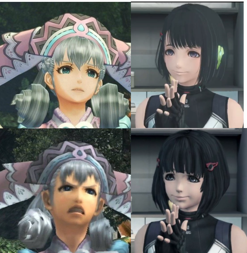
There was a time when I thought the bottom left was cute.
>>2
Not much above either…
Rin-chan’s charm is amazing.
Anger
ri
But Shinrin-chan’s expression is somewhat stiff.
I feel like I’m unable to show anger or a puzzled expression.
“Are you telling me to run away all by myself? (I can’t leave you all behind!)”
“Are you telling me to run back alone? (I can handle these guys all by myself!)”
Anger
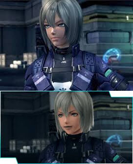
The new Elma is beautiful, but I think she looks like a gay man; when I looked at the old Elma, her face couldn’t be called pretty.
>>8
So what?
Ugly.
The one below is superior in expressing emotions.
>>11
I think different emotions are coming out…
To be honest, personally, I felt that the first generation DE was generally like this…
Muji has a face like a sunfish, but the changes in expression were quite significant, although I think Cross originally had a stiff, mask-like feel.
This is what Rin-chan looked like before the remake.
I thought Rin-chan’s face was too creepy even back then.
Grief
Anger
I feel that the original had a better richness of expression.
Don’t you think it’s admirable that such a young person is trying to fulfill their mission?
Well then…
It is ugly.
The way to style the hair is different too.
There is a Gym Leader from Pokémon XY.
To be honest, it’s a bit difficult to compare them just using still images.
The lower left is too masculine, isn’t it?
But at that time, we were thinking, “Melia-chan is cute like this!”
>>25
I’m not very attractive here, but usually I’m on the cute side…
To be honest, even with the power of ED, depending on the writing, old Rin-chan may unexpectedly show up.
Even if the game is interesting, it’s not worth it down here…
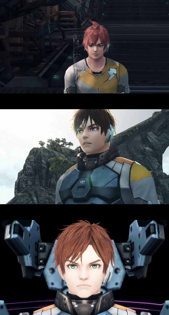
The characters on the right that haven’t undergone major renovations are relatively mediocre… especially Cross-kun and Mia.
Why did only Rin-chan reach the latest level?
Rin-chan feels like she has turned 3.
Ms. Elma is Alvis.
Neil Neil seems to have aimed for something good within the cross.
The hero is uh.
In the first generation DE, the other characters besides the main ones still have a sunfish face…
I think the difference between the updated model and the one that hasn’t been updated is more noticeable on this side.
I prefer Merya-chan when her lower expressions are more pronounced.
It seems like it could be in a horror manga in the bottom right.
As a result of adjustments, there’s Irina-san who ended up with a mob face.
Rin-chan has become quite cute, hasn’t she…
In the beginning, I had the impression that Melia-chan was a really strong-willed girl, so my image of her has changed.
I don’t know if it’s good or bad.
Isn’t the level of hair confusion increasing?
I like the old Rin-chan.
Honestly, the Cross DE is still not cute.
It feels like this is what happens when you directly turn Kunihiko Tanaka’s art into a 3D model, an old cross.
Personally, I also like the kind of Kunihiko Tanaka vibe seen in past works like 2DLC.
>>44
The old one looks like Xenogears graphics, doesn’t it?
>>45
No…?
In the first generation DE, Fiorun became so cute that I was surprised from the beginning.
Also, Riki’s expression being stuck in the pasted image makes me laugh a little due to the contrast.
Well, I remembered Episode 1 at the beginning.
Was 2015 like this…?
I wanted the character creation to be expanded a bit more, CroDE.
It has become quite cute, but the options are rather limited.
Lighting alone can really change the impression, doesn’t it?
>>51
Being able to properly create anime-style lighting in 2 is a big deal.
Recently, the level of anime-style 3D has greatly improved.
>>53
It’s an era where a certain level of cuteness is guaranteed in any game.
Wonderful
The bottom right feels like Tri-Ace.
I don’t like that there are people who say that Xenoblade Chronicles is due to Nosuini.
>>56
The designs of Shulk and Fiorun in Xenoblade 2 by Nosuini were just plain good.
Rather, the shadows of the original cross were dark overall, which was the cause.
It feels like they deliberately changed to a completely different direction because they aren’t involved with Nosui.
I think if I were involved, I would have made it closer to the characters from No More Heroes 2.
Writing is seriously important.
In FF7R, Cloud looked ugly depending on the lighting, but it was later corrected for brightness.
Slow Writer Nosuini
The lower part seems to have remnants of the time when they wanted to make something look realistic or anime-like, resulting in a half-baked modeling from the era of Xenogears.
The character graphics in Xenoblade 1 were pretty terrible even by the standards of that time.
Well, there’s definitely a decrease in the quality of characters compared to Xenosaga 3, even though the polygons allocated to characters have drastically decreased…
Over there, their expression is stiff and they don’t move much.
In terms of Nosuini-like qualities, Scherukfiorun from 2 is quite close to the ideal.


![[Rune Factory] I’m sorry, but I live behind the general shrine.](https://otaku-reviews.net/wp-content/uploads/2025/06/af0f4933.jpg)
![[Monster Hunter Wilds] I wonder if those who bomb with low ratings want to kill the series.](https://otaku-reviews.net/wp-content/uploads/2025/06/618be522.png)
![[Manga] The magic trick that everyone tried to master as kids but couldn’t is trending, lol.](https://otaku-reviews.net/wp-content/uploads/2025/06/bf53dd2f.jpg)
![[Gundam GQuuuuuuX] Even though you’re a Newtype, you’re so insensitive, Egusabe-kun.](https://otaku-reviews.net/wp-content/uploads/2025/06/b96ae33d.jpg)
![[Manga Time Kirara] Tell me your favorite couple in Kirara.](https://otaku-reviews.net/wp-content/uploads/2025/06/7f363a8b.jpg)
![[Fullmetal Alchemist] I have no certainty, but I feel like Envy is the weakest among the homunculi.](https://otaku-reviews.net/wp-content/uploads/2025/06/da613d5c.png)
![[Thunder thunder thunder] I thought this cover was sexy… so I bought it, and it turned out to be more interesting than I expected.](https://otaku-reviews.net/wp-content/uploads/2025/06/d303d5fc.jpg)