It’s a shame that the early kids sometimes look a bit plain.
漫画を買うなら楽天kobo(電子書籍)が断然オススメ!
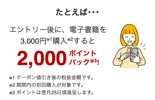
For example… After entry, if you purchase an e-book for 3,000 yen※1, you will receive 2,000 points back※3! ※1 This is the amount before tax after coupon discounts. ※2 The first purchase within the period is eligible. ※3 Points will be awarded around the 25th of the following month.
When lined up with Donna and Orphe, Golshi looks really plain.
Even though it’s so red.
I think that since it would die if turned into an anime, Singre would become relatively better.
Well, unlike before, all the mob characters are wearing high-calorie battle outfits…
From an artist’s perspective, the early ones that are relatively simple are probably easier to draw.
How many times has Daiya-chan been drawn in a swimsuit… Well, there are people who really like that sort of thing and draw it enthusiastically.
It’s common for there to be a difference in graphics between the early and latest versions, isn’t it?
You definitely want to have the latest everywhere, right?
That’s why it’s a different costume.
Just because an illustration is new doesn’t mean it’s necessarily good, but the advantage of 3D is that newer ones tend to be better, which is also a weakness when used in mobile games.
That said, I feel like Daiya-chan and Dasuka are quite comparable.
>>7
I heard that Dasca was a character that was created by the most skilled person in the company at that time.
>>10
That’s a bold decision… It’s a face that everyone will come across first.
Anyway, the early kids are also getting their models revised.
The design tends to change depending on the era! The three legends in the new scenario have really simple competition outfits.
I don’t need to change the costume, but I want the unique skill animations for the initial star 1 and star 2 Uma Musume to be redone.
>>12
It’s really simple, isn’t it… It’s cool, but it’s cool in a way.
>>14
When considering that the effort put into implementing features is the same regardless of whether it’s a 1-star or 3-star character, we hope that even if it’s not luxurious, the unique aspects can be done to a decent level.
There is certainly a simple coolness as well.
I’m a fan of Tachyon, but when I stand next to the newer kids, I can’t help but think that this guy’s head is really big.
>>13
The chairman, who normally has a big head, was corrected, but it’s still big, right?
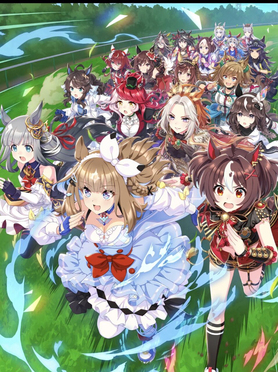
It’s unrelated, but in the thread image, Gran Alegria is running in front.
It looks like Ai-chan’s card.
>>17
The anniversary illustration support card is in a position that makes everyone wonder, “Why is it registered as a character?!”
>>17
There’s no way it would become a support card for the character in the front!
There are limits on the number of polygons, so it probably doesn’t change that much, right?
>>19
The polygon of the main body is surprisingly simple, and the technology to apply textures and make it look good is steadily improving.
Common occurrences in long-running social games.
Was it Gentil last year?
It’s early on, but I really like King-chan’s outfit and uniqueness.
It’s always the case with event support cards, but it’s confusing that a child who isn’t in the center has the card’s name.
It’s great how friendship training brings us really close, especially with the anniversary support card.
There are also strange ones like Bourbon and Mizumabu.
I don’t particularly think that way because I’ve been trained by Ultraman and Kamen Rider… They have been cool from the original series to the current one…
Recently, there are also plain cases like Air Messiah…
The technology is one thing, but the character design is quite different as well.
If the announcement were now, there would be one or two horses that would definitely be very different characters.
>>31
Ten years have both the oldest and the newest, so there is a time gap.
North Flight has clearly changed from its early version.
Almond Eye really feels like the latest of the Reiwa era, but I wonder why Takt-chan feels newer.
Even with the thread image, something like Daring Tact is quite simple, so it might depend on the horse’s image.
If I try to write seriously, it’s really quite a hassle to talk about Symboli Rudolf from the very beginning.
I want Rudolf to look like a handsome guy, like a speedy symbol of face creation.
Many of the scenarios are simple or rather plain.
High Seiko is super simple and might be influenced by the times!
They probably stopped considering things like derivative works.
>>40
Aren’t you not considering it from the beginning?
It was made based on the Specuzeteio standard, but there seems to be a feeling that it could have been more dress-like from somewhere.
Is it from Daiya-chan?
But the scene of High Seiko’s guidance.
Every time I see it, I think how cute it is.
Speaking of which, the Banpresto R-style prize figures that were being released at a pace of two per month have somehow stopped.
It seems that an erotic prize figure of Boosies will be released.
But the light blue and red of silk somehow makes me wonder if it really matches the character’s image, right?
In other words, if we take the simple approach, there will be too many horses from Sunday Racing, or the colors of Silk and North Hills will overlap too much.
If we don’t make it more detailed, everyone will end up looking like they are wearing similar clothes.
The initial group may look simple, but the design is actually very difficult.
I wonder which child’s costume is the hardest to draw right now…?
>>48
I wonder if she’s the queen… It might still be tough for Dia-chan… Bouque-chan seems to have a dull lining too.
When I put the tachyon in third place, the design becomes much better and more varied.
But if we’re going to put it next to a café, it has to be a lab coat… The café should also wear something nice for the third outfit.
Speaking of models, every time I saw SSR Kitarou standing next to Teio during the first event, I thought Kitarou had a big head.
Kita-chan is big all over…
The excessive decoration of anthropomorphized objects is quite controversial.
![[Rune Factory] I’m sorry, but I live behind the general shrine.](https://otaku-reviews.net/wp-content/uploads/2025/06/af0f4933.jpg)
![[Monster Hunter Wilds] I wonder if those who bomb with low ratings want to kill the series.](https://otaku-reviews.net/wp-content/uploads/2025/06/618be522.png)
![[Manga] The magic trick that everyone tried to master as kids but couldn’t is trending, lol.](https://otaku-reviews.net/wp-content/uploads/2025/06/bf53dd2f.jpg)
![[Gundam GQuuuuuuX] Even though you’re a Newtype, you’re so insensitive, Egusabe-kun.](https://otaku-reviews.net/wp-content/uploads/2025/06/b96ae33d.jpg)
![[Manga Time Kirara] Tell me your favorite couple in Kirara.](https://otaku-reviews.net/wp-content/uploads/2025/06/7f363a8b.jpg)
![[Fullmetal Alchemist] I have no certainty, but I feel like Envy is the weakest among the homunculi.](https://otaku-reviews.net/wp-content/uploads/2025/06/da613d5c.png)
![[Thunder thunder thunder] I thought this cover was sexy… so I bought it, and it turned out to be more interesting than I expected.](https://otaku-reviews.net/wp-content/uploads/2025/06/d303d5fc.jpg)