Aren’t the polygon counts for fingers higher now?
It’s really dark on the left, but it doesn’t matter for the image quality, right…?
>>2
The shading is dark because it is drawn into the texture.
The same as Snake from Smash Bros.
Is it this pretty if you increase the resolution of the DS version too?
>>3
The model used for promotional materials and packaging is completely different in polygon count from the in-game model.
In other words, you probably can’t move left on the DS.
Aren’t we together?
The seams of the overalls and the shirt are different, so aren’t you actually changing clothes?
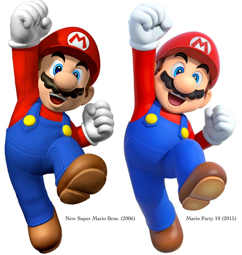
Which console is Mario Party 10 on again?
The patch on the hat has the biggest difference.
>>7
It feels like it has been carefully embroidered…
Isn’t the texture of the shoes starting to look like leather shoes?
I don’t mind it that much if it’s a game like Mario.
The right side looks cleaner, I think.
Mario during the GC era symbolized a decidedly coolness.
Striking a pose with a cool face in a package like Sunshine.
Did your height increase?
If this is the case in the 9 years from 2006 to 2015, then it should be even more beautiful now in 2025, after another 10 years, right?
Just by increasing the reflectors, doesn’t it look a lot better?
Evolution of Shaders
When compared, the left one is flat.
It feels like anything beyond this is just a change in the times.
The texture and SSAO are working well.
Even when compared to action games and party games, you know…
Even Nintendo wants to make their popular characters look nice and have a good texture, so they care about graphics.
If you look closely, don’t you think the interaction between the arms and face looks natural too?
Maybe it’s better to compare it with works from the same series…
>>25
It’s a package, so it doesn’t matter.
I thought it would be difficult to take promotional photos if the signature pose is during a jump.
The jeans fabric overalls from Smash Bros are nice, right?
>>28
In Super Smash Bros, characters are drawn from various works, so it seems that the information for each character is increased or decreased to some extent to avoid them standing out too much.
Characters like Kirby and Game & Watch are hopeless, but…
In the game, I felt a change in graphics through wonder.
Also, the fit of the hat has become poor since the Odyssey.
Doesn’t it seem like your expression has brightened up?
It might not stand out on its own, but when lined up, the left side looks a bit scary.
The seams of the trainer and the realistically fluffy outline have been streamlined, intentionally reducing the details.
Things like pores would be annoying if added, right?
The shadow on the beard has made it three-dimensional.
By around the year 2100, it will be an 8-head tall…
You’ve gotten better at writing.
Did you have some liver issues back then?
Even though it’s been deformed, isn’t it scary to look at the patch and eyes that are so realistic?
The eyebrows have slightly lifted, the mouth is slightly open, and the expression has brightened, while the lighting has eliminated the dark impression.
Is it just me, or has the head proportion changed a little? Or has the face become smaller?
These types of deformed figures don’t really change much in terms of visuals even if their performance improves.
>>42
It’s because both the left and right are artwork for package photos and promotional materials, so they are not in-game models.
The story about how Mario’s character design has changed over the years.
I prefer the texture of clothes from the past.
Is it not even a comparison between Mario Parties?
Aren’t you leaning towards the shadowless icons by Yoichi Odabe that started being used around the 3D world?
Is the seam of the jeans actually simplified?
It looks like just a change in how the light is directed.
>>48
Maybe you should cultivate a better eye for things after all…
Until around the DS and Wii, there were generally a lot of graphics that had a somewhat dark feeling.
The right side is probably lower in detail because of the amiibo compatibility.
It’s just a story about how pre-rendering technology has evolved; why does it turn into a discussion about games!?
Evolution from simple grayscale shadow colors to shadow colors that take environmental colors into account.
Transition to a more cell-look shader.
This year’s Mario looks like you can see his pores.
I had never thought about it, but it’s an embroidered hat mark.
Did the sewing of the shirt disappear?
Let’s eat shrimp~!
![[Rune Factory] I’m sorry, but I live behind the general shrine.](https://otaku-reviews.net/wp-content/uploads/2025/06/af0f4933.jpg)
![[Monster Hunter Wilds] I wonder if those who bomb with low ratings want to kill the series.](https://otaku-reviews.net/wp-content/uploads/2025/06/618be522.png)
![[Manga] The magic trick that everyone tried to master as kids but couldn’t is trending, lol.](https://otaku-reviews.net/wp-content/uploads/2025/06/bf53dd2f.jpg)
![[Gundam GQuuuuuuX] Even though you’re a Newtype, you’re so insensitive, Egusabe-kun.](https://otaku-reviews.net/wp-content/uploads/2025/06/b96ae33d.jpg)
![[Manga Time Kirara] Tell me your favorite couple in Kirara.](https://otaku-reviews.net/wp-content/uploads/2025/06/7f363a8b.jpg)
![[Fullmetal Alchemist] I have no certainty, but I feel like Envy is the weakest among the homunculi.](https://otaku-reviews.net/wp-content/uploads/2025/06/da613d5c.png)
![[Thunder thunder thunder] I thought this cover was sexy… so I bought it, and it turned out to be more interesting than I expected.](https://otaku-reviews.net/wp-content/uploads/2025/06/d303d5fc.jpg)