)
(=ω=.)
I really think it’s cute.
Since the late 90s, my eyes have been getting smaller and smaller.
The cute period of big eyes is coming again.
>>3Recently, it’s not my eyes that are getting bigger, but my breasts…
There are two types of cute…
Trust your own instincts.
Kona-chan!?
I wonder if kids these days would think it’s old…!?
I’m afraid of that.
I still think Kona-chan is cute.
I can totally handle those who were born before me.
I think Sally-chan and Knight of the Ribbon are really cute.
Disney Princesses can also easily fit in.
I think it’s cute, but the art style is a bit old.
I have seen girls who think Sailor Moon and Magic Knight Rayearth are cool.
If things like Anpanman and Conan are still popular, then there must be some universal elements.
I dislike Gen Z otaku who enjoy the slightly older art styles in a way that glorifies Heisei retro and treats it as kitsch, using it as a way to express their own sensitivity in a consumptive, sideways manner.
Take it straight on.
>>14Aren’t you trying to show off how sensitive and large your capacity is?
I’ve never seen that, so I don’t know.
>>14If you genuinely embraced the robot and idol anime of the 1980s, then you can say that.
I heard that Conan’s design has changed slightly over the years.
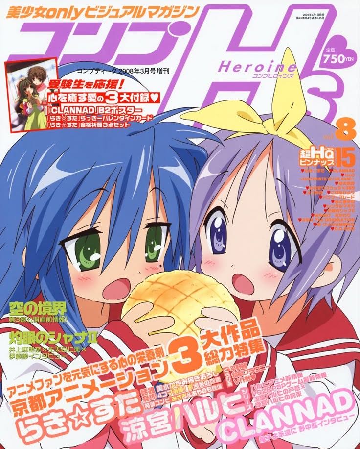
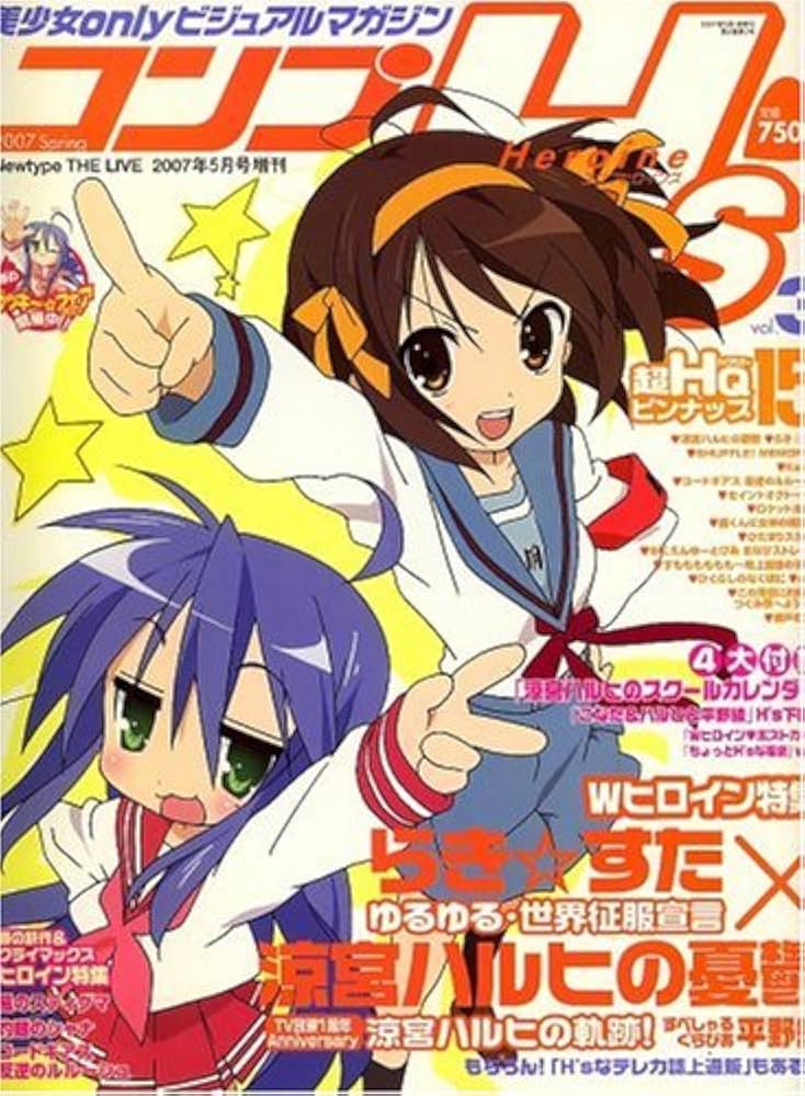
Lucky Star hasn’t released a new volume in years, right?
>>18It feels like the last volume was released over 10 years ago.
The KanColle cosplay cover was an extra.
Is it almost on indefinite hiatus in a sporadic serialization state?
I don’t buy magazines anymore.
Tsukasa loves you.
Delete the trolls.
I felt a sense of the era with Akiko Ikeda or Haruhi.
I feel that K-On! also had Yukiko Horiguchi’s art going a bit too far.
“Even now, I am moved by the line of the cheeks in Lucky Star, and above all, the design looks great for figures, so even now, the figures are top-tier and do not feel inferior.”
I think Kunetun is cuter without blushing cheeks.
I feel that “Lucky Star” is slightly too new to be considered Heisei retro.
It is said to be something from around before the 2000s.
A few years ago, when I rewatched Lucky Star, I could predict that flip phones would appear.
I really felt the era with the CRT television and desktop.
It seems like using the old primary colors is tough, but this one is completely fine.
Kunutyuu~n
Here we go!
When this moves in the anime, it’s ridiculously cute.
I like it when Tsukasa is tapping on their phone while licking their tongue.
I think the college section is unnecessary.
The series has ended.
A work about a child who abandoned humanity to become a god.
I used to think it was cute, but now that I see it, I can’t really think of anything that isn’t cute.
Isn’t it still cute now?
Okonakona
To be honest, I can’t tell the difference, but this one feels completely outdated, and I think the original image has somehow turned out to look much less old-fashioned.
Here is the extracted text from the image: “` Beautiful girl only visual magazine Comp H! Heroine 25024 magazine January issue special K ta – Nurakisutadorabura seal Co. Aasiakku 200 loan January out print Sasukeno 780 regular battle泉 BB, 0 yen Nissan H5 1n ku Topuri-su issue Vol. K chi Raki☆suta gu 7 against the year the pleasant designated teacher review Apre tsukamu Ka bi Re mo yo total H25 3 all net soul Raki☆ de iru Tamaro denon Seou Re k u Apumu Mimumu Aido hitariaan basaidO Kinpo Shin Festival issue ni risuhi 5 is Burui Puramura name to O Denkin su nariraki Christmas Keiju Doku Tsuin HW no te koto Subete ri dashi to Hakobisha ra 5 rabitoku bu S takabe doroga figure play volume #Nagatanosubstance 95 pieces name registration style, Ochiite rashi tsu “`
>>42Everything is cute.
It feels like an old illustration, but it’s still cute.
Old-fashioned and cute can coexist, after all…
Well, there’s no way to verify it on a bulletin board where only old people are present.
It seems interesting to research the lines that feel old to an anonymous person.
Just because it’s not trendy doesn’t mean it’s not cute.
“Rakista in the Reiwa era?!”
>>49I was going to say “Don’t make the same mistake again,” but now that I think about it, there was a character named Rakista on the message board.
I heard a while ago that the series about thirty-something Kona-chan was starting, but what happened to it?
Whether or not you feel a sense of age in music is different from whether it’s a good song…
Maybe Tanaka Masayoshi and Matsuo Yusuke are no longer at the forefront.
I wonder who would be the representative anime or designer of the current trend.
The theme song was covered by JAM Project and uploaded on Nico Nico.
The design trends haven’t changed much whether it’s now or in the past.
There was a time when cat ears were considered old-fashioned, but now it’s all about animal ears due to the influence of mobile games from the continent.
Originally, deformed drawings tend to have big eyes.
There isn’t much difference between now and then.
If it’s a theme song MAD, I liked “Take It! Edo’s Fang!” the most.
I love Kono-chan in this picture so much that I can’t help but smile broadly every time I see it.
It was trendy to understand things like balance, shadows, and line processing back then, so that old-fashionedness comes from recognizing the current trends.
I think it’s simply because I’m so used to Haruhi that it feels old.
If you lower the saturation of the anime that’s currently airing and cut it to a 4:3 aspect ratio, it’ll feel just like those late-night shows from the 2000s…
The art style of the anime Haruhi feels a bit outdated.
>>61I thought that the art style of Haruhi in the anime felt a bit outdated even in real time.
In the current work, the favorite characters have relatively large eyes.
Fryren and the others are smaller, but…
To put it extremely, even the girls drawn by Osamu Tezuka have very old-style illustrations, but they still look cute.
Saying that an old painting is cute is wrong! It’s being overly critical! I don’t quite understand those who make such accusations…
When I watch Haruhi and K-On now, I feel that the character designs are outdated.
>>65It’s been 20 years, so it’s actually old.
I have a memory that the jacket of some CD for Lucky Star had a good feel to it.
Personally, there is a line of baptism by time that divides whether the Haruhi television series feels old or not between the series and The Disappearance.
In another ten years, Naoyuki Asano may rearrange and reanimate it in a modern style.
Tsukasa has a cuteness that will last for 1,000,000 years.
It’s tough because it’s choppy in the era of 720p anime.
>>72In the 2000s, both the early and late periods had limited physical media that was upscaled to Blu-ray, and it’s tough that 480p has become the norm with subscriptions.
I found out that the person I dislike is the director, and I was feeling down about it, but later I was told by someone anonymous that they were only involved a little at the beginning, and the curse was lifted safely.
Don’t call it a representative work just because I was a little involved, it’s misleading!!!
I thought Clannad was old-fashioned even back then.
>>74Oops, it’s bad talk about Itaru.
In the case of the thread image, I think the oldness is probably due to the color usage, not the drawing style.
The anime version of Haruhi has always had a somewhat old impression to me.
I’m surprised at how old-fashioned the drawings and colors are, like with Munto from Kyoto Animation; I can’t believe this is from the same period as K-On!
>>79I don’t think it’s good to compare 2003 and 2009…
Well, there have been significant turning points in anime and art styles during this time.
Yukiko Horiguchi’s character designs are great, aren’t they…?
>>80When I saw the name in the OP of Bozaro, I felt moved that the animator continued, and I thought the person they brought along was excellent…
If a cute young person who aims to enter the illustration industry had this art style, I would wonder why…
>>81Isn’t it dependent on where you want to excel?
It’s a strange thing, but even the art style from the early 2010s is starting to feel a bit outdated.
The wonderful version of Di Gi Charat is old, but cute.
>>84Cutness isn’t just about the drawing style, huh?
Clannad, or rather Leaf/Key, was considered outdated in terms of art even back then.
It’s often misunderstood, but Tokimeki Memorial too…
Ero H
The coloring looks cheap, or rather, the amount of information in today’s anime is amazing.
>>88Around 2007, a technology that changed the paradigm came out a lot.
Yukiko Horiguchi is really amazing at single illustrations, isn’t she?
The filming process has seriously become luxurious.
>>91Even if the original drawing is terrible, it has become capable of at least ensuring a minimum level of appearance.
Kyoto Animation is known for their crazy levels of detail in works like Violet Evergarden and the Euphonium series…
The reason why it doesn’t look older than K-On might be because the K-On art has been consumed too much.
>>93I’ve seen quite a few people influenced by K-On illustrations.
>>98I was thinking that Ixy has an amazing portrait.
I’m doing it together with Leaf, but even if there are some shortcomings, the art style of Leaf was fashionable by the standards of that time, right?
When an old person paints, it becomes just an old-fashioned picture.
When a young person draws, it can look retro and stylish.
>>99Even if we call it retro style from the 〇〇s, if it’s made for today’s people, it’s not exactly the same and has been modernized.
Kunutyun
The finish and colors can really change the impression a lot.
The style is old-fashioned.
The “K-On” face represents the art style of the 2000s.
Lucky Star is cute, but K-On just looks like a hamster, so it’s really low on the shikority scale.
>>107Actually, I have the impression that there were few illustrations in the lewd category.
I feel like Azunyan and Mio were somewhat there.
>>109That said, if it becomes popular, the erotic content will increase.
About 10% of the total will generally be erotic.
Isn’t it good to have the cute designs from the past in the cute style of today?
I think it’s amazing that Poyoyon Rock and Akio Watanabe have been at the forefront of the cute era all along.
The big-eyed style that was often seen in eroge during the time of Lucky Star is still my trend.
I like the current art style too, but…
I feel like people said that Hayate’s art style was old even back then, but it’s cute, so who cares!!! That’s what I thought.
If it was drawn by Ishikei, it’s definitely certified as lewd.
I don’t think the style is old-fashioned since there are various designs these days.
>>115I think this actually exists.
There’s not much of the “let’s ride the trend” illustration style these days, is there?
>>115It feels outdated like mass-produced art from a decade ago.
As long as there is the author’s individuality, that’s all there is to it.
It seems that kids nowadays do not recognize pixel art as something old.
It’s pretty chill, you know.
If someone tells me this is old, I’ll probably make a pained face.
Izumi Takemoto’s artwork is being accepted.
>>120I think it’s amazing how well they’ve adjusted it with the design.
It has a proper Takemoto style, yet it doesn’t feel old and is cute.
I feel like there is a culture regarding trendy styles, such as popular breast and thigh sizes.
I believe the update of the design basically finished around the year 2000.
Since then, I feel like it’s really just a difference in direction about what to reference afterwards.
I mean, it’s only the old guys who care about being old-fashioned or trendy…
Even the hairstyle air intakes are showing signs of revival recently.
>>126You don’t often see those large air intakes from the past anymore.
You’ve started to see hairstyles that feel like the genes of air intake, haven’t you?
I sometimes get off to Di Gi Charat, so I understand how you feel.
There may not be a trendy style, but there are those stylish and somewhat edgy designs that are well-received on social media.
When I see someone certifying something old with a single element, I feel a bit frustrated.
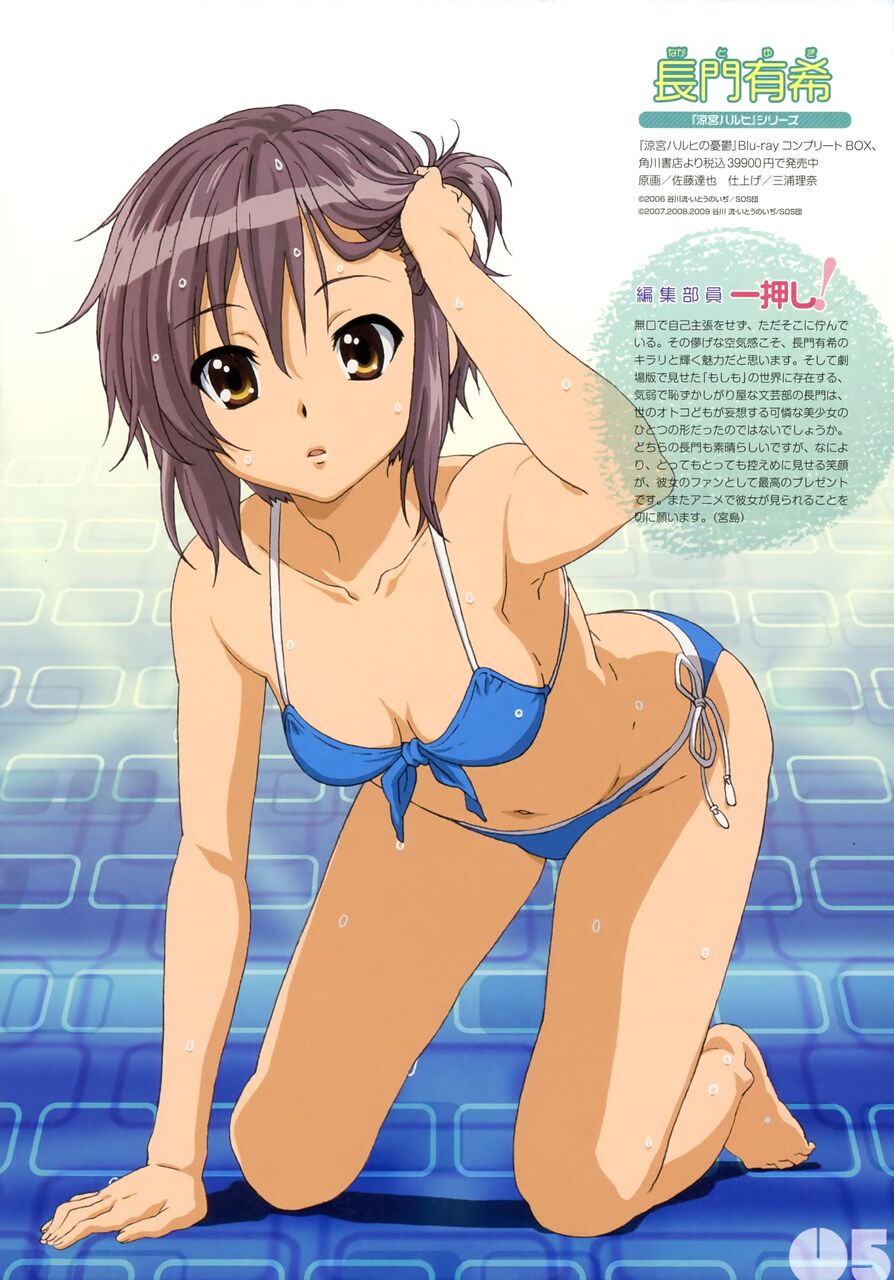
Was Nagato always this well-endowed…?
>>130It’s emphasized by the pose.
Well, if it’s this kind of illustration, I might embellish it a little.
>>133I lightly Googled it, but it looks like the pin-up is indeed enhanced…
In the Endless Eight swimwear, it sadly appears as if there is no chest.
Nagato has an image that fits in the palm of your hand.
What specific symbols can be called the art style of the past?
>>135Isn’t it the eyes and the painting that are easy to understand?
The way to draw eyes is clear and distinct.
I think it’s amazing that Takeuchi’s illustrations for Fate have been accepted for 20 years.
Even considering the improvement in the person’s drawing skills, the style itself hasn’t changed that much.
>>137If you continue, it will become the taste of a long-established shop…
Next season, there will be anime with this kind of art style, and there may also be a resurgence of 90s art styles to some extent.
>>139Seriously, is it going to be next season’s work?
I thought so, but it does include details that wouldn’t have been depicted in the past…
Being cute has nothing to do with the era…
Instead of being outdated, it has become a style from the ’80s, and as a result, there isn’t really anything that stands out now. I feel like when I look back later, I might not be able to identify the colors of this era.
I jerked off to Tsukasa yesterday!
Now Tsukasa has become a god too…
The production company is still a bit inexperienced with digital work, so the coloring is a bit heavy.
Miyuki is always sexy.
Miyuki…?
Misaki?
![[Manga] The magic trick that everyone tried to master as kids but couldn’t is trending, lol.](https://otaku-reviews.net/wp-content/uploads/2025/06/bf53dd2f.jpg)
![[Gundam GQuuuuuuX] Even though you’re a Newtype, you’re so insensitive, Egusabe-kun.](https://otaku-reviews.net/wp-content/uploads/2025/06/b96ae33d.jpg)
![[Rune Factory] I’m sorry, but I live behind the general shrine.](https://otaku-reviews.net/wp-content/uploads/2025/06/af0f4933.jpg)
![[Manga Time Kirara] Tell me your favorite couple in Kirara.](https://otaku-reviews.net/wp-content/uploads/2025/06/7f363a8b.jpg)
![[Fullmetal Alchemist] I have no certainty, but I feel like Envy is the weakest among the homunculi.](https://otaku-reviews.net/wp-content/uploads/2025/06/da613d5c.png)
![[Thunder thunder thunder] I thought this cover was sexy… so I bought it, and it turned out to be more interesting than I expected.](https://otaku-reviews.net/wp-content/uploads/2025/06/d303d5fc.jpg)