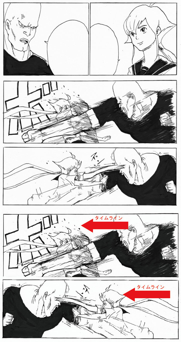
Timeline Timeline
Basically, momentum is given more importance.
Togashi and Toriyama’s imaginary worlds are a mess, but they’re easy to read as manga.
Well, it’s unavoidable due to the nature of manga that has to be read from right to left.
A manga that takes the reader “beyond” reality is great.
If that’s not the case, then it doesn’t need to be a manga.
>>2Isn’t it a different story from reality?
In the case of video, if you don’t properly follow this, it seriously becomes a screen with a sense of discomfort.
Shiromasa’s Black Magic and Inoue’s Slam Dunk are not being protected here either.
As a content, it was quite bad.
If you prioritize the timeline and reverse it, then the screen pull is too far away.
It would be better to take a close-up shot that shows more of the upper body immersed in the frame.
I am impressed that Iwakami is thoroughly protecting Imaginary.
That’s why it looks so much like a video.
Could it be that you’re saying the bottom is better?
The upper part is normally good, but…
Sometimes it may not be necessary to adhere to certain rules if the visual aspect is good, but there is no case where “it’s better not to follow the rules.”
Not knowing what to do is a problem that precedes judging whether something is interesting or not.
It seems like an image that critics who enjoy feeling like they understand something by drawing red arrows on Dragon Ball images would like.
Isn’t it better up there?
I wonder if it changes based on the proportion of content I usually interact with.
The most important thing is to clearly establish that the depiction in this manga progresses according to these rules and to not waver from them.
>>10It seems like you’re drawing a shitty manga.
It seems like they’re just criticizing popular manga.
The first step is to attack in double-page spreads, but I’m making sure it doesn’t change direction, and it’s clear what I’m doing, so there’s also a sense of impact.
You don’t need to spin the camera around to create impact.
I think it’s fine that there’s no discomfort in crossing the imaginary line between panels 1-2 and 3.
I think it’s good to have it above because if 3-4 panels have a similar composition and cross the imaginary line, it becomes confusing.
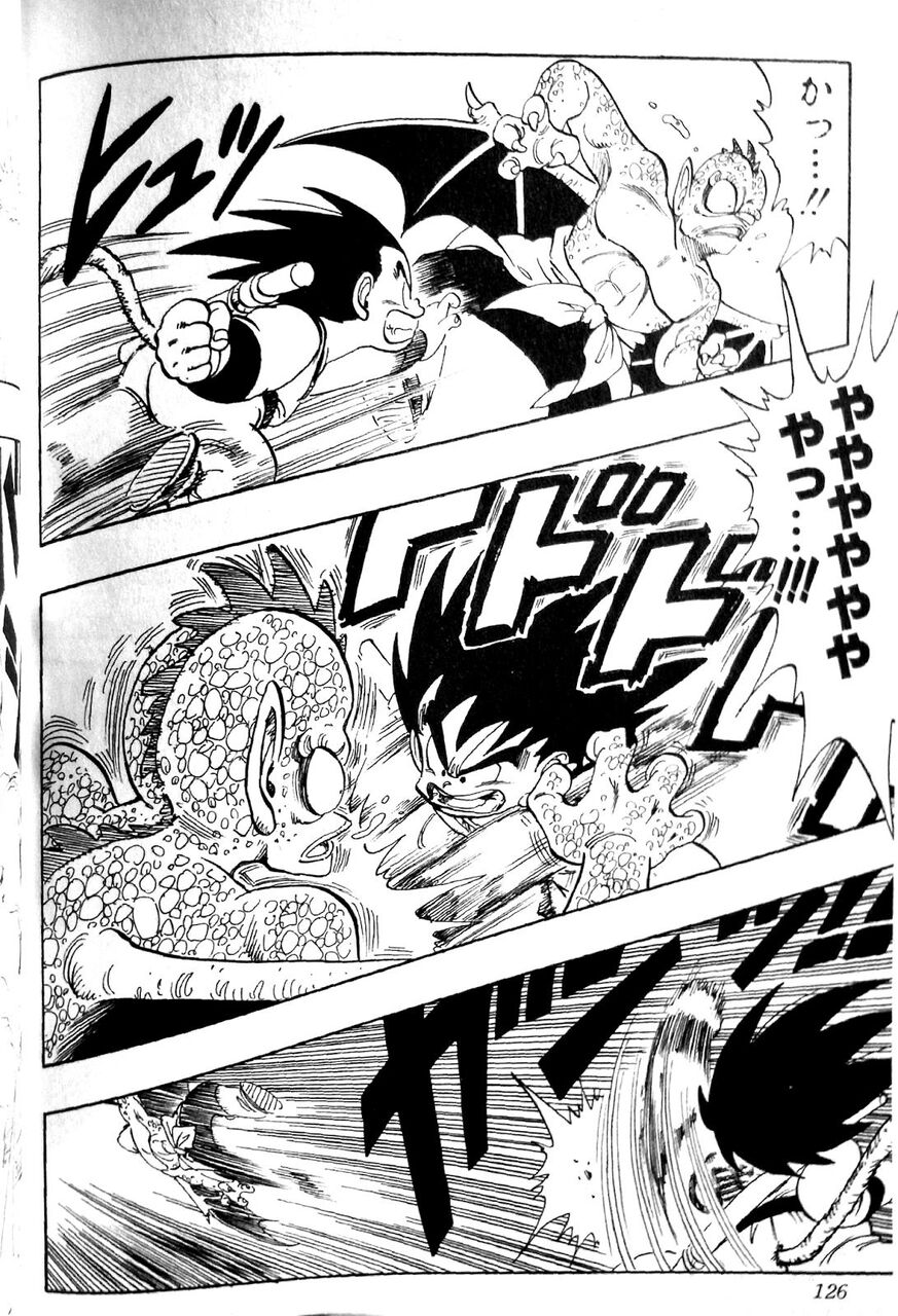
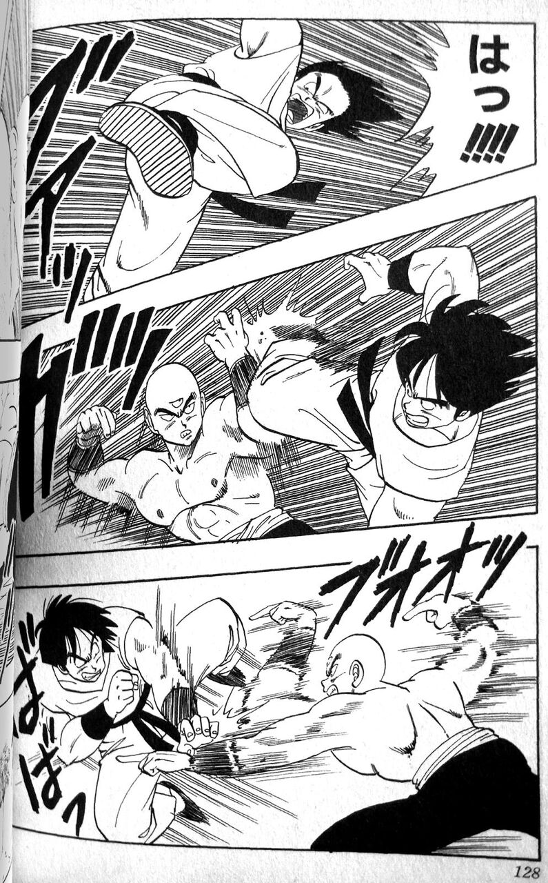
Dragon Ball is always about going down.
I don’t understand the theory; it feels more awkward when the left and right are swapped in the second frame when it’s extracted like this.
If it weren’t for images like this, I might usually just skim over and not read it.
I think it’s good that the person above wants to capture the moment with a high-speed camera.
Together with the erotic fixed-point camera.
If it is simply flipped, the depth will be reversed, so it’s not really a good example.
In addition to the clarity of not changing positions, it seamlessly incorporates attacks while deflecting punches, making the fighting depiction superior.
The lower person only thinks about the flow of time, so it takes longer to understand the situation, making the attacks feel slow.
Kah…!! Ya-yah-yah-yah…!!! 126
Is it okay that Toriyama is at the bottom?
>>18I realized this by looking at it, but is the paneling and composition of the thread image inherently bad?
>>18The first panel is moving from left to right, and it doesn’t seem to be below either.
It seems that things might be different since the camera is not exactly at the side.
>>18The first and second frames are below, but the second and third frames are above, right?
Hmm, the difference in drawing skills.
Dragon Ball is pretty free-form, isn’t it?
Toriyama is only forgiven because he is good at drawing.
It’s amazing that even without any background drawn while fighting in the sky, there is still a proper sense of depth.
Akiyo Toriyama’s compositions are different, so that’s good, isn’t it?
Well, I can’t deny it 100% if it’s called authoritarianism.
The flow of movement is really easy to see, possibly because the position is expressed in depth…
There are cases where either option is better, but I think both are not good in this case.
Isn’t it difficult to draw fight scenes from a side angle in a cool way?
You should reference “Tekken Chinni” for the action scenes.
Depth is important…
If you read it and don’t feel weird thinking “hmm~?”, then it’s okay.
I completely understand now.
If you’re good at drawing, you can get away with anything.
>>34It’s the opposite.
In manga, you can draw anything and get away with it, but if your art is bad, it may not be forgiven.
If Toriyama goes down that path, I’ll do the same.
The double-page spreads in NARUTO are great, aren’t they…
Isn’t it good that the camera switch makes it easy to understand the change of offense and defense?
I think suddenly swapping the character positions in a composition that’s as straightforward as the one in the thread image only leads to confusion.
The familiar scene of Hanyu passionately talking on the bulletin board at the gods’ mountain peak is honestly quite strange.
I’m not denying that it’s a masterpiece or that the artwork is skillful, but it’s just a matter of clarity.
I read the original article of the thread image, and after briefly explaining the imaginary line, it mentioned that comics also need to be aware of the timeline, so it’s not just about blindly adhering to one or the other.
It seems that the images in the thread are arranged just according to the thread’s anonymous intent.
It feels like having the same angle is not good.
Is it about a video or a manga?
It’s important to be aware of things like this, but there’s no value in amateur incompetents giving lectures and explanations, so it’s better to read a proper textbook.
I think most Jump manga artists are definitely lower tier.
It’s probably around Kishimoto, right?
If the one hitting with the right hand turned out to be the left hand, it would be concerning, right…
For now, it seems like the person I’m addressing without honorifics is quite concerning.
It’s blind to place this workshop below just because the flow of time goes from right to left.
It’s breaking the setup of a fight scene where the power character deflects an attack and the technician immediately counters.
Jumping over the line suddenly can have effects, such as creating a rotated performance or clearly indicating a change of offense and defense.
The imaginary line is about camera work.
Being conscious of the imaginary line in manga is
Something that makes you conscious of paneling in visuals.
I feel like there’s something off about the image, but I don’t mind it when it comes to Dragon Ball. I wonder why that is.
>>50I think it’s because the camera position is slightly different.
Not directly from the side, but at a diagonal angle or from above.
>>50If you did a similar counter with a deflection in Dragon Ball, wouldn’t it feel out of place?
Isn’t it more unsettling that the character’s direction doesn’t match before and after the setup?
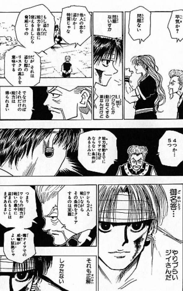
>>51I feel the same way, but JoJo and Hunter x Hunter are like this all the time too.
I think the one above is correct in terms of the flow of time.
What’s below is more about the flow of perspective rather than the flow of time.
I thought it would be better not to change the camera angle, as the image suits a continuous action that quickly returns.
If you want to emphasize each powerful punch exchanged between each other, it might be better from below as well.
Mr. Toriyama is a trend follower, so even during serialization, he keeps incorporating techniques from various places.
The bottom row of the thread images feels off because they switched the positions even though the camera angle is the same, right?
>>56It seems like they’re paying attention to every move in the fight, but suddenly the arm they’re holding gets flipped left and right, so it feels kind of strange.
If the camera suddenly flips, I want the man to have his back turned to this side.
Sometimes I get concerned if the arm that’s hitting changes or the position changes.
Well, I guess it’s fine.
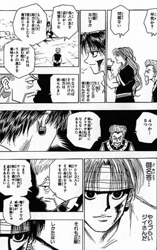
Are you okay? No problem, no problem. Those two are suspicious, but they are perfectly in sync. Is it a stand? They might be stealing someone else’s aura or they’re a special type. Well, I can understand that. With their aura, they can persuade classes of wisdom, but if it comes to a fight between them and the two of us, clearing that condition would be nearly impossible. Four… fifty times… Good answer… If the ability can just move, it would be clear, but rather than an ability, it’s something they possess… sneaky abilities that intrude into one’s mind… It’s pitiful… It’s limited to what I have, I guess. However, that essentially creates a different battle, and it poses a risk. That’s only one of those abilities; it doesn’t have many… It’s also again a tragic ambition. That’s correct, there’s no helping it; it’s hard to deal with that old man.
Even though we are definitely facing each other, our positions are all over the place.
>>60I think Togashi makes sure that the character’s orientation doesn’t contradict when reading lines in an S shape.
I feel like the direction of a character’s face doesn’t really relate to guiding the gaze, but once it sells, it becomes the right answer…
I tried drawing it my way, and even in the lower panel, it doesn’t feel too out of place like this.
>>61I think it’s the same composition that is causing the problem.
>>61I think the message you want to convey with that hand-drawn illustration came through, and it’s powerful and good.
I think the page of the thread image wants to depict the slender person’s minimum essential movements targeting vital points for counters.
So I thought it would be better not to change the 3rd and 4th panels as much as possible.
>>69A dynamic composition is good for a fierce brawl, but it’s the first exchange of attacks and defenses.
I think showing the difference between power characters and technique characters aligns with the original image’s intent.
>>69I also thought the upper part was better, but it made sense when it was clearly articulated.
First of all, it feels off that the characters’ left and right are switched between the upper and middle sections.
The imaginary line confuses people when the sides suddenly switch, so let’s avoid turning it 180 degrees; that’s the rule of the video.
As an exception, it’s fine to rotate the front cut 180 degrees and alternate between showing each other’s faces.
The fight scenes in Dragon Ball have depth due to the tilted camera, so it might be okay to switch them around.
It’s blunt, but both of the images are lame, so the correct answer is not clear.
>>67People who try to undermine the foundation of this kind are a nuisance, so I wish they would just sleep.
>>73I can’t tell which one is correct in the thread article, no foundation or anything…
>>78That’s not because it’s lame or anything!
I think it’s probably because it’s a manga that it doesn’t feel out of place.
If it’s like this in the anime, it will definitely feel out of place.
>>68Well, manga and anime (video) are clearly different things.
“Even if they say ‘It’s going to feel uncomfortable,’ I think, what are you talking about, that’s obvious.”
Mr. Toriyama is primarily involved with the Hetappi Manga Research Institute and the first Tenkaichi Budokai while working on various things during the serialization.
If the second panel is reversed, it disrupts the flow of reading.
I feel like this is the correct answer.
If you swap the left and right in a composition like a fixed-point camera, it’s bound to be confusing.
If it’s a white background, then it’s probably up.
It feels like the hunter’s gaze is guided by the position of the speech bubble.
The original image is easier to understand with similar panels lined up above.
The biggest mistake is the way of thinking that one side has to be wrong.
I mean, isn’t it strange that the image in the thread separates the third and fourth panels?
If you want to express a flowing counter, you should draw the third and a half frame.
>>82I think it’s a matter of personal preference in that regard.
I really like the way the images are presented, it feels like being able to see the momentary struggle in slow motion or frame by frame.
>>85Since the movements of the power character are stopped, it seems that the timing is also cut off even more, doesn’t it?
It’s that thing created by a combination of various elements.
>>89I don’t think it’s good to escape from verbalization by talking about things like “that” or “messy” in this flow.
>>89Indeed, the effect line that was in the third panel has disappeared in the fourth panel, and I also feel a bit of discomfort about that.
I feel like it’s okay to keep some effect lines in the fourth panel as well.
If the intention is that the man’s momentum is completely dead in the fourth frame, then it’s just my misunderstanding.
>>108If a man’s movements seem continuous, the feeling of it being strange diminishes even if it crosses the imaginary line, so I think it might work with effect lines or anything else.
Is that it?
When the camera moves, the intensity of the movement gets expressed, so for the thread image, it feels more appropriate to keep the camera position the same as above.
Imaginarily, this might be correct, but to be honest, I don’t really care either way.
>>86I don’t feel any particular discomfort.
>>86When you say it, this feels more natural, but it’s almost negligible.
>>86The frame is small, so the impact is minimal…
>>86If I focus on the picture, it’s this way.
The flow of the dialogue might be better in the original, around the transition from the fourth to the fifth panel.
>>103I just noticed that the position of the speech bubble originally forms a nice S shape.
It feels like it’s about whether to prioritize the flow of lines or the flow of the direction of the face.
>>107Do you want to show the picture after reading the lines?
I wonder if they want to read the lines after looking at the picture.
I think that in the thread image, the upper part conveys the nuance of a man evading the attack and immediately counterattacking!
Rather than drawing the very bottom, it would be better to draw from a different angle.
Just understand that it’s easy to get confused when the camera moves, so draw it in a way that it’s okay to move the camera.
That’s precisely the kind of thing in the world of video that could be debated forever, whether it’s better to pan or to do a long take.
>>92That’s not a conflict.
>>95Did you think you were in conflict while looking at the thread image?
>>98What are you saying, seriously?
>>98I think the discussion is based on which is better, the top or the bottom of the thread image.
It’s not that you can’t read it unless it’s protected.
I don’t mind if a good manga is a little flawed.
In a poorly drawn manga, this might stand out as a flaw.
Haven’t you ever been told that your actions are always one-dimensional and boring, moving from right to left?
Who decided the rules and why are you following them?
>>102Do whatever you think is easy to see.
Baki has an impression of skillfully using the side angle.
If you get too caught up in talking about the thread images…
I think it will be mockingly referred to as a turn-based battle this time.
There is no continuous flow of visuals in manga, so if it’s not hard to read, it doesn’t really matter.
>>109I enjoy talking about which one is cooler or more attractive.
I’m just an amateur, neither a manga artist nor an editor.
Both long takes and bread can be done, and they both present a choice of whether to cut them or not.
Whether to cut or do a long take, the intention behind each expression is clearly different, so it’s a completely different discussion from whether it should be done or not.
Isn’t it the case that it has to be like this for the image in the thread below?
>>113It’s probably just the image flipped.
>>113It’s just a simple reversal, that’s the preface.
I can’t tell if the upper part is good, but it’s clear that the lower part is not good.
It’s more like whether to cut or turn back after reaching from the top to the bottom and from the right to the left of the page.
I think people who can draw manga that engages readers know how to effectively present panels, including their angles.
Stable angles like directly to the side or directly above are used to show the relationship between positions rather than the passage of time.
It’s not a decisive blow filled with overwhelming emotions, but rather a back-and-forth exchange of jabs at the start of a boxing match, so it would be better to keep it simple.
It’s simply incompetent to just move the camera from right to left in the same position without thinking.
The thread image is using a panel that has just been inverted.
The discussion deviates from the merits and demerits of the imaginary line.
>>124The problem is not just because it was reversed, but because they don’t understand the interactions typical of action scenes in movies shot with fixed cameras.
The original flow of the thread images is clear because the composition of the third and fourth panels is almost the same, which shows that the side performing the counter has minimal movement of the legs and hips, and I think that’s good.
The red text in the thread image is just a mistake, right?
It’s a silly thread image to talk about seriously.
What should I say?
The unique dedication is amazing, yeah!
>>129Even the opportunistic jerks who just want to stir things up have shown up.
In the first place, this kind of creative theory is fundamentally just a basis and not something that must be strictly adhered to.
>>130But perhaps if we delve deeply into gaze guidance, timelines, the imaginary line, compositional changes, and the appeal of composition itself, we can establish a hierarchy of priorities.
It might change depending on the situation, like whether it’s just a conversation or an action scene.
It’s frustrating that the character has long hair but only minimal movement.
The switching of the left and right characters between the top two panels and the next panel isn’t that noticeable.
I feel like the reversed frame for comparison is just not right…
That reply is just a self-promotion, right?
You’re looking down on me, you bastard.
>>135Poor thing 😢
I still don’t understand the logic behind panel layout and visual guidance.
Is it a matter of sense or is it that of a manga artist?
>>137Readers follow the dialogue, so I’ll write what I want to show between the lines of dialogue.
Using focus lines to draw attention or alternatively using flat tones to blend in.
It’s quite manageable with logic.
>>139In other words, it’s a matter of production, so it’s based 100% on logic.
However, depending on what kind of production you want to create, the correct answer can be completely different.
>>144If there is an intention to do so, you wouldn’t feel uncomfortable even if it deviates from the theory.
>>137
This was quite easy to understand.
>>140It’s determined more by the arrangement of speech bubbles than by panel layout.
I see.
>>143
The reason why a name is called a name.
>>143In topics like this, the outrageous irregular panel layouts that are often used can guide the reader’s gaze through the placement of speech bubbles, making even the strange ones easy to read.
Manga has the concept of pages and panel divisions.
Isn’t it necessary to have a certain level of completeness as a single piece of art, regardless of the timeline and other factors?
You can understand it if you read it yourself, right?
>>141The terrifying thing is that when I try to draw it myself, I suddenly become unable to understand why!
>>157That’s because I’m reading it knowing all of that.
Forget it once before you read!
>>161How do I do it!?
>>142Putting good and bad aside, I really think that you need to be a genius to draw this panel layout.
>>142The flow of time
←
Sure! Please provide the Japanese text you would like me to translate.
←
It’s happening…
>>147I read it again after reading the commentary lines.
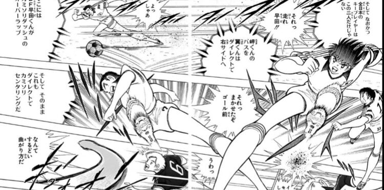
I think it’s hard to read, but I’ve made it to the point of raising the centering, so I’m way too excited to open the next page.
It seems like the difficulty in reading is contributing to the buildup leading up to the shooting scene.
In Toriyama’s case, he’s also using the shape of the panels to guide the viewer’s gaze.
I can’t believe they can do this weekly…
Speech bubbles are really important, you know.
I don’t like Captain Tsubasa or Yu-Gi-Oh, but I can only say that the panel layout is genuinely genius.
I feel like we’re connecting with our passes.
If you read the speech bubbles, you’ll understand, so it feels like they just rely on the visual impact from there.
>>153When you understand the flow, the passing from Misaki to Tsubasa to Nitta becomes clear, and the razor center-crossing is exciting, isn’t it?
I think while the color arrangement on a page of Yu-Gi-Oh is really well balanced, it’s not very good as a manga.
The impression is hard to see because the top and bottom of the screen are cut off.
If you follow the speech bubbles in order, the necessary images will appear at the right timing.
I want to reverse the first and second panels of the thread image.
The sense of dynamism is amazing.
I really think the pinnacle of action depicted in manga is cufflinks.
The image in the thread looks a bit awkward because the speech bubbles overlap at a similar height.
It’s better to raise the speech bubble for the woman.
It might be better to start with the speech bubble and then think about how to break down the panels to support it.
>>165To be honest, it changes depending on the genre and concept of the work.
Action manga and sports manga place great importance on the dynamism of the illustrations.
In sports manga, theoretical explanations can sometimes be important.
Creation is often built on these little calculations, you could say.
Whether you are firm in that area or not, even if you appear to be at the same level, the evaluation changes completely.
It’s like the video feel of connecting pictures, but there might be some exceptions.
It’s difficult, this kind of story.
Even if I tell you that the bottom part of the image is good, it’s just been mirrored, so the punched arm is also on the opposite side, and despite trying to act like an expert by providing feedback, it’s really too lazy.
In terms of guiding the viewer’s gaze with speech bubbles, I learned that Demon Slayer has almost no irregular placement of speech bubbles and always arranges them horizontally above the panels, making it easy to read.
I didn’t know that speech bubbles have the strongest power to guide a person’s gaze compared to pictures and other elements.
When I consciously think about it after being told, it makes sense.
>>171That might be the biggest difference between visual works and manga.
Manga can somehow manage even without sticking to the so-called imaginary line.
It’s a rare thread that is actually helpful…
In terms of the timeline, a woman speaks → a man speaks → considering that I want to bring the image of the man hitting in the third panel first, having the camera reversed from 1 and 2 to 3 is correct from a manga perspective.
On the other hand, since we want to clearly showcase the counter using a fixed camera in 3→4, the fact that we haven’t changed the angle here is also narratively correct in a comic-like way.
I can understand that a readable manga has a good sense of where to place speech bubbles and sound effects, rather than just focusing on composition or panel layout.
I think that as long as there’s a proper flow to the movement, any cut can be read without discomfort; at least, it’s not present in the thread image.
I don’t understand what the girl in the picture is doing in the first place.
Onomatopoeia is especially difficult.
All of the size, layout, and design.
>>178Crispy crispy pi.
If character A is drawn on the left side of the page and character B on the right side, it makes their positional relationship clear, but the overall image on the page becomes quite monotonous.
Unless you want to intentionally create that kind of direction, I think it would be better to film each frame with the camera from various angles to capture the character.
The combat scenes are different between the top and bottom; the top one is parrying the right straight and blinding the opponent.
It looks like he is doing left punch pairing and eye gouging after taking a right straight.
It must be whether you can move your gaze more naturally than the imaginary line.
When you’re looking at one frame, it’s not like you can only see that frame.
There are quite a few people who move on to the “breaking” stage without mastering the “protect” stage of the Shuhari concept.
Indeed, “reading from right to left is easier” is a fact that exists as a line.
In this case, it ends up being the type of picture where you read from right to left and get confused, so it’s counterproductive.
If anything, when I see the gaze I directed at my left eye return, the counterattack might land perfectly at the same time.
I thought that the imaginary line has meaning within everyday actions that resemble scenes from a daily drama, without any action scenes.
It’s hard to see when the camera angle suddenly switches from left to right in a normal everyday scene like that.
In terms of guiding the gaze
I think it would be better to see an attack movement in a shape that flows down to the right from the piece.
The original composition and presentation are not that great, so I can’t quite grasp it as an example.
>>186If you simply flip the composition left and right, it just becomes confusing.
When creating visual effects that span across panels like this, it’s obviously better to adhere to that.
Since this is quite a special case, I don’t think we should bring this up in relation to the topic of the imaginary line in the first place.
The example of Dragon Ball that was posted above is like that.
When expressing the speed and intensity of battle scenes, I think it’s better to prioritize eye guidance by frequently changing the characters’ positions relative to each other, as it adds more impact and results in a better finish.
On the contrary, in that scene with the image, after dodging the attack from the big man, it would be a moment where a quick counter would come in.
I think it would definitely be better to keep the composition as is without changing the position, as it can express the feeling of the man being caught off guard.
![[Manga] The magic trick that everyone tried to master as kids but couldn’t is trending, lol.](https://otaku-reviews.net/wp-content/uploads/2025/06/bf53dd2f.jpg)
![[Manga Time Kirara] Tell me your favorite couple in Kirara.](https://otaku-reviews.net/wp-content/uploads/2025/06/7f363a8b.jpg)
![[Gundam GQuuuuuuX] Even though you’re a Newtype, you’re so insensitive, Egusabe-kun.](https://otaku-reviews.net/wp-content/uploads/2025/06/b96ae33d.jpg)
![[Rune Factory] I’m sorry, but I live behind the general shrine.](https://otaku-reviews.net/wp-content/uploads/2025/06/af0f4933.jpg)
![[Fullmetal Alchemist] I have no certainty, but I feel like Envy is the weakest among the homunculi.](https://otaku-reviews.net/wp-content/uploads/2025/06/da613d5c.png)
![[Thunder thunder thunder] I thought this cover was sexy… so I bought it, and it turned out to be more interesting than I expected.](https://otaku-reviews.net/wp-content/uploads/2025/06/d303d5fc.jpg)