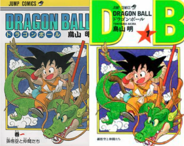
Sure, here are the extracted characters: **Left Cover:** – JUMP COMICS – DRAGON BALL – Akira Toriyama **Right Cover:** – JUMP COMICS – DRAGON BALL – AKIRA TORIYAMA – DRAGON BALL – Akira Toriyama – 1
DB!?
Dragon Ball
There was probably an intention to establish the abbreviation DB.
I still find it uncomfortable that Twitter became X, and I think it’s lame.
Voo…
The font is awful…
The design is simply deteriorating.
The visibility of the thumbnail is definitely better on the right.
>>8The topic will be tainted by the DB on the right.
>>8Isn’t it because the colors are vibrant?
I feel like it’s Yajirobe’s fault.
It looks like a design that I could draw in 5 minutes with free software, but if you could get paid for this, I’m envious.
If it’s released as a new edition, that’s fine, but I think it’s the worst that they made the original out of print.
Voo…
The new red complete edition is better, isn’t it?
>>14Yeah
It’s a bit overpriced, but you can enjoy the DB illustrations in large color reproductions, there are some new illustrations as well, and the cover features a drawing of Tori from when there was still some fat left, so I definitely recommend this one.
The art style inevitably changes, and it’s painful to see the extra corner being removed.
Have you lost the ability to distinguish between good and bad…?
Since online sales have become mainstream, this is a design to enhance visibility in thumbnails.
D★B
It seems that the original title logo was created by Tori himself, and upon looking at it again, I think it has a good overall balance, especially since he comes from an advertising background. It’s not too flashy, and the cool colors give it a clean impression that matches well with any illustration.
Since the covers of all the volumes of Kinnikuman have been redrawn, there’s a huge gap with the contents.
>>20I think a self-remake with that much enthusiasm is great; the initial art skills were severely lacking.
I feel that there was a trend at the time for new editions to have a simple design.
I still don’t know if the official title is Dragon Ball or DRAGON BALL.
Has it been about 15 years since it changed?
It will become like this next time.
>>24Now that I’m dead, I can do whatever I want.
>>37What are you talking about? It’s a repurposing of a project that was originally done in Shonen Jump while still alive.
>>42I think without a comment from the author or the contribution of Oda, the intent of the illustration won’t be fully conveyed. I wonder what they’ll do about it.
>>24People who try to stay close to the original work and those who put their own style into it are too different.
>>24I have a lot to say, but I think it’s nice that the first volume is by Katsura-sensei and the final volume is by Oda-chi.
>>24Did Togashi’s drawing skills decline?
>>24I want the thing by Kentaro Yabuki a little…
There are times when one cannot read kanji numerals.
The left Dragon Ball is great because it’s perfectly surrounded by a circle of 7 characters.
Overall, was it not enough to just keep the left as it is and make the colors of the picture as vibrant as the right?
Well, that’s probably about the reason.
If the left one were really excellent on its own, that would be a different story.
I wish the idiots who abbreviate “tamago kake gohan” as TKG would die.
>>30If you’re irritated, I’ll keep using TKG from now on.
I prefer some parts of the old cover of the meat.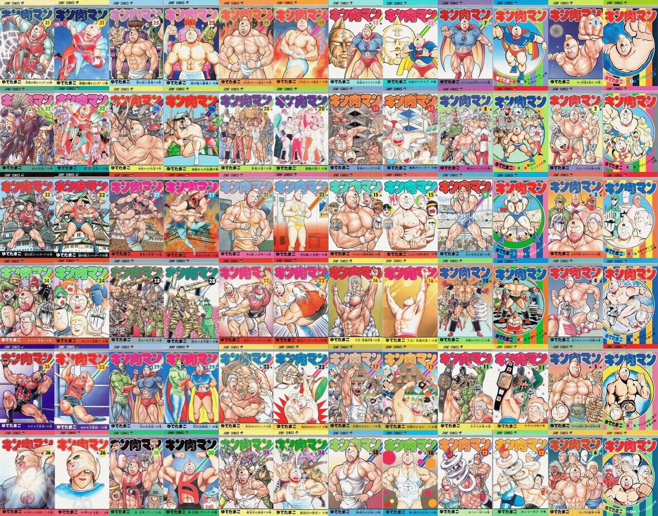
>>31When I line them up, the improvement in drawing skills is incredible…
However, there are times when I feel like I prefer the original vinyl because it has more energy.
>>31I laughed because the castles are adjacent at 27 and 33.
>>31Volume 16 is better off the way it is.
What is with the big boobs transformation and the added nipples in volume 31…?
It has a convenience store vibe on the right.
I definitely think the old frames of Yu-Gi-Oh (like GX), Duel Masters, and Magic: The Gathering are cooler, although there are some unavoidable issues due to the amount of text.
>>40They are regularly releasing cards with the old frame specification for such people.
Whoa… The atmosphere is amazing, but it’s hard to read…
>>47I’m grateful that they have finally been considerate recently… If I had to voice a complaint, it’s a bit concerning that the reprinted cards have the Studio Dice label.
There’s Kochikame.
>>41I feel like my request for about two people to draw the DB cover in their own style didn’t get through.
>>41But this illustration properly follows the original illustration.
I can vaguely remember the title logo of the anime, but…
Is the logo for the manga supposed to be on the left?
I can’t help it, no matter how I change it, I’ll end up getting a job at Nippon Paint.
It’s not really related, but there were several types of logos for the original DB, right?
Something like a dragon holding a ball in its mouth.
I’ve also done a sale of the magazine edition compiled in magazine size just like that.
There are definitely some that make you go “huh?” when you talk about a fundamentally luxurious lineup of authors.
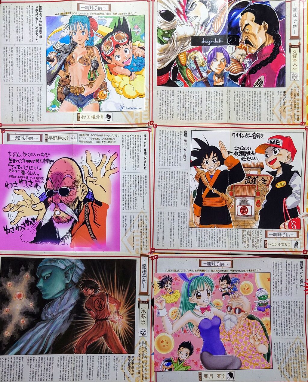
I want to see Akira Toriyama’s illustrations of Dragon Ball.
I like the old ones from 36… Their simplicity is lonely and poignant.
It’s too late for the nostalgic folks; the new generation is being prioritized.
>>54If asked which one to buy in the same condition across generations, I think about 90% would choose the left one…
>>60It’s amazing that this anonymous person understands the preferences of all generations.
It’s frustrating that there’s no margin between the text and the edge of the DB.
D B JUMP COMICS DRAGON BALL Toriyama Akira 1 ★ Son Goku and his friends Toriyama Akira Toshiba
If they release a reissue version in about 10 years, it will sell again.
While the current version is undoubtedly better at boiling, I believe there was an atmosphere and madness that could only be conveyed through that art style, like with Ramen Man.
>>57I studied manga, so I can’t bring out that crazy style anymore.
>>62Sometimes it feels like I’m skipping between the lines again…
The hard work of editing can be imagined.
>>62The recent Warsman was a bit of a ridiculous throwback to the past.
>>57In any art form, a rough charm can only be produced when you have youth and energy, for better or worse…
>>64Mr. Waka still has his usual outrageous sense, but he said that he can’t draw “The Encouragement of Courage” anymore.
Honestly, the current frame of Duel Masters feels a bit cheap to me.
There are many cases where there are no high rarity cards or even any slots, so I don’t mind it that much.
The complete edition includes an exclusive illustration by a Shueisha manga artist, reminiscing about the first edition’s bonus! The choice of the artist is more reasonable compared to that time.
The Weekly Jump authors over there are unfinished, while the Ribbon authors read from Ultra Jump as well.
The ending was like “Why is it Hirano Kouta?”
>>59Compared to the variability in choices and quality here, this newly created cover project is much better, isn’t it?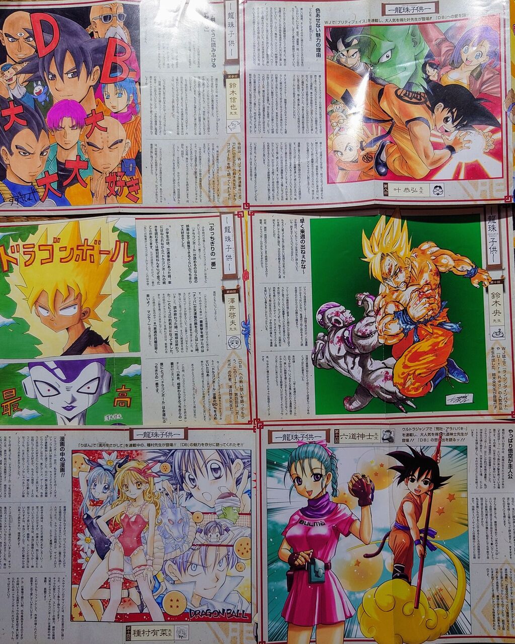
Comic covers often look outdated and uncool.
That said, just because it’s new doesn’t mean it has better taste.
It’s been about 15 years since the cover changed.
I prefer the old logo of Kochikame too, but I guess it does feel dated, and since they’re playing around with the cover anyway, I don’t think it’s a big issue.
Who is Masanori Morita already!!
I’m going to use the red that was the main point.
Although I increased the saturation, it’s becoming diffuse.
I don’t know that the complete edition has a better design than the original text in the paperback or revised edition.
>>69Isn’t the comic bunko edition cover of Yu-Gi-Oh! more popular?
It feels like the cool Yu-Gi-Oh that the current fan base is looking for.
>>72It’s not bad, but honestly, I preferred the previous one.
I really want to see a large-format color illustration, and I wished they would release a complete edition with newly drawn watercolor illustrations while the artist was still alive…
>>84It’s too bad that complete edition manga, not just for Yu-Gi-Oh, peaked in the 2000s and is now on the decline.
D★B has a color that makes you think, “What is that?” above all else.
I can understand if it’s a level of a rookie manga that was included out of necessity because there was nothing else to feature, but I really don’t understand the intention behind cutting corners in a super popular work that is still a mainstay.
I don’t deny that there are people who dislike it, but I definitely think that the one on the right is easier to see.
Originally, only the 淫夢 fans were complaining about DB.
I’m an old-fashioned person, so it’s fine to use my left hand; I have it.
The new person might like this, so it’s good to buy the right one.
Isn’t it a design that takes into account selling translations worldwide rather than just being lazy?
An uncle who thinks everything he doesn’t like looks lazy…
I think the cover of the comic bunko version is better than the paperback version for ToLOVEる, at least for the original series.
It simply means that the author has become better.
Isn’t one of the reasons for Slam Dunk’s popularity the cover of the complete edition?
The final volume might be the old paperback edition, though.
E-books are increasing, and it seems that releasing a renewed version like a complete edition won’t sell as well as it used to.
I prefer the wide edition cover of ARMS.
Toshimasa Saeki’s bloomers are erotic.
It’s good that the author’s art style and characters are present, but couldn’t something have been done about volume 34…?
>>87The horse has no motivation at all.
>>87Before talking about being bad at it, is there really anyone who can notice it’s Dragon Ball without being told…? KochiKame is somewhat similar, but it’s a famous composition, so it feels like it’s just barely acceptable.
Is this a thread here? 🐧
I personally don’t really like the art style of Yu-Gi-Oh! after the serialization ended…
I’m sorry for those who prefer that way, but…
How about having someone else draw exactly the same composition?
I was surprised to hear that GANTZ sold quite well, but the paper version went out of print as soon as the serialization ended.
There is a paperback edition, but that size is just right and I liked the rough texture, so I’m not sure… that’s how I feel.
I had △△ sensei arrange and write the cover of the volume, and we were doing a commentary project over 42 books, so it’s the back cover of the strongest jump.
It seems that the DB faction has won and the Dragon Ball faction has lost.
>>98At least we can understand that the officials didn’t like Dragon Ball… that’s about it!
>>98I didn’t even know the latter existed, but it is indeed difficult to understand DB just by mouth.
I don’t remember ever shortening it to Dragon Ball when talking with friends.
Akimoto and Dr. Hara have their own works on the cover of that volume, so it’s relatively easy to understand.
I think the one that’s the furthest from the original cover is volume 32, or rather the crocodile.
>>99Shima-Boo and Boichi are completely different.
>>99It’s not that I’m favoring the crocodile, but it’s a project asking the author to draw DB in their style, so I think this is fine. The feeling of what Kochikame and DB came here for is strong.
The volumes of Kochikame and Kingdom are mixed together…
I don’t like that the design is different from other Jump Comics.
I don’t really understand 2 or 25, but I wonder if the characters in the database would be recognizable if the resolution improved.
There are many book covers that can be replaced with volume ◯ as a supplement or something, and they often end up just being stored away because of their subtle wastefulness and lack of cohesiveness.
Shimabu has a suspicion of simply not understanding the intention of the plan.
>>108But I understand the feeling of wanting to depict the confrontation scene here.
I feel an unnaturalness similar to a sample image that says “SAMPLE.”
I guess it’s this mixed feeling that makes it good.
After all, the person buying it probably already has the old version.
The cover of volume 27 of Gash is seriously amazing, but due to the circumstances, I guess I have no choice but to give up and buy a used copy.
Shima Boo and Boichi make it feel like they’re writing the content of that volume, so it’s quite easy to understand, right?
Ariana Tanemura is always Ariana Tanemura, no matter what…
After all, things I’m not used to drawing tend to come out a bit off.
The authors of Miss Full and Bobobo ended up creating something that reflects what elementary and middle school students were writing back then.
I bought the paperback version of JoJo lured by its somewhat lower price, but I regret not being able to see the stylish cover; I feel like there aren’t many cases where the paperback is better.
Isn’t it a project that results in pictures that look like they were drawn by a child?
I like Shimabu because I can feel the desire to draw here as a fanboy, even though I know he gets a lot of criticism.
>>121If suddenly both of my eyebrows turned into Ryo-san, it would definitely be funny… I couldn’t resist that temptation, I love Toriko.
Matsui Post is sneaky.
Kaisei-sensei and Piccolo have a very high affinity.
If you include everything, there would be no complaints.
The author themselves wants to redraw it…
It’s a bit complicated when talking about “Kenka Shobai” and “Kenka Kagyō,” and there’s no clear separation like in “Baki,” which I would have preferred to continue as “Kenka Shobai.”
>>124The author is trash because they are a supporter of Himasora, so it can’t be helped.
>>126Heh heh heh, that’s a terrible thing to say, but I don’t like anything other than manga either.
Complete edition manga isn’t actually that complete…
I’m complaining a bit about what they call a bird in DB.
>>129I don’t really understand the connection of the words or what is being said.
Database
Does Dragon Ball really have that strong of an image as DB?
I don’t quite get it.
Even though it’s seven characters in Dragon Ball.
Looks like a new edition of “Meat” has been released.
I can’t say it out loud, but I like the round-faced Suguru more.
At first glance, I thought the left side was a reader’s submitted illustration.
It’s more like putting things like “I love it” or “the best” into a picture, which feels very elementary school-like.
I thought it was the same as the Daibo’s erotic dream notation, but it turned out to be something different.
The cover renewal of Ranma was terrible, huh……
Ariana Tanemura was drawing Dragon Ball!?
The star rating of 1 looks lame too.
Compared to something that would become x, it’s normal for the abbreviation of Dragon Ball to be DB.
It’s okay to dismiss those who use strange abbreviations thinking it’s funny.
I like the original versions of Mankin and Gash, but if there are circumstances like a transfer, it can’t be helped…
It’s uncomfortable that 1 is off-center from the star’s center.
>>143If you want to make it trendy, I wanted them to put numbers on the Dragon Ball or something like that.
I think it’s lacking taste to center a Mincho font with a comical font.
I only have the advantage of knowing how to read Akira Toriyama’s name.
Was the original cover’s Goku in such a dull color…? If the color of the original artwork is closer to the new one, then that might have been a good thing.
![[Manga] The magic trick that everyone tried to master as kids but couldn’t is trending, lol.](https://otaku-reviews.net/wp-content/uploads/2025/06/bf53dd2f.jpg)
![[Manga Time Kirara] Tell me your favorite couple in Kirara.](https://otaku-reviews.net/wp-content/uploads/2025/06/7f363a8b.jpg)
![[Gundam GQuuuuuuX] Even though you’re a Newtype, you’re so insensitive, Egusabe-kun.](https://otaku-reviews.net/wp-content/uploads/2025/06/b96ae33d.jpg)
![[Rune Factory] I’m sorry, but I live behind the general shrine.](https://otaku-reviews.net/wp-content/uploads/2025/06/af0f4933.jpg)
![[Fullmetal Alchemist] I have no certainty, but I feel like Envy is the weakest among the homunculi.](https://otaku-reviews.net/wp-content/uploads/2025/06/da613d5c.png)
![[Thunder thunder thunder] I thought this cover was sexy… so I bought it, and it turned out to be more interesting than I expected.](https://otaku-reviews.net/wp-content/uploads/2025/06/d303d5fc.jpg)