Jump Novel Jump J Books JUMP BOOKS
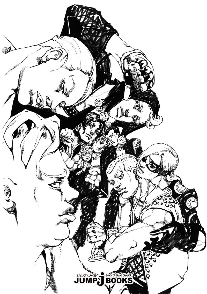
Pesshi is looking more human-like.
Did you forget about Ghiaccio?
The angle of the formaldehyde…
I definitely prefer recent drawings.
It’s a nice picture that gives a sense of a cozy workplace.
It looks cool, but it feels quite different.
I’m so surprised that there are even sorbet and gelato.
It’s as if Pesci is an important character…
Hasn’t the illustration style evolved since coming here? Not in terms of drawing skill or anything.
Doesn’t it feel like the atmosphere from back then?
The illustrations have gotten better compared to a while ago.
Prosciutto is really cool, after all.
I thought everyone in the 8th part looked dead and old…
It’s strangely interesting in the 9th part, and I wonder if things have been going well lately.
Merone seems like a pervert.
Is it a thumbs down in response to this thumbs up?
It’s something that’s already well known, but the artwork is just incredibly amazing.
The intensity of the art has been higher since the 8th volume.
The skill in the painting isn’t an exaggeration; it’s at the level of the Louvre.
It feels like I’m connecting lines as if I’m quickly jotting down with a brush!
I like the previous art style, including the color scheme of the collaboration posters.
Pessi has a jaw.
I laughed because the risotto looked like it was posing for a fist bump.
I was also curious to see such an aggressive risotto…
The “Who is this person?” vibe from a while ago is gone.
The illustration of Sorbet and Gelato coming before Ghiaccio can only be drawn by the original creator.
You remembered Solgera well… By the way, reveal the stand settings too.
It’s surprisingly few, isn’t it?
I felt like I was there longer.
The distance of skin contact feels gross…
I don’t know if it’s a golden rectangle, but it has a spiral composition.
Ghiaccio is far away!
I can only see a small face.
The painting style feels reminiscent of the latter half of Volume 7, and I really like the way it’s drawn now.
During the 8th volume, the style had changed in various ways due to the impact of the earthquake.
There are many interesting angles that are quite visually appealing, making it fun to watch.
The eighth part had the JoJo boom, so the editing was flooded with work other than manga…
They do seem to get along well, and that’s nice.
Exactly, the 9th part is the thug team.
Risotto looks happy and that’s nice.
I feel like the density of the drawings has returned a bit compared to a while ago.
I can tell that Pesci is being taken care of.
The sorbet gelato is not only properly present but also fits in well, bringing a sense of calm while, for some reason, laughter wells up inside me.
I guess the sorbet and gelato also had quite a rough stand, huh?
I think there is a feeling that they have been searching for something because the machismo of Fist of the North Star has become out of sync with the times.
Jonathan and Joseph were originally set up to look identical (yet have different personalities)…
There were times even during the second part when I couldn’t tell them apart just by the cover art.
Fan art and doujinshi are still being created.
The assassin team really is popular with women.
It’s interesting to see a cute Pesshi in the dark-themed fan creations.
Isn’t it cool to be stylish, caring for friends, and to love tragedies?
It somehow returned to looking just cool.
I was anxious because I couldn’t tell if my round eyes and small mouth were a result of aging or a trend among the teachers.
Since he looks like a turnip fairy, when he properly puts on a human jaw, he ends up looking extremely handsome due to the contrast, huh, Pessi…
The recent dark-themed only lottery really surprised me.
I’m still not confident about whether it’s Jonathan or Joseph in the art book…
It looks like the art style has returned quite a bit to that of the 5th volume.
It looks a bit different from the art style of my brother Prosciutto from a while ago.
I feel like it has become stylish and easy to understand from episode 9.
The composition is cool too.
Well, it’s also Joseph and Jonathan.
You can tell it’s Polnareff just by his hairstyle, and his facial features and art style have changed quite a bit.
During the third part, the expression was comical.
When it was Jonathan with a bandana and Joseph with a fighter jet helmet for the distinction, I really wished that at least Joseph would have been wearing a bandana instead!
Prosciutto brother is not looking ahead at all, only looking at Pesci, and his gaze is filled with too much affection.
In the cover, Jonathan might be wearing a stylish hat, but in the main story, he had a plain look without a hat or bandana.
Ghiaccio may be small, but these guys really want to stand out big during times like this.
Isn’t the painting starting to feel good again now that we’re here?
There were a few panels before that had somewhat creepy expressions.
Personally, Jonathan has a part in the middle that shows his forehead and has long hair in the back.
Joseph had a neat side, with one side of his hair sticking out like frizzy curls.
Is it really okay for Ghiaccio to be that small…?
You’re keeping that prosciutto brother stag beetle, aren’t you?
It’s quite rare for a writer with this kind of vibe to not just end up a legend but to keep actively creating new works.
I really think the design is in great shape right now, seriously.
Above all, it’s “easy to see.”
My brother’s eyes are filled with compassion…
Weren’t you in Part 8 of JoJo’s Bizarre Adventure?
Risotto looks cool even with this hairstyle…
Araki-sensei’s favorite homosexual-like close contact poses are great because they don’t take up much space in group illustrations.
Upon closer inspection, it actually has the black and white of the risotto inverted.
You remembered well.
Personally, I like the art style in the second half of Part 4 and after the middle of Part 7, but Part 9 feels like a good mix of those two.
The resolution of Holmajio has increased, but it has become kind of ugly.
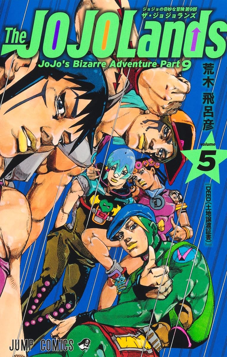
JoJoLands has a nice art style, an interesting story, and the atmosphere of its roughness blends well with the setting…
SBR uses a lot of large panels, which gives the artwork a powerful impact.
The growth of drawing skill is like that of a painter.
Jodio is not only genuinely handsome, but also has a slightly androgynous cuteness that reminds me of being brothers with Dragona, which is nice.
Melone has a lower degree of perversion over here.
The stand ability for sorbet and gelato will likely make its appearance.
The 9 parts have some areas where deformation is effective, which gives a nice balance feel, doesn’t it?
It’s easier to tell who is who than in the main character group illustration.
I saw Pesci’s jaw for the first time.
Somehow, it feels less out of place than the others I’ve just redrawn.
It’s possible to not only look younger in recent photos but also to have a younger style.
For some reason, the reproduction quality of Melone is high…
Was the person who drew this so homosexual-looking?
It was.
Isn’t sorbet and gelato, ghiaccio, doing well?
Everyone’s ice cream.
I forgot to draw Ghiaccio and added him, so now it’s smaller…
I like this design of the risotto, it’s cool.
I like the use of colors in Part 8, but I’m not fond of the square outlines in the early to mid stages.
I want goods because it’s so cool.
The girl became quite cute at 7 to 8 parts.
I like the style of painting after chapter 9.
The feeling of excitement has returned.
For a moment, I thought Ghiaccio was not around.
Volume 8’s cover and color illustration design is too avant-garde.
What is that signal flag?!
Polnareff has a distinctly gay fashion, but I don’t feel that way at all, perhaps because the art style is influenced by Fist of the North Star.
In that way, I’ve gotten used to it and no longer feel uncomfortable with the weird fashion of Part 5.
Iruzo looks like an ordinary older brother.
Well… maybe this is surprisingly how it usually is…
I’m aligning it to the arrow at the back.
I actually quite like the 8th part in full color.
I’ve heard various things, but the girl in the 8th part looks soft and that’s nice.
It feels like the 9th part is a reorganization of the 5.6 part, and it also seems like a good time to depict the assassination team.
In the latest version, characters like Paco and muscle characters have also started to take on main roles, so if I were to draw Jonathan or Jotaro now, it might turn out differently.
Prosciutto brother is really erotic.
Honestly, around 4, 5, and 6, it’s a period where the art style has quite a lot of quirks.
I’m happy that Pesch is really Pesch, Prosciutto is really Prosciutto, and Risotto is really Risotto.
I wondered if everyone was looking at the camera or at Pesshi.
Well, it’s a team that gets everyone killed, so “thumbs down” is fitting…
![[Manga] The magic trick that everyone tried to master as kids but couldn’t is trending, lol.](https://otaku-reviews.net/wp-content/uploads/2025/06/bf53dd2f.jpg)
![[Manga Time Kirara] Tell me your favorite couple in Kirara.](https://otaku-reviews.net/wp-content/uploads/2025/06/7f363a8b.jpg)
![[Gundam GQuuuuuuX] Even though you’re a Newtype, you’re so insensitive, Egusabe-kun.](https://otaku-reviews.net/wp-content/uploads/2025/06/b96ae33d.jpg)
![[Rune Factory] I’m sorry, but I live behind the general shrine.](https://otaku-reviews.net/wp-content/uploads/2025/06/af0f4933.jpg)
![[Fullmetal Alchemist] I have no certainty, but I feel like Envy is the weakest among the homunculi.](https://otaku-reviews.net/wp-content/uploads/2025/06/da613d5c.png)
![[Thunder thunder thunder] I thought this cover was sexy… so I bought it, and it turned out to be more interesting than I expected.](https://otaku-reviews.net/wp-content/uploads/2025/06/d303d5fc.jpg)