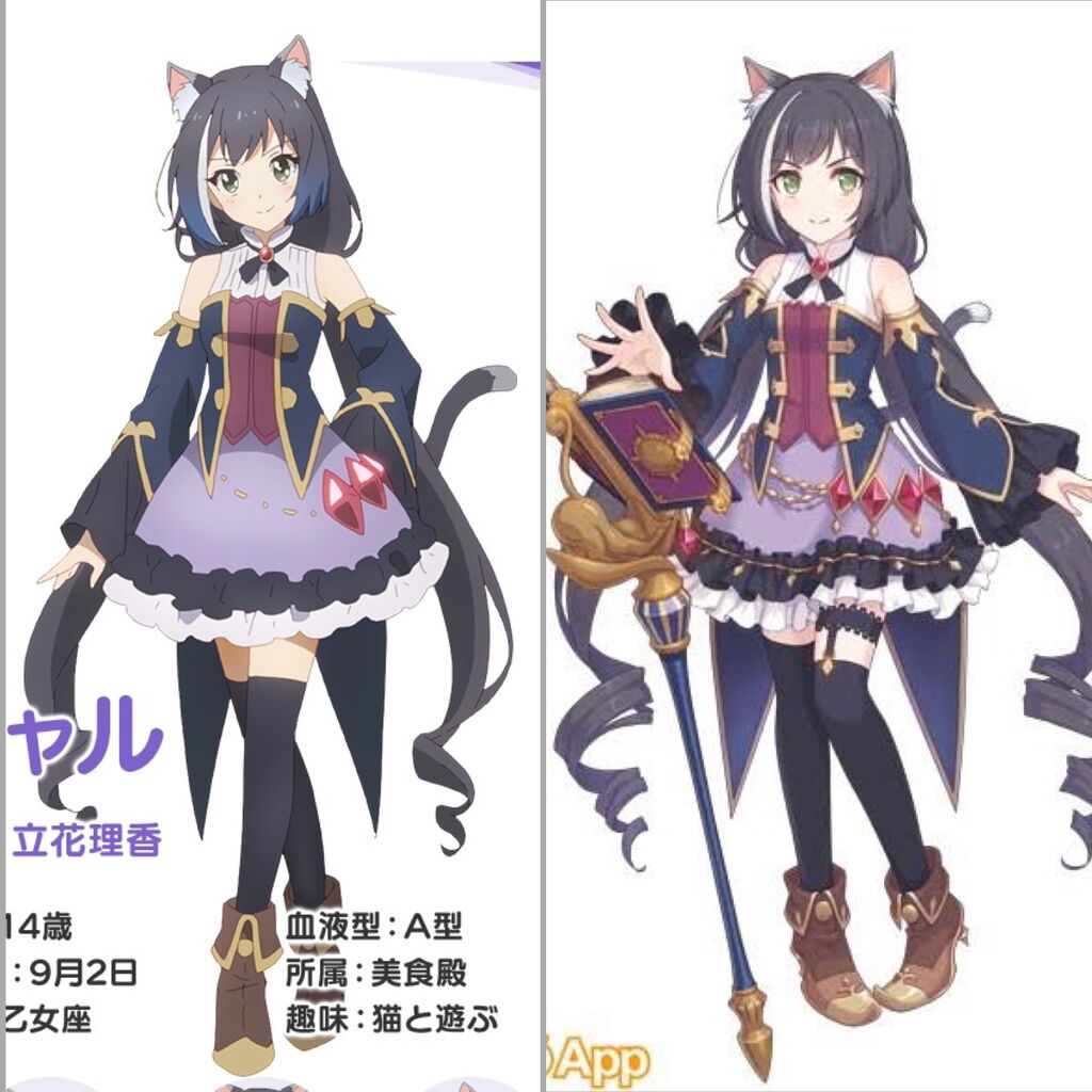
Yaru Tachibana Rika, 14 years old: September 2, Virgo, Blood type: A, Affiliation: Gourmet Hall, Hobby: Playing with cats.
I think it’s quite a challenging task for someone to transform a character full of decorations into an anime style.
Reducing lines seems to require a lot of sense.
Professionals are amazing.
When arranged like this, the left side looks remarkably rushed.
It’s not that kind of talk, and it’s a necessary downgrade.
I think this and the character designs from Granblue Fantasy have a lot of detailed metal parts added, so it seems like it would be challenging for the animation.
>>4
It is said that drawing the Black Knight is more difficult than drawing Gundam…
How miserable!
Even if you reduce the lines, you mustn’t change the impression.
The clothing of Granblue Fantasy characters has many flouncy, dynamic parts that make their standing poses more lively.
I like stories about the differences in media where it seems difficult because there are so many places that need to be activated when animating.
I like live-action the most.
>>9
Practice.
I love Jin’s older brother, who had blonde hair until digital animation allowed for a better representation of his silver hair.
I prefer the clean feeling on the left over the cluttered feeling on the right.
It is said that if you animate it, the animator will die: King Gundam II.
>>12
If it’s now, we can probably move it in 3D.
The in-game animation is drawn according to the right, even if it’s just a little movement, right?
The original is too difficult, but it seems quite tough to move the left side as well.
It’s amazing how it’s significantly streamlined yet still looks the same to the same person.
It looks like it’s still difficult to draw, even though it’s simplified…
The difference between game character portraits and animated character portraits can change the conversation quite a bit.
I think it’s unavoidable, but I think it’s better to keep the belt above the left sock.
One day, a time will come when Mori Kaoru’s illustrations can be animated!
With so many decorations, I wonder if it would be easier to make it in 3D animation, but I wonder what others think.
>>20
This time, the handling of the face and hair that falls apart at the angle…
It is possible to reproduce it in 3DCG.
>>21
The reproduction is…
The movement is…
>>21
When I thought about creating powerful visuals, moving them turned out to be quite difficult instead…
>>32
When I read specialized 3DCG magazines, I think they are doing amazing things to recreate the lies of anime in 3D.
Change the size of the parts to show the perspective.
>>17
As long as the facial drawing isn’t distorted, I feel a sense of satisfaction…
The size of the female Draph in Granblue Fantasy is so small according to the setting that I always struggle with depictions in external appearances.
>>23
In the anime, there was a scene added where Shero from Harvin climbs onto the table.
I like how Nijigasaki turned accessories that were removed due to simplification into limited edition items for the final episode.
I think there should be more comparison images like this, but I don’t see them often.
3D has its own constraints.
Penetration, etc.
There was a story about how the details in the design sketches were too intricate, and when they were reduced due to feedback, the animators ended up adding more details.
>>29
That is more like an example of doing too much at first, as in the first season it had more details than a typical robot anime, but in the second season it felt like it dropped to a standard level.
With a design that has many small items, even in 3D, it seems like they would get stuck or interfere with each other every time there is movement.
Your hair was super long… I didn’t really notice it.
So please draw Neo Tachyon.
It’s one thing for a puppet show with standing illustrations, but having too many decorations in anime is bad for the eyes.
>>34
Gohands has been noisy all this time…
In games, the lower body impression of characters tends to become faint even in 3D.
>>35
There are a lot of bust shots.
It can’t be helped.
I guess we can only hope for the development of my cut AI.
Seeing character designs that completely capture the essence of the original work and translate it into anime is just amazing…
Even though it’s an anime, it occasionally recreates scenes so well that I think, “This composition might have existed in the original work…”
People tend to think that with 3D animation, you just need to create the models and then move them. However, depending on the angle, just placing them directly can create a sense of discomfort, so fine-tuning is necessary, and in the end, it still requires effort!
>>39
It’s famous to split the arm parts and place them in an extreme shape in front of the body.
>>49
Before incorporating this special effects technique, 3DCG animation was said to have poor movement.
There was indeed a 3DCG anime with terrible animation.
Isn’t the gradient with a bluish tint towards the tips of the anime hair a hassle?!
>>40
You just need to place a filter layer, and just having this gives a sense of contrast, so it’s a worthwhile addition.
>>48
I see… it’s been considered, huh…
I still don’t like it on the left.
Everyone, please wear a shirt, jersey, or suit.
>>41
Bad at drawing artist
I wonder how many animators would cry if I decided to make anime on the right.
Were the cell spots messed up?
>>44
In reality, it should have been very unpopular among the anime staff.
There may be separate settings for uploading…
Like in Parasyte, everyone is in jeans and T-shirts.
I heard that the eye highlights also take quite a bit of time.
3D is rather struggling to reproduce the lies of two dimensions.
In the two-dimensional world, people often have mouths positioned so they always face the camera.
The one with the arm from High Score Girl.
The original robot colors and parts from older Super Robot Wars are too edgy!
There were probably various reasons, such as not moving much in general, making the features recognizable even in SD form, and not blending in with other licensed robots.
It seems like the anime would have more ups, but the gradient actually emphasizes it instead.
Miserable cat lover
When there is too much information about a character that moves and acts in 3D, it can become distracting.
Due to the impact of a single illustration in social games, I am adding more decorations.
I thought they managed to animate Tales of the Abyss really well at that time.
Simplification from concept art in 3D models is pretty common, right?
Since everyone only looks at faces and breasts anyway.
When you think about the effort it takes to move…
It’s interesting that in 3D games, the face is highly detailed while the body is surprisingly simplified.
I wonder how they were able to operate things like 0083.
>>65
Gold
Money is everything.
>>65
Money and the animator’s spirit and perseverance.
Seriously
It’s also like the legendary 5 seconds.
>>65
It is a product of the bubble era of anime production, where animators had no awareness of compliance issues or labor environment improvements, for better or for worse…
>>65
Is it that over-the-top of a design?
>>73
There were already many lines at the gym, and on top of that, the shadows increased.
It’s amazing how they are making an effort to reduce lines and decorations effectively to animate it.
Basically, the lower half is not visible.
If you really want to be serious about it, you can spend the cost when it shows.
Characters from manga and anime are not designed to be viewed from the back, so they can appear strange when moved in a 3D game.
I felt that in JoJo’s Battle Royale, (High DIO has a back that’s open and looks like hard gay clothes…)
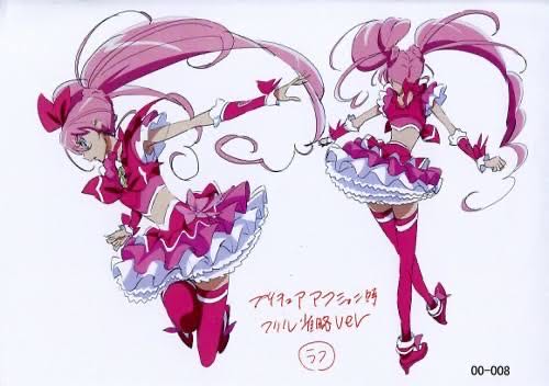
00-008 Eye Cap Rack Time Full Consultation Version Rough
Having a lot of lines makes Precure hard.
>>75
I’m sorry, but even the version without frills looks like a questionable amount to me.
>>79
Mr. Takahashi reflected that he went too far and reduced the battles in DokiDoki Precure…
>>75
It still looks quite detailed even with the omission of some parts…!
It seems that anime character designs are well thought out.
Looking at it now, it feels like the animation is sucking up a lot of money and life…
It’s not just one or two; it’s amazing to the point of being scary that they exist, those old anime.
>>78
Stop grouping everything from the past together and talking about it as if it was all made at the same time.
I feel like Uma Musume has been released without much change…
>>80
In the first place, the models for games are quietly energy-efficient…
What was often mentioned is that Dusuka’s sleeves are shaped very boldly with sharp angles.
It seems like a lot of effort goes into things like frills in anime.
In 3D, there are too many unstable objects this time, and they keep getting stuck everywhere! Death!!!! New problems are attacking me!
That’s why, female dragon.
Frills, disappear.
“May everything disappear from this world.”
Well, it’s tough, but moving it is also part of a professional’s job.
The original creator said that cells are troublesome even in the manga.
I had two chances to evolve, so I wonder why I left the spots.
>>90
It is designed to be a complete form so that it doesn’t have to be covered in spots.
Works featuring species that are 2m and 1m tall.
It’s impossible to fit both on the screen; I guess this will happen repeatedly.
3D has a lot of design constraints.
Long skirts and kimonos with long lengths are tough.
You’re kidding me with this Demon Slayer stuff, it’s so intense that even complaints are coming from the field.
After all, they were trying to properly move the pattern of the kimono.
(Jun was shining alone in his armor, having gracefully given up.)
Look at this decoration cut; it wasn’t done much because of that.
Two animations of an atelier with very little movement, struggling to make it walk.
0083 had wiring issues in the cross-section as well.
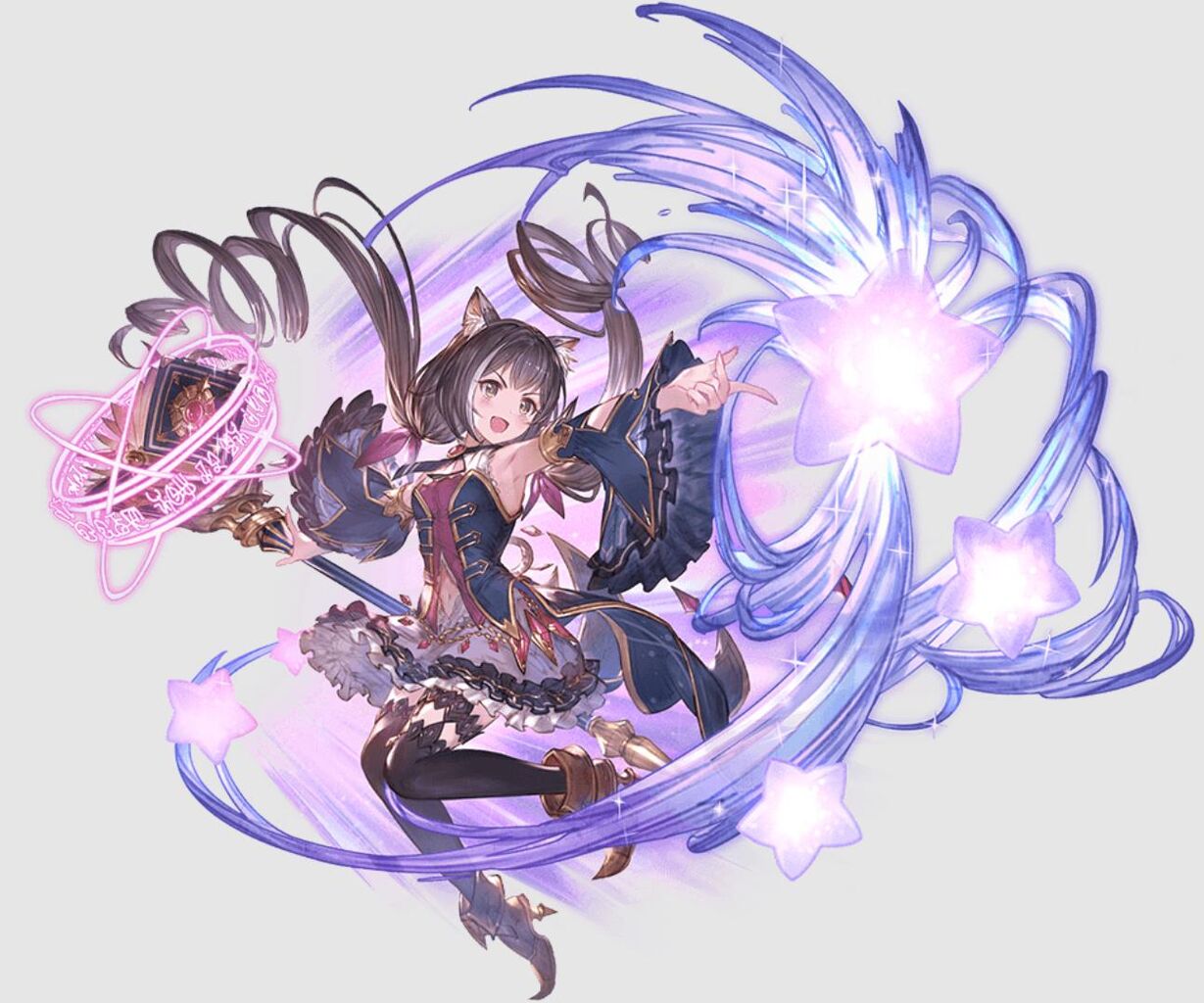
If it’s a type of Granblue Fantasy that presents a single illustration with a “bam!”, the amount of detail will increase even more.
The anime can only be turned into scale figures or prize figures.
Characters in social games are so heavily adorned with accessories, aren’t they?
It’s not very recent, but games like Mihoyo’s Genshin Impact and Star Rail are 3D, so they’ve exaggerated a lot and I can’t draw them.
It makes me want to ask for at least plain clothes.
The fighting game in Granblue Fantasy must require an incredible amount of effort for the flashy and complex decorations on the armor and costumes.
So, for the separate skin, it seems like the clothes are mostly ones that require minimal effort, like swimsuits.
The details of the clasp are elaborate, and there are more jewels, making it incredibly rich.
Since players spend money on gacha game characters, there’s a tendency for them to be enhanced and made more appealing.
Also, illustrators tend to want to embellish.
>>105
When the design is revealed and there’s a design for a single button or something like that,
Whoa… Do professional illustrators really think that deeply about it…? I’m amazed.
>>110
When the drawings with each button written on them move, there’s too much information! It makes my eyes dizzy, so some degree of simplification is definitely necessary.
There are some who can’t walk properly with such messy decorations on.
It’s pretty tough to animate a design that’s based on a single static image.
>>106
I wonder how they wear it… There are quite a few characters like that.
Isn’t Ruripiusa getting bigger?
>>107
Lyria is 152 cm, Katarina is 169 cm, and Gran is 170 cm, so I think it’s about this.
Aren’t there a lot of characters with overly excessive decorations?
I remember someone saying that all the authors who are doing the Fate comic adaptations should fight in T-shirts!
>>109
There were a lot of Apo armor…
>>113
Manga characters are designed with the idea of being animated in mind, but they are designed without considering that at all…
Another reason why characters that I never see in fan art for social games are suddenly drawn in large numbers when they release a swimsuit is…
Since illustrations in games and light novels are focused on appearance and not designed to be animated.
That’s amazing how people who make figures do it without skipping much.
>>114
Thank you, veteran Chinese aunties…
Drawing nudes can be tedious because you have to pay attention to details like balance and muscle definition.
As expected, T-shirts are the strongest.
Alternatively, please become like an energy body and emit light in a fluid form.
The reason why Buster T-shirts haven’t disappeared even in the Reiwa era.
In fan works, drafts are often typically portrayed as plump and around 150-160 cm tall.
Drawing the Uma Musume manga and their race outfits seems like a lot of work.
>>121
The older ones are mostly simpler, but the recent ones are amazing.
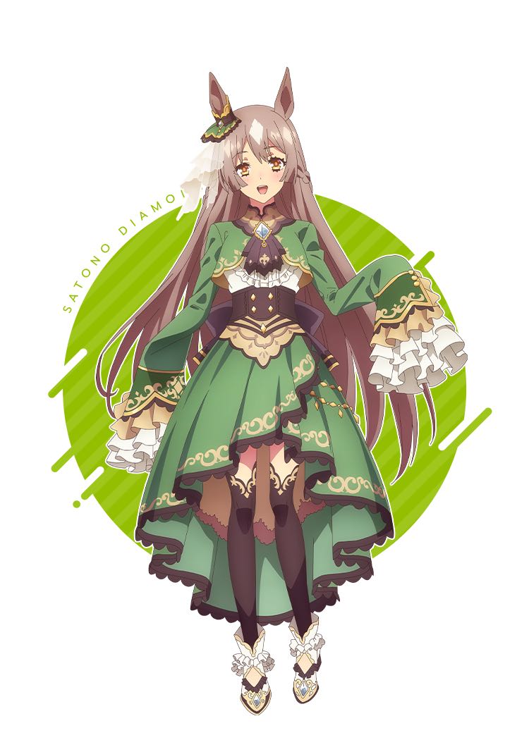
Even the relatively earlier Satono Diamond was pretty much the same.
>>121
In G1, designing all the mob characters is a huge hassle.
Sports manga jerseys must really be comfortable.
In parts that move spectacularly like idol anime or robot anime, 3D has a good balance.
Game version
Anime version
>>125
The details have reduced, but the ruffle hell hasn’t been resolved!
>>129
The holes and patterns of the frills are too much trouble to deal with…
>>125
You made quite a change, huh…?
>>125
Huh, is this trying to kill the animator?
>>125
If you’re a frill maniac, you can also wear a petticoat to add even more volume.
AniDaiya-chan is so thin…
This ridiculous race in the game is really trying to kill everyone who draws it, isn’t it, Dia-chan?
>>131
It’s understandable that there were more illustrations of Satono Color in swimsuits than in competition outfits.
Since it’s not manga or anime, the people who draw tend to want to exaggerate the features…
>>126
When you’re wearing the race uniform, it’s a G1, so they probably put a lot of effort into the animation for the race itself.
I’m starting to feel that it must be difficult to create costumes like these…
The drawing calories for social game characters are so high that if you don’t detune them appropriately, you’ll end up overwhelmed.
In a novel, a few illustrations are fine, and you can have flashy characters too.
It’s not an anime, but it really seemed like the comic adaptation of Fate/Apocrypha was quite difficult.
The armor is too gaudy.
Once you paint the texture for the 3D model, the details should be fine for continuous use, but it becomes a nightmare when converting to 2D.
The issue of overly dense information in social game character design.
If it’s not deep, I probably can’t survive in the current front lines.
I think Satono Diamond is the number one Uma Musume drawn in a swimsuit, even though there is no swimsuit implementation for her.
Since there is effort involved in animating manga as well, I think the type of social game that focuses solely on creating standing characters and variations is the one that can be the most elaborate.
>>144
It’s probably a Cell that got annoyed with the patterns.
Understood, I will go with the shiny golden armor.
In Build Fighters, since it originally comes from a manga and has a lot of lines, the main episodes of Gundam used darker shadows in the visuals to simplify the animation.
The AI drawing is on the left of the thread image, right?
No one pays attention to the fine details of accessories, so they are simplified.
The way Mr. Kaoru Mori draws those frills with such effort in his manga is insane…
>>149
Anyone who actively enjoys frills must be crazy!
If we just make games in 3D and use those models in anime, we don’t have to worry about differences, right?
>>150
There are replies above, but if you attach a lot of swaying parts, you’ll need to control all of them, and it will be a disaster.
In-game, it’s acceptable for things to be a bit chaotic or overlap, but when it becomes an anime, it becomes concerning.
In cases like this, it makes me realize that the battle models and SD models for social games are also quite impressive.
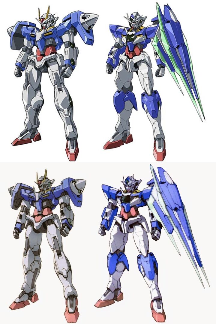
It seems that Gundam’s second season of 00 has a noticeably reduced quality.
>>153
The designer reduced the lines out of consideration, but the animation side reportedly said that it would have been better with more lines.
Episode 1
Patterns are just a hassle or an excuse.
>>154
It’s amazing how detailed this is and how it turned out to be such a beautiful picture.
In both domestic and international contexts, social game designs tend to overuse gold embellishments, mysterious cords, and engravings too casually.
There are only troublesome ones when it comes to painting with debris.
Kantai Collection seems to have many characters that are relatively easy to draw as long as I don’t have to depict their disguises.
It must be tough since the right side has to be animated in-game.
>>158
It seems that a simplified design for in-game animations has been prepared.
Even on the left, the regular character’s outfit isn’t exactly sane.
Perhaps because of a fear of clusters, highly detailed lace patterns can evoke a slight feeling of unease.
Anime Char-chan is also pretty cute, isn’t she?
The ninjas that aired yesterday had few lines and shadows, so all the characters on screen were moving lively without interruption, which was amazing.
>>165
The girls’ golf anime has simple clothes, which seems easier for the animators.
The character designs in mobile games are often not designed with movement in mind, as they are primarily based on a single illustration.
The second wife has too much hell; even without embroidery, there are horses, and culture and politics are intertwined.
The animation of Reigen had terrible artwork because they couldn’t make such choices.
No one in the world is interested in Tao and Rent’s equipment, so it would have been better to omit it.
>>168
I wonder why there were no measures taken even though the same mistake happened in the eslogy.
>>187
There might not have been someone who could simply do it or take the lead.
Robots are already perfectly realized in CG, right?
Becoming unable to produce anything at all due to an obsession with hand-drawing is completely counterproductive.
>>173
I want to draw mechs!! Let me draw them!!
The number of animators has significantly decreased since around Build Fighters…
>>178
Could it be that people who can draw mechs are becoming a rare breed?
>>183
It has been a rare species since ancient times.
>>173
In the end, it’s a result of refining technology, so it’s not a matter of right or wrong.
The Gundam that was mainly hand-drawn might not be sane.
Pokémon’s lines are simple, but if they’re too simple and the balance is a bit off, they become less cute.
Being an animator seems tough.
It may have been a time when there was money, but thinking back, Berserk was probably quite a difficult work to animate…
I like when robots are a mix of CGI and hand-drawn animation.
The opening for the new Guilty Gear anime has been released, but it seems that the designs for Strive were significantly simplified from the beginning, considering how they would be animated.
Shin’s outfit is easy to understand, but in GG2 it had too much decoration and became a really simple outfit.
There was an interview with the designer of Yumia’s Atelier, and it seemed quite difficult to design just one character.
Reducing the lines when you animate the designs that everyone has worked so hard on…
Uma Musume’s race outfits are already a challenge for the animators, and with both races and live performances, it feels like they are experimenting with just how much they can push the animation team.
The black knight who cannot move while sitting.
When drawing something like this, which should I refer to?
Well, normally I should refer to the original work, but if I draw a simplified version of the anime, will people think, “Oh, this person is cutting corners…”?
>>188
If the artwork is cute or the jokes are funny, no one will care.
The character design in the anime is also incorporated in a way that does not lose the character’s recognition.
>>188
While a beautiful standalone illustration might be seen as cutting corners, I don’t think there will be much complaint if it’s simplified in a manga.
The Double O had a simplified arm connector shape, but the Quanta retains the design as intended, which gives a sense of richness in the movie version.
Race → Move multiple people at the same time and die.
Live → Die from dance and camera work.
I sometimes see characters that have a high production cost for animation and don’t appear in fan creations in social games.
>>191
FGO’s Cú Chulainn is typically alone.
The drawing cost for Lord Xiang Yu is too high.
![[Rune Factory] I’m sorry, but I live behind the general shrine.](https://otaku-reviews.net/wp-content/uploads/2025/06/af0f4933.jpg)
![[Monster Hunter Wilds] I wonder if those who bomb with low ratings want to kill the series.](https://otaku-reviews.net/wp-content/uploads/2025/06/618be522.png)
![[Manga] The magic trick that everyone tried to master as kids but couldn’t is trending, lol.](https://otaku-reviews.net/wp-content/uploads/2025/06/bf53dd2f.jpg)
![[Gundam GQuuuuuuX] Even though you’re a Newtype, you’re so insensitive, Egusabe-kun.](https://otaku-reviews.net/wp-content/uploads/2025/06/b96ae33d.jpg)
![[Manga Time Kirara] Tell me your favorite couple in Kirara.](https://otaku-reviews.net/wp-content/uploads/2025/06/7f363a8b.jpg)
![[Fullmetal Alchemist] I have no certainty, but I feel like Envy is the weakest among the homunculi.](https://otaku-reviews.net/wp-content/uploads/2025/06/da613d5c.png)
![[Thunder thunder thunder] I thought this cover was sexy… so I bought it, and it turned out to be more interesting than I expected.](https://otaku-reviews.net/wp-content/uploads/2025/06/d303d5fc.jpg)