
Too sparkly.
I thought this child and Karen Bouquedore were especially amazing.
A ribbon as a crown?
>>4
It may seem so, but the decoration on the chest is probably easier to understand.
The eyes are scary.
I thought the ribbon was a shadow roll.
I was surprised by how unruly it seemed.
I think it’s cute, but I wish they had avoided elements similar to Kizuna Ai and Hoshino Ai.
>>10
Why?
You’ve got eyes just like Fukukitaru…
It looks like you are putting a lot of effort into the character designs for me…
>>13
There are many similar plain characters, so I don’t think so.
Even a beginner can clearly see that the thread images are particularly sparkling.
Well then, shall we bring out Kizuna? Kizuna.
Is there some meaningful motif behind the Alice-like theme?
>>16
I saw an opinion that Donna might be Alice in relation to the Queen of Hearts.
What’s going on with this loop on the foot?
>>17
There are materials in that world that can float… like Bourbon and others use.
to be scattered, to be disordered
This is my conversion.
That being said, it feels like Ai-chan has changed direction rather than just putting in more effort.
My Favorite Child
Perfect and ultimate idol.
If you’re an amateur, you don’t need to talk about your abilities, just speak honestly about what you like and dislike…
In the newsletter, there was a brief mention about the design of the competition outfit.
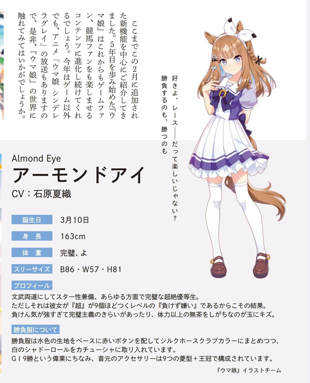
I love you, racing. Isn’t it about competing and winning? Up until now, I have introduced the new features added this February. As the fifth year begins, Uma Musume and racing are evolving rapidly, continuing to develop as one of the major contents that greatly entertains the horse racing world. This year, the anime “Uma Musume” is also airing, so please definitely immerse yourself in the world of Uma Musume. Almond Eye CV: Kaori Ishihara Birthday: March 10 Height: 163cm Weight: Perfect, Measurements: B86・W57・H81 Profile: An all-rounder with both academic and athletic excellence, a perfect super student in every aspect. However, she is extremely competitive, and here are the results reflecting that. As a perfectionist who tends to have a bit of a princess mentality, she occasionally takes on more than her strength allows. About her race outfit: The race outfit features a base of light blue fabric with red buttons, styled as a silk horse clamp, while also incorporating a white shadow roll into the headband. The accessories around the neck consist of nine replicated jewels of the crown. “Uma Musume” Illustration Team
The training center uniform is especially cute.
It may be due to the pose.
https://www.silkhorseclub.jp/assets_static/pdf/silkspecialreport_umamusume_202503.pdf
It’s nice to have comments on what motifs are used as the basis for designing the newsletter.
You’ve managed to make that tacky silk competition outfit look pretty cute.
It was a surprise attack that came not from a king or an empress, but from an idol.
I wonder how they incorporate silk elements into something like Equinox.
I wonder what will happen to Sodashi-chan.
The design is somewhat subdued in the early phases, likely to fit into the game’s modeling.
Well, that design is almost a decade old now.
>>32
It seems that there are parts that reflect the age of the actual horse.
The legendary trio is easy to understand, and it feels like the Ace and others from that era had that masculine style of clothing.
>>32
It is said that the design direction is different for the generation that was active in the first place.
This is just like a character from a mobile game.
Depending on the character, there are elements that were either trimmed down or significantly altered from the original concept in the game version.
It’s just a complete guess, but I personally think that Ai-chan didn’t have any parts that were trimmed away.
There are too many people with brown hair and short hair.
So, if we make super risqué fashion trendy now, it will be reflected in things like Evayan…
Everyone is putting a lot of effort into the design, which is only natural.
It’s very clear that this child has been created to become quite popular.
I wonder what the reason is for whether there is a draft on the official website or not.
>>40
I can only say it’s up to CyGame’s mood…
Basically, there is a tendency to add them after events like Paka Live or Anniversary Half Birthday.
A design capable of aiming for the top popularity even in IMAS.
I’m quietly wondering if they won’t remake the early models.
The latest character from the Reiwa era has already solidified various aspects from the planning stage, so isn’t it a bit pointless to strip things down?
>>43
It feels like it was designed with the premise of being a model for the app starting around Season 2.
There were some who had things like early models, skate shoes, and fur attached.
I wonder how to incorporate the red circle of silk into the design.
I thought it wouldn’t look uncool no matter how I compared it to the red cross, but I was being shallow.
>>44
The red circle element can be used as an accent color, and overall, I was impressed that if I build it with a light blue base like in the reference image with Ai-chan, it will somehow work out…
Designing the one in light blue and red is too difficult…
A tiny pattern drawn with gold leaf on the side of the eyelashes closest to the ear (even though there’s no human ear…)
When I try to draw, I have to zoom in quite a bit, and it’s too difficult!
The existence of a draft (revised) is troublesome.
Sodashi-chan’s secret.
Actually, my front teeth are gapped.
The reason the original draft created in the early stages has changed significantly is probably because there was no consideration for moving it in 3D and due to the influence of school uniform themes.
It feels like from a certain point onward, the discrepancy between the original concept and the implementation completely disappeared, especially when you understand that it can be moved in 3D.
>>51
Even if you plan to move it in 3D, you won’t know how much you can actually move it until you try it out…
I think the design team has also grasped that balance.
The initial group is just looking at the names and initial settings for a personification vibe for now.
There are probably rubies that seem to have been designed even earlier than Helios.
It’s almost exactly like Helios, but with the bandages on the legs and umbrella gone; it might have been designed around the first season.
“I’m seriously going to create an idol! The design feels amazing.”
I’m receiving a luxurious demo all by myself. 🥒
I don’t need a big ribbon.
It’s a Reiwa character design, in a very good way.
There are some who are trying really hard to rot.
The initial group is also designed with various elements firmly incorporated, though…
It’s just that dropping the snowflakes in this double front-button style is the same method as King’s.
The king’s design was perfect too…
If you look closely at the eyes, there are stars scattered all the way.
>>63
I wondered if there were also 9 of these.
It doesn’t seem to be particularly so.
I didn’t really understand the Kizuna AI element, but is it possibly because of the ribbon she has on her head?
The almond blossoms are similar to cherry blossoms, aren’t they?
I don’t think they were expecting it to be run like an anime in the early days.
That’s why there are more school uniforms.
>>67
It was probably decided from the beginning that it would be a school-themed story, so that image has likely been strongly reflected.
Instead of simply using a silk color scheme, it’s skillful to appropriately incorporate white colors in an assorted manner to reduce the richness.
It’s a legendary racehorse that might be talked about as a myth in later history.
Well, I need to get myself together.
>>69
What are you going to do if you don’t give it your all in such an important match?
They have come up with an amazing design…
Suzuka’s cool cape…
I wanted you to wear it…
Well, when I see a neatly arranged crown like the one with polka dots, I can’t help but think that making polka dots must be quite challenging.
>>72
Karen’s house already has a cool color scheme for the competition outfit.
The current version is more detailed and has more design elements than the initial group, making it a hassle to write about.
Compared to Orfe’s racing outfit, Dasuka’s racing outfit looks like it was made with more effort.
The project presentation is in 16 years.
In that case, it seems like the design progress of the initial group was over 10 years ago.
It’s an unreasonable request, but I wanted them to put more effort into the mob’s battle outfits.
>>79
The mob is designed to be easily recognizable as a mob at a glance…
But it was sad that there were no skirts at all for the early group.
Overseas mobs do wear skirts, you know.
What I’m happy about with the latest design is the high rate of meteor reproduction.
>>80
Did Lara really go that far!?
It’s something I can say regardless of the character’s time period, but I often wonder how they can incorporate such unfashionable competition outfits into the design.
I think the design of the Speo Gritio in the initial group is quite complete.
>>82
There may also be a difference in whether or not experience and know-how have accumulated, rather than just being about high or low.
Designing things like the wooden clogs, ball-shaped decorations, and snake-eye patterns into a stylish design seems challenging…
The horse’s ears are so cute…
Because Wodasu is an early character, it’s a shame that it lacks depth in comparison to subsequent characters.
I think it would be interesting to renew it since it’s like a leader of the era of ohinbatsu yotsuyo.
>>87
Since the eyes are like that, Vodka will also be more enhanced.
>>87
I have a feeling that the remake of Vodka is my dad.
It’s precisely because it’s well done that it stands out a bit due to the difference…
Scattering stars that might seem childish is surprisingly difficult.
The addition of brown to the Furioso makes it come together nicely.
>>88
Taiki’s high level of exposure used for the sheriff’s star has turned out nicely, and I really like it.
It feels like the design is influenced by whether it’s viewed as an idol horse or evaluated as an athlete.
If that’s the case, then Vodka will definitely have that design.
It’s quite sad to be told that you are a fan of “my child” when you look at shiitake mushrooms.
>>90
Trends are just like that.
It can’t be helped.
>>94
No matter what you do, it’s Eva. No matter what you do, it’s Madoka Magica.
No matter the era, there are always those with a lack of knowledge, so let’s look at them with a warm smile.
>>103
The fact that so many new users are getting hooked indicates that it’s definitely a good trend from an IP perspective.
>>90
It’s Oshi no Ko!!!
That aside, if this was presented as the personification of Almond Eye outside of Uma Musume, it would probably feel like too much of an adventure!!!
It’s a one-year course anyway, it’s tough being made to wait until next year’s anniversary.
What!? Isn’t Shiitake Ai referring to Misaki Shokuhou!?
But with Vodka… it’s not just Tanino Vodka coming from Tanino Gimlet, so it loses its simplicity.
Wodasu outfit change star 3! Damajor brother! Puska!
If you do this all at once, it will surely…
>>100
Well, it is true that neither of us has a third place in the early stages yet.
The year after Chrono’s retirement is the generation that I started watching horse racing.
>>101
It seems like my brain might get fried around the fall of 2022.
>>104
Also, I was brain fried by the Shilsoni Spring Sky.
Oh, so this child’s original design was like this, huh? I’m looking at the official art.
I got really excited about Tap Dance City (original idea).
It seems that the later groups need to add more information to avoid overlapping with someone else and be distinguishable.
>>105
Despite everyone being latecomers, it already seems tough for the red cross.
Due to the uneven performance associated with the running style and strategy, the initial group wants a new look…
I want Love-chan quickly.
There was a model redesign for the initial group, right?
I remember that Rice, the chairman, and City had strangely large heads.
When you move, the impression changes completely, and that’s amazing.
I wasn’t really into the overly flashy designs like Loves, but when I saw it in motion, it was really great.
It’s said that Fuku-chan was the first to get a new costume because the initial competition outfit was too much like a school uniform…
While I wondered how it fits as an original element, I ended up feeling satisfied with the appearance of Eishin Flash.
>>114
There is a more unique treatment than the racing outfit…
The first star in my eyes, Ai, well, there’s probably an awareness of Hoshino Ai…
Jump, as usual…
I like you because you are natural and honest…
>>119
Since it’s related to trolls, please delete it all at once for me as well.
>>123
I think you can understand, but she’s a stalker of artists, so it’s fine to just ignore her.
>>123
This artist is a vandal…
>>119
Isn’t Ai-chan really big?!
It’s unrelated, but please make it possible to see the different costumes on the official site.
I’ve been sending this request for a long time, but it still hasn’t been realized.
Are you saying I should buy the artwork? I bought it, though.
>>120
To be honest, I’m dissatisfied because I can’t fully explain that competition outfit, even though I bought everything.
It has an Alice motif, and Donna has a Queen of Hearts motif, so it’s been speculated that there’s a deliberate connection, and it’s really impressive.
You are a perfect idol with nine crowns.
Changing to modeling instead of eyelash texture seems like it could lead to complications later if I want to adjust various things.
Even though it’s a texture, Diamond-chan has a lot of information in her eyelashes.
I think the person who thought of making the menko’s color match the hair color did a great job.
When they gather, it becomes lively with just brown, black, and silver hair, and when I saw the horse’s face, the more noticeable element than its coat color stood out.
I find myself liking North Flight more and more every time I revisit it.
It seems like they are incorporating elements that otaku would joyfully embrace in a good way.
The parts that look like sports shoes are generally liked by Uma Musume fans.
I also thought it was clearly a shortcoming that there was no explanation for the alternate outfits of the artworks.
The explanation for the basic competition attire makes it stand out even more.
It seems like the staff is also being influenced by the bread, given that they are quickly putting it in at the end of Turbo’s training.
>>130
It’s been done about as well as when they forced in King in the first season of the anime.
>>130
Winning in Saudi the day after the implementation also scores high in artistry points.
I thought it had a design that girls would likely like.
I don’t actually know how it is.
It’s not just three points that you’re particular about.
I don’t understand things like using D excessively to represent Daitaku Helios or the clock pointing to the start time of the Derby that Vodka won! I want a more detailed explanation.
The character modeling is like that too, but the costumes of the early characters are relatively simple in shape, so after a few years of doing this, I’ve become able to create more complex outfits like this now.
>>137
OP and evolution are easy to understand.
Almond Idol
I think it’s a good design, but I feel like there might be more to it; it’s not easily perceived as the final form.
It seems that achieving something with the ankle is more likely than with Bourbon.
I think I’m being a bit too hasty, but I want to see different swimsuits and outfits soon.
I don’t understand because I’m a novice.
Now that various characters have increased, I can’t help but think.
Isn’t it strange that only Bourbon’s lewd battle outfit is like that?
Hurry up and implement it, seriously.
You don’t have to hold back in a weird way…
I like Oguri, but I always think that because the white elements are stronger than the blue ones, isn’t the image color actually white?
Christmas is clearly something you’re putting a lot of effort into, right?
I got my brain roasted by Director Fuji, but…
After studying horse racing, the coloring application is just too extravagant.
The black and white ribbon evokes a cuteness reminiscent of a Siberian tit, a panda, and an orca.
The direction of the movie was great… Fuji-san.
Coming to give me motivation after being revived from the ghost under the willow.
There’s someone showing their breasts! The elementary school kid inside me was making a fuss.
I think it would have been nice if the eyes were almond-colored since it’s Almond Eye.
Almond Eye March 10, 2015
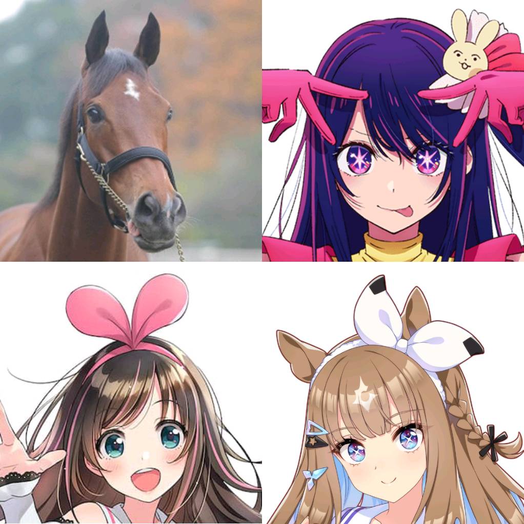
Kizuna AI June 30, 2016
Hoshino Ai April 23, 2020
The girl in the upper left is too cute with her tongue out.
Doesn’t it look a bit like Suzuka-san?
>>156
The color and milk are similar to Zephyr.
The ultimate girl × light blue = Alice is quite straightforward, but I couldn’t think of it.
>>157
I realized it just now when you mentioned it.
To be honest, I’m looking at you with lewd eyes.
![[Rune Factory] I’m sorry, but I live behind the general shrine.](https://otaku-reviews.net/wp-content/uploads/2025/06/af0f4933.jpg)
![[Monster Hunter Wilds] I wonder if those who bomb with low ratings want to kill the series.](https://otaku-reviews.net/wp-content/uploads/2025/06/618be522.png)
![[Manga] The magic trick that everyone tried to master as kids but couldn’t is trending, lol.](https://otaku-reviews.net/wp-content/uploads/2025/06/bf53dd2f.jpg)
![[Gundam GQuuuuuuX] Even though you’re a Newtype, you’re so insensitive, Egusabe-kun.](https://otaku-reviews.net/wp-content/uploads/2025/06/b96ae33d.jpg)
![[Manga Time Kirara] Tell me your favorite couple in Kirara.](https://otaku-reviews.net/wp-content/uploads/2025/06/7f363a8b.jpg)
![[Fullmetal Alchemist] I have no certainty, but I feel like Envy is the weakest among the homunculi.](https://otaku-reviews.net/wp-content/uploads/2025/06/da613d5c.png)
![[Thunder thunder thunder] I thought this cover was sexy… so I bought it, and it turned out to be more interesting than I expected.](https://otaku-reviews.net/wp-content/uploads/2025/06/d303d5fc.jpg)