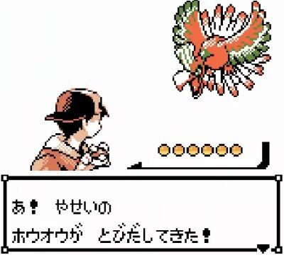
Ah! A wild Ho-Oh has appeared!
No?
It’s extremely classy, isn’t it…?
If the gold and silver Ho-Oh doesn’t have a legendary feel, then which one would look legendary instead…
>>3
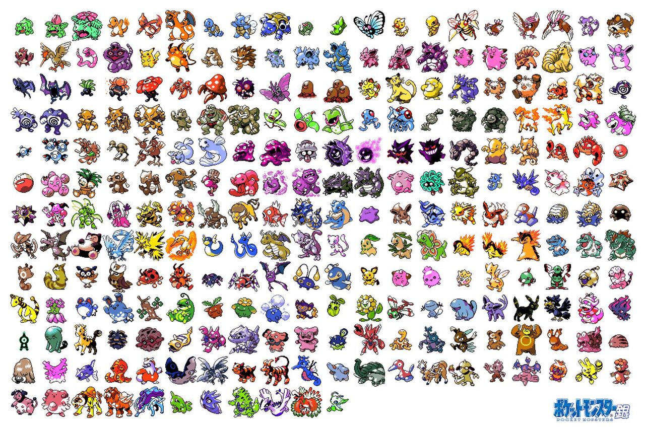
The pixel art of gold, not to mention silver, is of the highest class.
It looks like grilled chicken skewers.
Doesn’t it feel different ever since it became 3D?
>>7
The round shape of the belly is emphasized, making it look delicious when eaten.
>>7
I couldn’t stand how Lugia and Ho-Oh were standing upright on the ground during the time of Poké Stadium and Battle Revolution.
Since XY, flying Pokémon hanging in the air have been criticized, but I really think it’s great that these guys can actually fly now.
What kind of yakitori do you usually eat?
Rather, it’s a craft of some sort that, despite being only four colors, has a somehow rainbow-like quality.
I think the package delivery is somehow cool.
If this were to appear by the roadside, it would be legendary enough to be a scam like Absol.
It may not be rainbow-colored, but it also doesn’t seem to be just four colors; it’s the art of craftsmanship.
Oni Drill is one example, but when the pixel art occupies a large portion of the frame, it looks strong.
>>12
Civil Don…
>>12
I want to say something about retro-style pixel art games, but when all the characters are crammed into the space, it makes the strong-looking characters look faint and somewhat off.
Someone with a fear of blank spaces isn’t suited for that kind of thing.
The impression of this neck-shortened radial pose is so strong that when I look at illustrations from the side, I think it looks slim…
This visual looks clearly exceptional.
Legends, in particular, have a stronger atmosphere with a single illustration.
It seems to have a blast effect.
I think it really gives off a divine presence.
Is there a dot art general Pokémon that has a legendary feel instead of this?
Windy
A slightly luxurious Oni Drill.
I understand that the packaging artwork might feel a bit less legendary.
>>22
It’s bad that my partner, who also did the movie’s promotional poster, is such a mysterious creature.
>>23
The image in the thread appears in episode 1 of the anime, so it should be fine.
Gold and silver can only use two colors per piece, aside from black and white.
Recently, the Ho-Oh is lacking this big tail.
>>26
The dots in the thread image have large wings, tail feathers, and face, which makes them look impressive and cool, right?
3D can’t do this kind of thing.
Compared to recent legends, the design is straightforward, or rather it’s just a flashy patterned bird! I can understand why people feel that way.
I don’t know about the sense of legend, but it’s about three times the size I expected.
When I first saw Airamudo and Donphan, I thought they were cool.
A single picture of wings spread wide always looks cool no matter when I see it.
>>33
Well then, should we spread all the bird’s wings and keep them in the air…
>>38
If it’s a Native, I’ll forgive it…
My favorite second-generation pixel art characters are Freezer (Gold), Sawamurā (Gold), and Haganeil (Gold, Crystal).
I don’t understand what the handwritten expression is trying to convey.
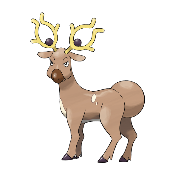
It’s not really related, but I thought Archeops’ pixel art was cool.
The 3D model feels a bit different…
I seriously thought that a big tail was growing out of the face, and I thought that was cool.
Isn’t Lugia thinner? I mean, I like it though.
>>39
Lugia has an impressive appearance in the package art, but the pixel art looks lame.
The back view is also no good.
I wondered if it was hand-drawn, but it seems different in some way…
What the hell is this?
>>40
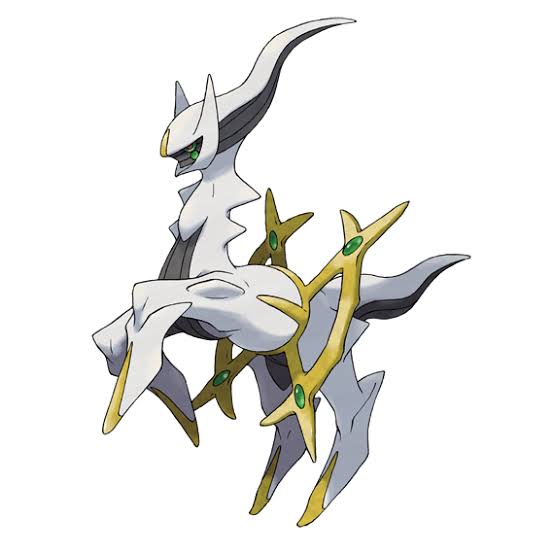
Isn’t it Arceus?
I like the silver sitting Naitō.
The silver Mantine has an air of dignity.
LEGEND
I really like the pixel art of Muuma.
Pokémon Jade
>>47
It’s funny how Pidgeot looks like an Iwato-biyori penguin with its decorative feathers standing upright.
>>47
When you look at them alternately, it seems like Dugtrio is having a meeting, and it’s cute.
>>47
When comparing gold and silver alternately, it seems that the basic movement is like two frames.
The golden Lugia is cooler than the silver Lugia, isn’t it?
The three dogs were standing out too much in some parts.
>>49
The head of the Raikou looked like a seaweed roll, and it was shocking…
I like Ordile, which is bipedal but also has a crocodile-like quality.
I felt it was incredibly vivid despite the limited colors of the GB.
Doesn’t it look like Arceus…?
>>53
Sorry, it got mixed up.
Ordile’s dead dot is cool.
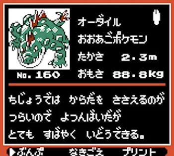
Orderil, the big jaw Pokémon. Height: 2.3m, Weight: 88.8kg, No.160. It struggles to support its body on land, so it moves on all fours, but can move very quickly.
>>54
That’s definitely a crocodile.
In the first place, it’s supposed to be about gold and silver, so why is it Arceus…
>>57
I wonder if it got mixed up with HGSS…
I remember feeling like it had a sense of legend, but I wish it had been Lugia…
I’ve seen someone confuse Arceus and Oddish for the first time.
When it comes to the dot of the gold and silver Ho-Oh, the dot of the mini icon Ho-Oh’s tail looks like its beak and body.
I’ve always wondered why Ho-Oh’s icon is a dragonfly…

I felt something off about the Fire dot, and then I realized that unlike now, the entire wings were engulfed in flames.
I think Steelix has a legendary aura with its gold and silver dot design.
I generally like the poses that the silver one is doing.
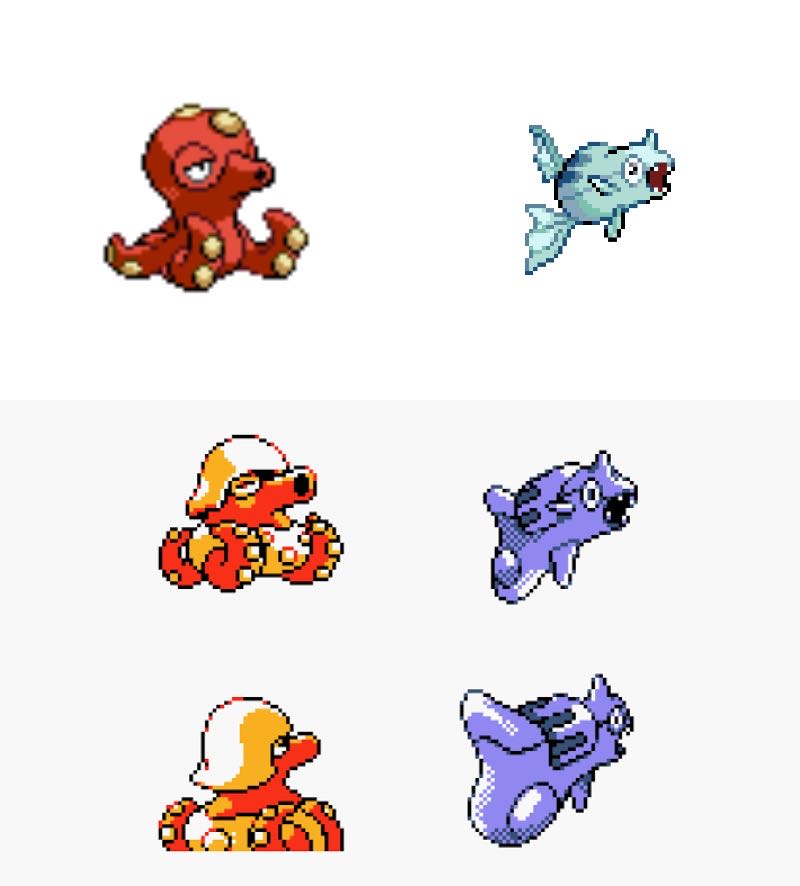
I still can’t accept that the Barracuda evolves into Octillery.
Saying that a gun → a tank is like saying fish → octopus is a bit of a stretch, isn’t it?
>>69
Since Pokémon can evolve from shells to fish, it’s not a big deal.
>>69
Somehow, the sheep can turn into a dragon that doesn’t make much sense, it’s just a margin of error.
At that time, there were fewer people and money in Pokemon compared to now, yet people who loved Pokemon were changing the dots with Gold and Silver.
I’m still curious about what the area around the mouth of the silver and gold Suicune looks like.
Is it even a mouth to begin with?
Silver has a lot of strange poses…
The front picture is too perfect no matter how many times I see it…
The back view of Ho-Oh when you’re using it yourself is way too bird-like.
>>73
Whoa, is there a different-colored version of me!?
The golden Rhydon is cute.
“It seems like they’re saying ‘Hurry up!'”
I think it’s amazing how it looks really colorful even though it only has three colors.
Well, I can understand that Ho-Oh doesn’t have much of a legendary feel, regardless of gold and silver.
I don’t accept insects that completely metamorphose in reality either.
The later released Crystal aside, did Gold and Silver have different dots at the same time of release?
A slightly luxurious fire.
I think it’s just funny that Groudon and Kyogre come out from here, but the design definitely reflects that they are legendary Pokémon.
I agree with the unfinished designs of Tetsuozu and Oktan.
>>84
I understand that the underlying elements are the same, but can’t you agree that the evolution doesn’t make sense!?
>>84
The pattern of the barracuda is a remnant of a cylinder, huh…
>>84
Real weapons were probably banned, but they’re designed too well…
Lugia doesn’t really have a legendary feel either; it looks like a dragonized Mewtwo.
The legendary feel increases in media that showcase size.
At the time of the three dogs, there is absolutely no difference… not even a slight movement.
Because it appears in the first episode of the anime, it gives an impression of being an undeserving symbol of that world.
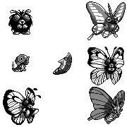
Since I heard the idea that in terms of evolution, Mothim and Butterfree should actually be reversed, I can only see it that way now.
>>90
In the analysis page that concludes there is no theory of data misalignment from the perspective of the typical development process and the order of implementation seen from other arrangements in the catalog, it mentioned “but too similar” about three times within the text, and that was no good.
>>95
It seems there are no misplacements, but the theory that it was intentionally switched is still there.
Because the time for graphic input is approaching.
>>100
For what purpose?
Both have a balanced image without excess or deficiency, and I think they are the two that stand out as the number one in design among legends.
Mantine is inspired by a bomber, and Carvahall has remnants of a missile.
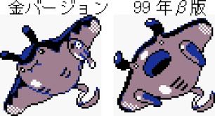
Gold Version 99 beta version
>>94
The sea of Asagi-Tanba, where tanks, guns, bombers, and luminous weapons are swimming, is way too dangerous.
Is it because Lugia was originally designed as an anime-exclusive Pokémon that there is a rainbow-colored Ho-Oh, summoned by rainbow-colored wings and transparent bells, which has no gold elements at all?
Well, it’s true that you could say Lugia doesn’t have silver elements.
When it comes to items, I thought that Lugia, with its silver wings, was smooth and sleek, but then it turns out it has feathers?
>>98
Penguins might look smooth at first glance, but they actually have feathers, so I think that’s probably the feeling.
Looking at it again, Nuoh has been quite plump since that time.
Isn’t it unfair that Suicune gets its own special BGM first with Crystal?
I wonder why Lugia is not a Water/Psychic type.
>>103
It might be related to the specialized technique Aero Blast.
>>103
The implementation of the three types of Water Flying Espers is eagerly awaited.
Ho-Oh has a legendary feel like a remarkable person in the neighborhood.
What are the motifs of Chinchou and Lanturn?
I understand that the concept is based on the anglerfish, but it looks so unlike it that there must be other motifs, right?
>>106
Isn’t Chonchi also inspired by a regular anglerfish?
Regarding the lantern, it’s within the realm of the deformed styles of anglerfish.
I think Butterfree and Mothim are more like the larval stage of a swallowtail butterfly, and it’s kind of odd that they turned into moths, right? Maybe that’s why they switched.
>>108
Morpheon is modeled after a swallowtail butterfly.
>>112
That butt is a moth, right?
If Bozokutan were not connected to Bozuteppouo, it would have been safe.
If you have doubts about Lugia, you might wonder why it isn’t a Water/Flying type.
Isn’t the character illustration of the protagonist in the thread cool? The way the eyes are hidden and cast in shadow gives it a nice feel.
It’s like with anything, but as a series progresses, it becomes more refined and stylish, and I feel it’s a bit sad that the flamboyance disappears.
The movie poster is too watery.
The Ho-Oh in the thread image is beautiful.
Feel the golden ratio.
On the contrary, because it turned into 3D, it became like, “Aren’t they supposed to be thin!? Is that still legendary?!”
When combined with the story of extinct things becoming Pokémon, it’s a world where weapons no longer exist.
Kopun and Butterfree are similar, but Caterpie and Metapod don’t really resemble Mothim.
![[Rune Factory] I’m sorry, but I live behind the general shrine.](https://otaku-reviews.net/wp-content/uploads/2025/06/af0f4933.jpg)
![[Monster Hunter Wilds] I wonder if those who bomb with low ratings want to kill the series.](https://otaku-reviews.net/wp-content/uploads/2025/06/618be522.png)
![[Manga] The magic trick that everyone tried to master as kids but couldn’t is trending, lol.](https://otaku-reviews.net/wp-content/uploads/2025/06/bf53dd2f.jpg)
![[Gundam GQuuuuuuX] Even though you’re a Newtype, you’re so insensitive, Egusabe-kun.](https://otaku-reviews.net/wp-content/uploads/2025/06/b96ae33d.jpg)
![[Manga Time Kirara] Tell me your favorite couple in Kirara.](https://otaku-reviews.net/wp-content/uploads/2025/06/7f363a8b.jpg)
![[Fullmetal Alchemist] I have no certainty, but I feel like Envy is the weakest among the homunculi.](https://otaku-reviews.net/wp-content/uploads/2025/06/da613d5c.png)
![[Thunder thunder thunder] I thought this cover was sexy… so I bought it, and it turned out to be more interesting than I expected.](https://otaku-reviews.net/wp-content/uploads/2025/06/d303d5fc.jpg)