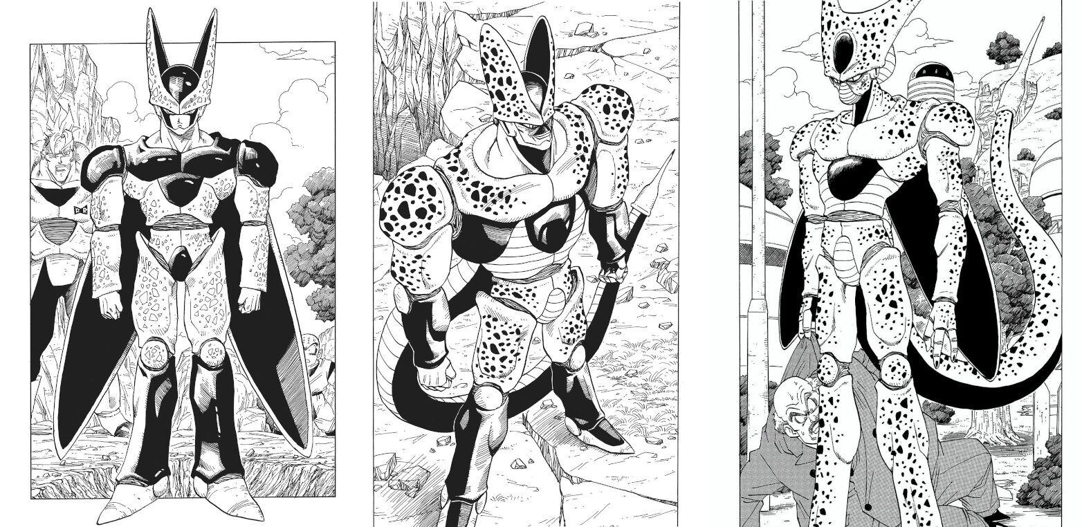
The second form is so ugly that the final form stands out, right?
It’s too much of a struggle to draw this in a weekly series.
>>2
Why did you do it again even though you experienced it during the Frieza time?
>>6
I tend to get really into things, after all…
The three fingers of the first form are good.
Frieza also went through an ugly phase.
>>4
Both Frieza and Cell seem to be the best at giving oral in their ugly forms…
Memory of the second form ending in episode 1.
When I try to write by hand, the splotches are really a hassle, this ugly thing.
In anime, the distinction in performance by form is also detailed.
It would have been fine to make it a human-type like a normal android, but I wonder why they made it such a creepy monster.
>>10
The impact when the right made its first appearance from a horror scenario was incredible, wasn’t it?
I like the first form and the final form.
>>11
Huh………!?
In the second form, the wings disappear, huh?
I can sense a desire to make it a bit easier to draw, given that the final form has the stripes turning white.
The monster that gave the swallowing fetish to elementary school students at the time.
I love the first one the most.
It looks like it’s evolving smoothly considering the circumstances.
I was thinking it was the same as when Frieza transformed into King Cold.
The sense of connection in the second form is incredible.
I like the feeling that there is some mysterious monster lurking until Cell reveals himself.
After the final form is weakened, the second form also has the embarrassing move of becoming muscular and self-destructing, and overall it has a pitiful and ugly move, doesn’t it?
>>22
It’s because a pathetic, ugly old man has a bird fetish…
The second form has said many times that it wants to become complete…
Slim → Muscular → Good balance in between
The second one is the face…
It might be that the presence of the second person enhances the appeal of the third person.
Seriously, the complete form is ridiculously handsome and cool.
Hasn’t the final height decreased?
Wing deletion!
Wings revived!
I honestly like the second form, even though it’s ugly.
Creepy guy
Cool guy
Unattractive stuck in between.
I was like, “You really liked that second form in Super Hero that much?”
>>33
It would be more appropriate to present it as a second, rather than a monster without reason.
In the first place, it’s a creature that exudes a more intelligent sense of fear.
In its final form, it has a strong human-like element.
If it’s a creepy and big monster, then it’s fine in the second one.
>>33
Well, to be honest, it was originally planned to be more active with that design.
It means that I took revenge as a superhero.
The tail disappears.
Well, there’s a sense that you can do anything in the second form.
Anime was animated with hand-drawn spots, you know…
The final form is the simplest when you look at it this way.
Looking at it this way, Madara’s final form must have been quite a hassle with that black surface…
I wonder if it wasn’t possible to make it smooth, even if it doesn’t reach the level of Frieza.
The part that seems to take the most effort to draw in constructing the body is the cell form on the far right.
Even though Dragon Ball has a small number of pages per chapter…
Why did you add such a troublesome pattern to the drawing?
>>43
Since I was originally working in design, I probably have a personality that cannot compromise on the design itself.
However, when it comes to animating in manga, the hassle of spots takes precedence… it feels that way.
The second one might be due to the angle, but the final form seems like it’s trying too hard to fit into one panel… like… it’s ended up being a bit stubby with short legs…
It seems like it would be difficult to draw because there are many parts with bumps and unevenness, just like with the spots, especially in the early stages of the cell.
The perfectly bad feeling of 2, which can only be thought of as being written by working backwards after completing 1 and 3 first.
>>46
In reality, 2 was made to look strong in a straightforward manner from 1, but the person in charge said it looked silly and asked for it to be made cooler, resulting in the complete form.
I still like 1 the best; this transformation from a chrysalis has a big impact.
I am gradually reducing the spots and modifying the design to be easier to write for the bird.
It’s a matter of hindsight, but just like how muscular Trunks didn’t quite perform well, this looks like it won’t be able to shine either. It’s all about appearance.
As I write this, I can’t help but think that such jinxes are irrelevant; Broly is truly amazing.
I felt disappointed that it turned out like Frieza in its perfect form.
I like the first form the most; it’s the eeriest.
>>54
The level of damage has a horror-like feeling to it.
I’m gradually making it easier to draw hands by removing spots and getting rid of the insect joint-like appearance.
Unlike Frieza, there is no sense of despair at all in the intermediate forms.
This guy is really just ugly, isn’t he?
There is a cover in the groin area, but I wonder if the genitals are tucked away.
⚪︎ Garbage ◎
>>36
Damn it!!!! I think there is also a negative image associated with it.
>>61
As mentioned above, it’s pretty pathetic that it’s mostly in 2…
Crying to Vegeta and self-destructing out of frustration are both options.
However, since becoming Perfect Cell, the solid coloring of the patterns has been omitted.
I feel a little better.
It’s a skill of mastery.
Number 19 and Number 20 → Are these fat guys and old men the enemies?
No. 17 and No. 18 → Are such good-looking men and women our enemies?
First form of the cell → Is this monster the boss?
Cell Second Form → Buuza
Cell Perfect form → Well, that’s fine…
I wonder if interactions like that really happened with the editor…
>>63
It’s too unreasonable.
>>63
Numbers 17 and 18 can’t be like this kid, so the nuance is different again.
>>63
There are images of such exchanges, so it’s true.
By the way, the person who was giving feedback until the cells were released had already been reassigned, but it was Mashirito who was calling one by one.
The editing by Kondo, who was in charge at the time, was criticizing the second cell.
In the Cell Saga, when the townspeople vanished leaving only their clothes behind, and there was just a foot visible from outside the panel with the next episode continuing from there, that was really scary.
>>66
The part where Trunks and the others find the empty shell, and where the god is pale and trembling, is also frightening.
Vegeta is being careless and seems to have forgotten Frieza’s lesson about shrinking once he becomes complete (note that Buu does the same thing).
The Android Saga was when I was hit with it in real-time, but when I was a kid, I liked the first form.
After growing up, it became my second favorite.
The second one hired the last person, and they have an unremarkable sense.
It’s too easy to use for punchlines and comebacks…
It’s surprising that after getting carried away and showing a pitiful side by digging my own grave, it doesn’t get talked about much, even though it’s the same in the final form.
I wonder if it’s because he’s good-looking after all.
>>71
I feel like it’s a cliché to retort when I’m told that Gohan is meaningless.
I wonder why this guy evolves twice more from the caterpillar stage.
The second one is ultimately easier to handle.
The end lacks any interesting aspects.
The balance of the first form’s creepiness and coolness is just perfect.
The second form is nothing but unpleasantness.
I like how the coolness and monster-like qualities are well blended together.
The moment when Gohan and Trunks discovered Cell’s husk was the peak of Cell’s eeriness.
Isn’t it actually really difficult to animate this guy in anime?
>>80
If it were now, this guy would probably be full CG.
>>80
So I’ll make the final boss a simple, muscular alien of the gray type who is bald…
Spots seem troublesome…
The difficulties of animation can be inferred from the fact that Cell Max is a CG movie.
What I don’t really understand is the feathers that retreated in the second round.
It’s growing again in its complete form.
>>86
When I look at the first form and the perfect form, I can’t help but think that having these wings makes it really cool.
>>88
Eh…!?
>>86
The fact that the tail retracts makes sense as “there’s no need to absorb anymore,” but it’s a mystery why the wings would come back.
>>89
I think it’s because it stands out when doing aerial battles.
It’s something like a cape.
Even if the arrangement and size of the spots are somewhat off, it’s okay for manga, but it’s tough for animation…
The base design hasn’t changed much, which suggests that they were really committed to the design from the beginning.
I just realized that I no longer have to paint spots on the final form.
>>91
The black areas other than the spots have increased, and even if the spots are white, it doesn’t feel out of place—this is the skill of a craftsman.
It’s important that the design of the final enemy is really cool…
I like that the complete form has its tail stored away.
The second is originally a form along the way, so it was decided from the beginning that the end would be a different form…
Whoa… that’s honestly too ugly… hurry up and change it.
>>74
I basically like characters like the Red Ribbon Army or Android 16, who are essentially the Arnold Schwarzenegger type.
The influence of Hollywood and American comics during that era and time is inevitable.
When arranged, it gives the impression that only the final form’s face is floating.
In color, it’s clearly a different color from humans, so it doesn’t bother me that much.
It’s interesting how each time it deforms, it spreads the black fill and reduces the area for drawing the spots.
Isn’t the proportion on the left strange?
The second one has its own flavor, but during the second time, the behavior and actions were also quite comical, right?
>>103
It looks kind of like a Western movie, that second form cell.
A pretentious feeling or vibe.
The first spot is too small…
The first form looks like the exoskeleton of crustaceans, but from the second form onwards, it resembles a protector, which is skillful.
In addition to the habit of hand movements, is it that the final form of the reference image feels clumsy compared to the first form, which has a cooler silhouette?
I still think the final form of Cell is really cool.
The second form would have been cool if the mouth area looked like a mask, wouldn’t it?
It can hide the uncool black nose too.
I always think it’s complicated that it’s not said that the first form is right after hatching from the egg.
The appearance of a super hero resembling a giant monster fits perfectly in the right place since the second one was really into it.
The first one looks quite scary if you take a closer look.
It seems like there are quite a few children who cried after watching anime.
I think the full form being the same yellow aura as a Super Saiyan in the anime is really cool.
But I don’t think Frieza’s third form is ugly.
It’s gross, but it has flavor.
Selmax has wings, you know.
>>117
I think having wings makes the overall silhouette cool.
The second form looks somewhat lonely on the back side.
Cell Max was advertised as a being that surpasses Cell, but despite that, it doesn’t have Cell’s characteristics of absorption or regeneration, and its base form is a creepy second form, so there’s really nothing good about it…
>>118
The Perfect Cell itself is perfect, so it doesn’t absorb anything, and since it is an existence that surpasses that, it wouldn’t be weird for it to disappear either.
Whether or not there are wings, the overall silhouette itself is the same, so the sense of unity is amazing.
Despite the proper transformation from the first form to the final form, it can still be recognized as the same cell.
Both Terminator and Alien were movies that were incredibly popular at the time, like a bird in flight.
It will likely be affected in some way.
Is that a nose above the Second Form Cell’s lips?
I thought it was the part in between humans.
What Mr. Toriyama likes the most is probably the middle.
![[Manga] The magic trick that everyone tried to master as kids but couldn’t is trending, lol.](https://otaku-reviews.net/wp-content/uploads/2025/06/bf53dd2f.jpg)
![[Manga Time Kirara] Tell me your favorite couple in Kirara.](https://otaku-reviews.net/wp-content/uploads/2025/06/7f363a8b.jpg)
![[Gundam GQuuuuuuX] Even though you’re a Newtype, you’re so insensitive, Egusabe-kun.](https://otaku-reviews.net/wp-content/uploads/2025/06/b96ae33d.jpg)
![[Rune Factory] I’m sorry, but I live behind the general shrine.](https://otaku-reviews.net/wp-content/uploads/2025/06/af0f4933.jpg)
![[Fullmetal Alchemist] I have no certainty, but I feel like Envy is the weakest among the homunculi.](https://otaku-reviews.net/wp-content/uploads/2025/06/da613d5c.png)
![[Thunder thunder thunder] I thought this cover was sexy… so I bought it, and it turned out to be more interesting than I expected.](https://otaku-reviews.net/wp-content/uploads/2025/06/d303d5fc.jpg)